The Setup
This family loves their neighborhood and their house. The young ones are out of the baby stage now so it made sense to call Drury Design and make the home more liveable for the next stage of life.
There were some druthers with the kitchen and there was a desire to make certain rooms more grown-up again. Unlike some of our clients who get rid of their formal dining rooms, this family wanted to keep theirs. They saw it as good space for entertaining and doing work – why not make it more stylish and purposeful?
The Remodel
Design Objectives
- Keep the craftsman style of the home but make it more modern
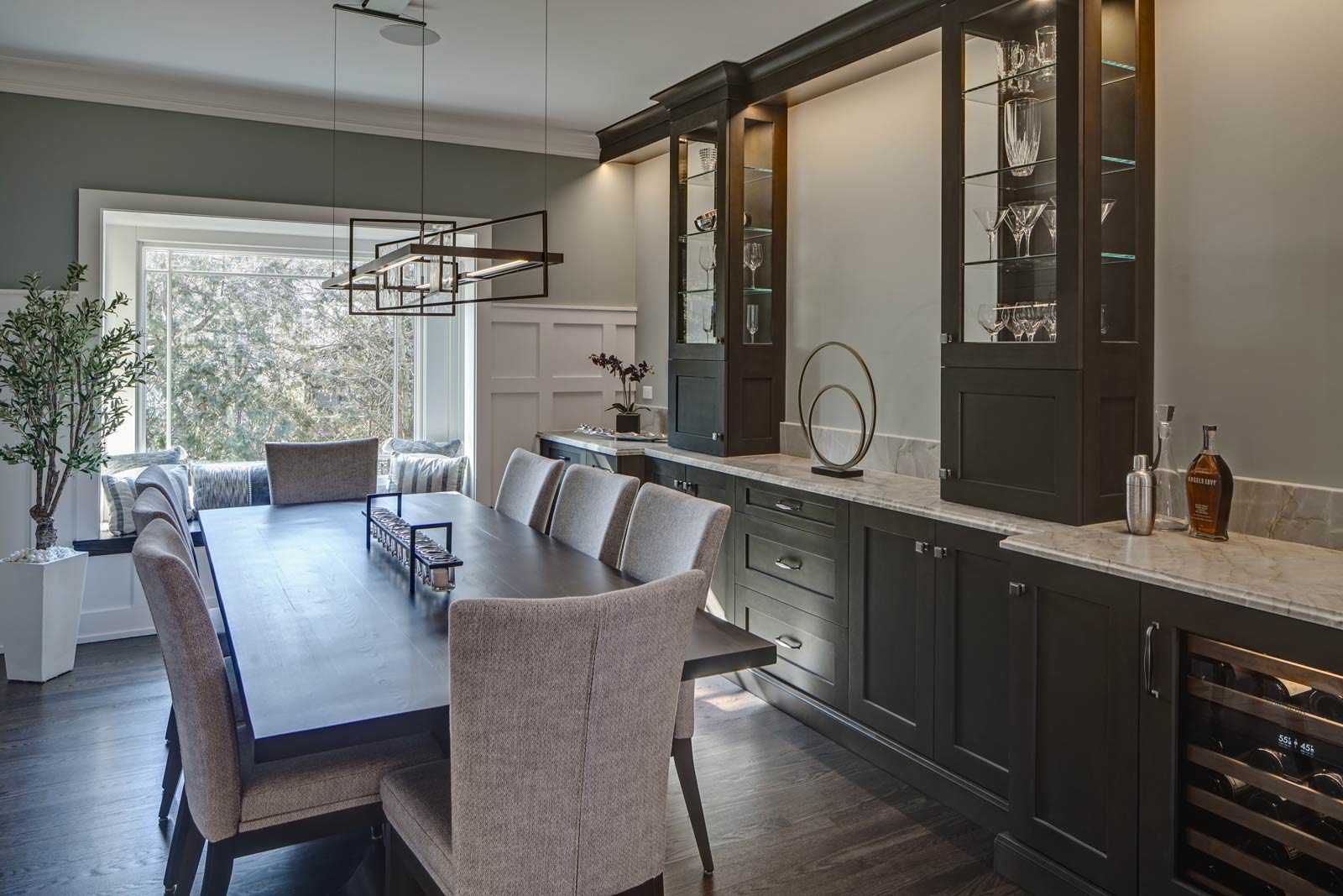
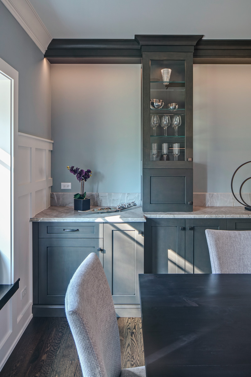
- Update the dining room to be more formal for entertaining and provide storage for china, stemware, wine, etc.
- Open up the kitchen to improve flow
- Incorporate new decorative lighting throughout the home to accent the home’s style
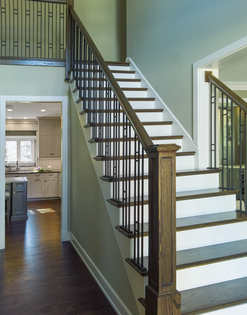
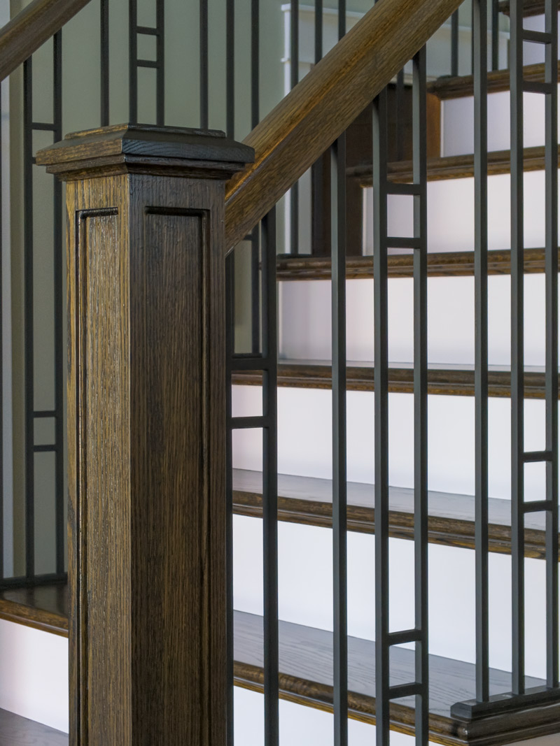
- Transform the staircase into a statement piece that greets visitors – redesign it with arts & crafts details in the balusters, newel posts and handrails
Design Challenges:
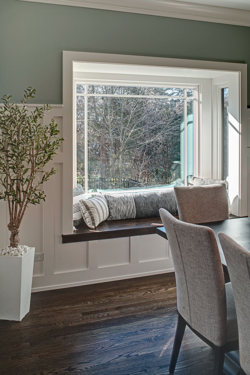
- Open up the dining room window for more light and a better view of the backyard. The previous window felt closed in with heavy shutters.
- Improve kitchen flow without making the footprint larger
- Make the entire home feel updated and cohesive while staying true to the house’s style.
The Renewed Spaces
We bumped out the dining room window to make a new bay window. The glass mullion design mimics the craftsman style, setting the tone for the room while letting plenty of light in. It really opened up that end of the dining room. The view of the backyard is much bigger now, too. It’s also a great nook for playing board games, doing puzzles and playing with Legos.
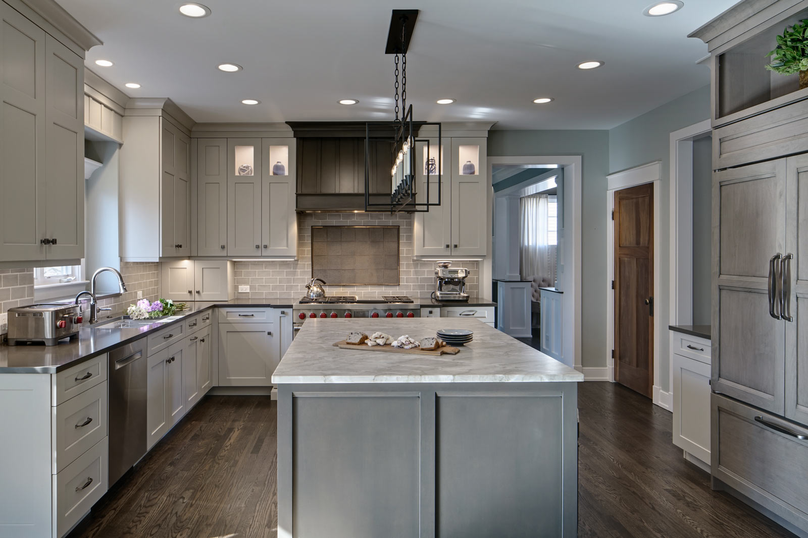
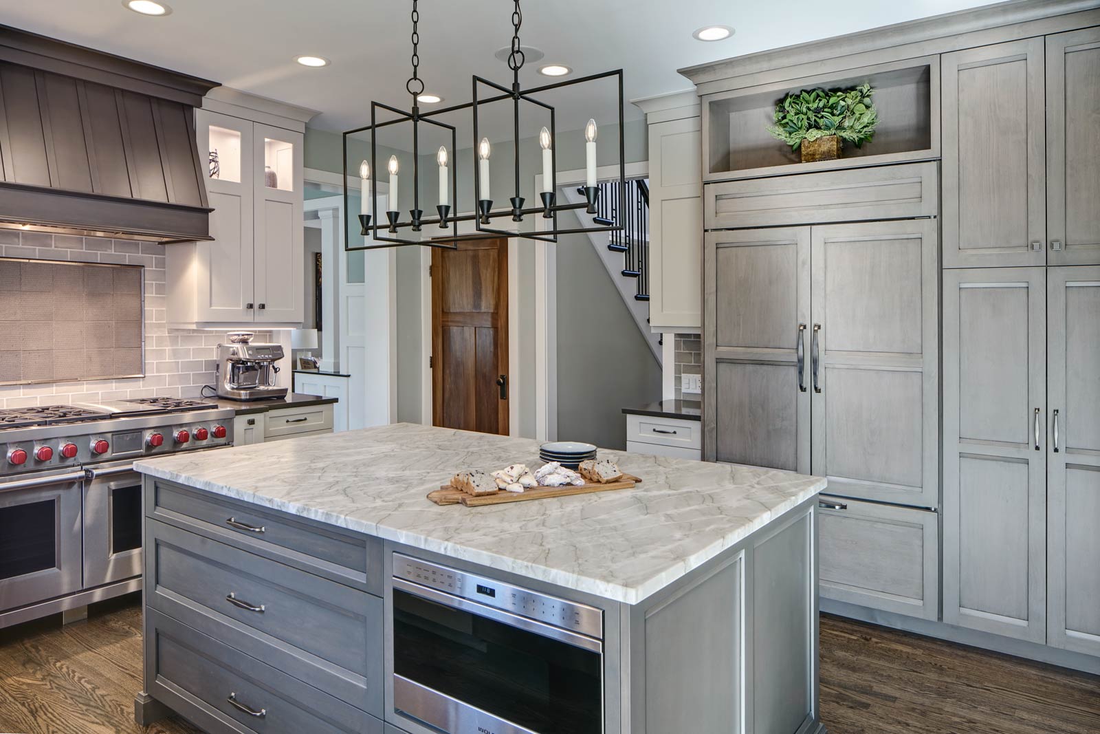
We actually got rid of a walk-in pantry that had cut off a corner of the kitchen, and were able to keep all the main walls intact. The old pantry room is where the fridge is now, as well as a tall pantry cabinet, some additional cabinets and a new countertop surface. The flow is much better and it’s roomy now, with a kitchen table that’s great for informal meals, homework and kids seating when adults are entertaining in the dining room.
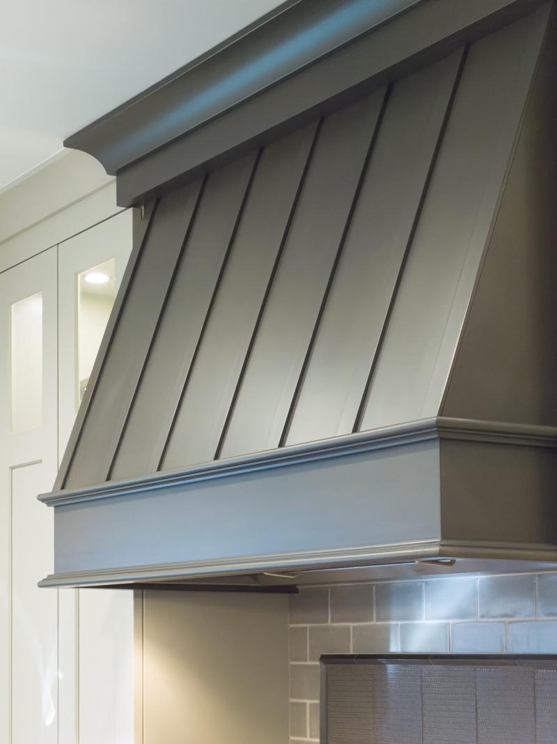
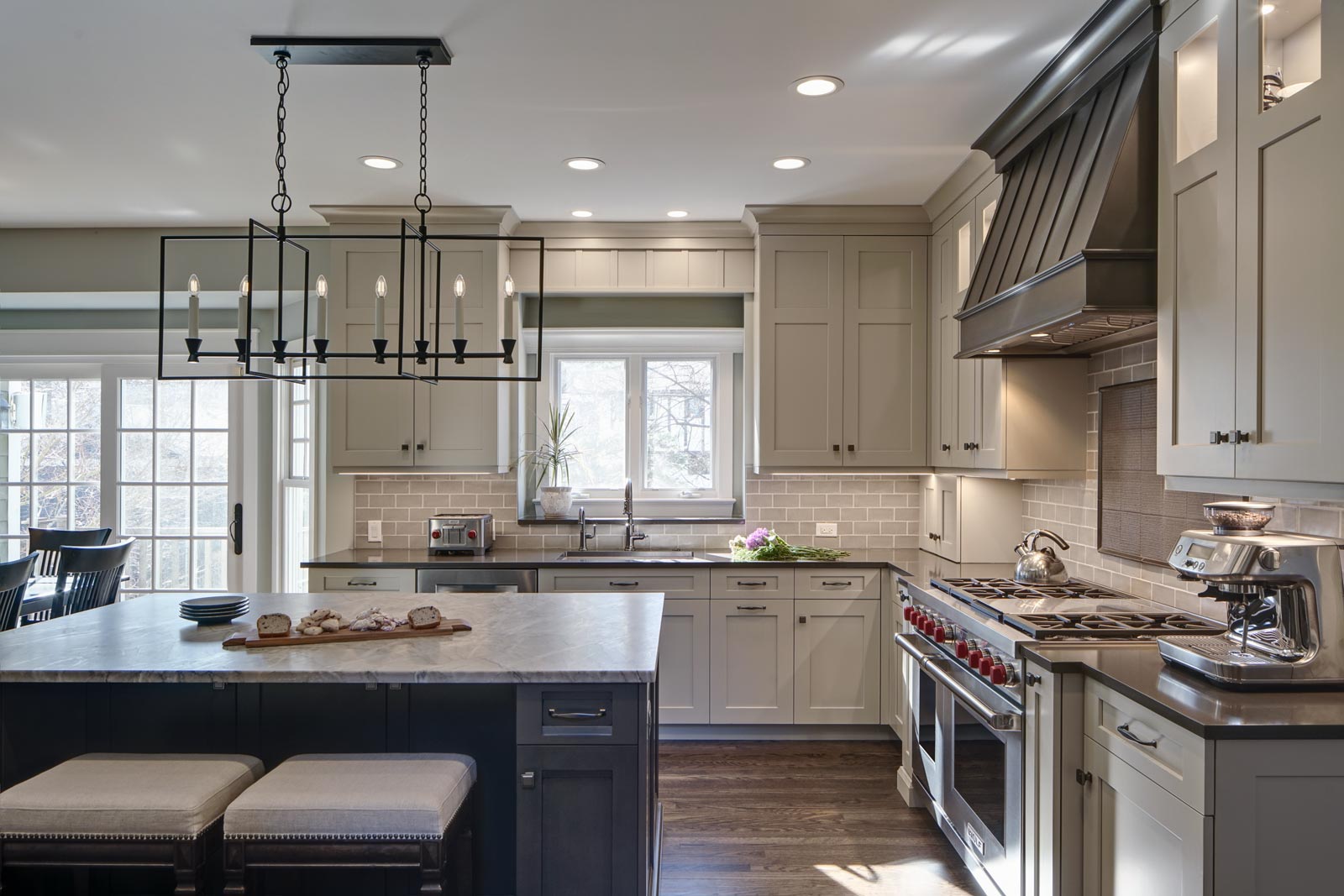
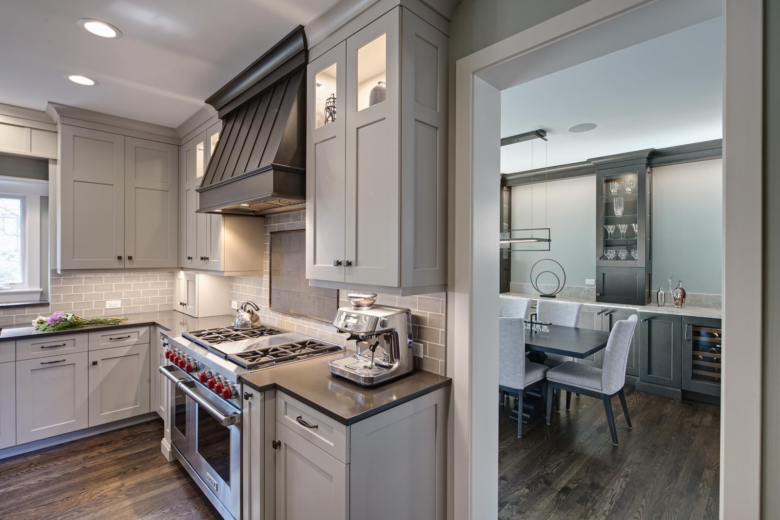
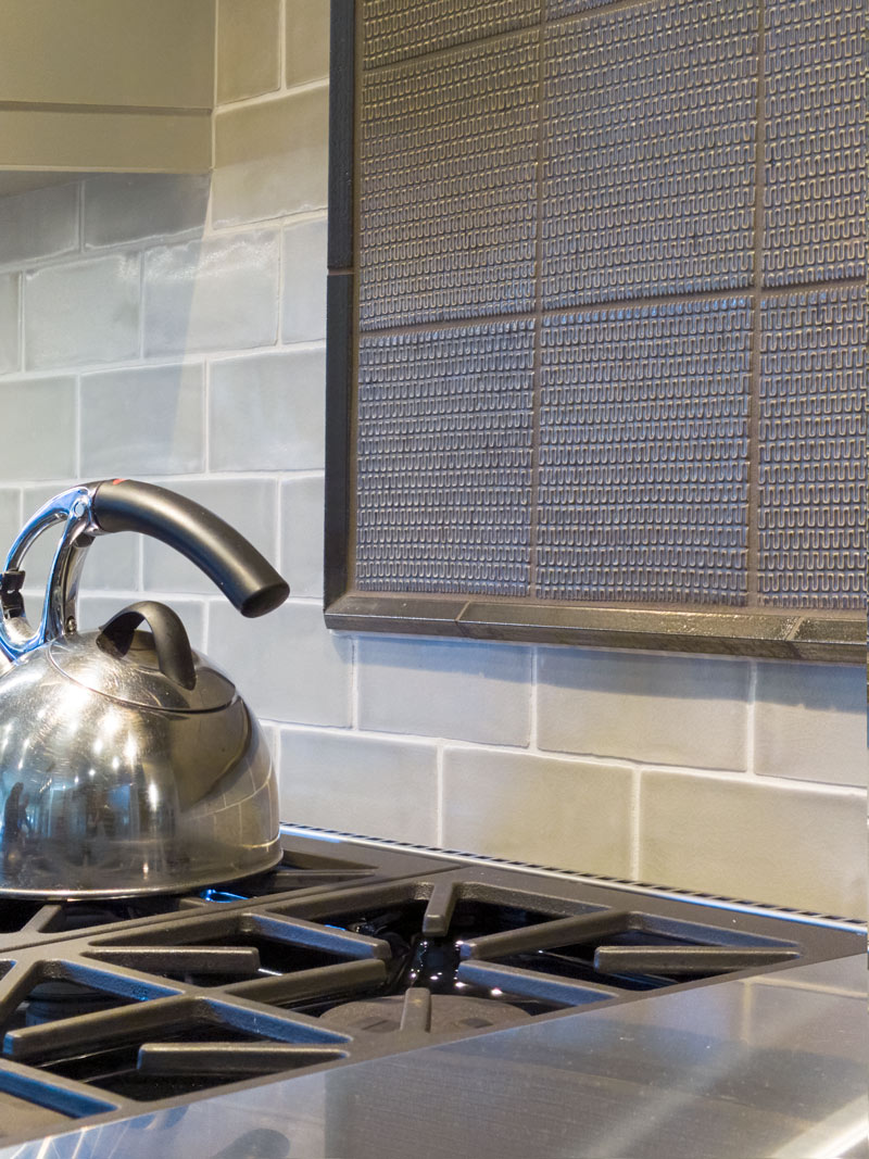
The cabinet, tile and countertop colors are still neutral but offer a more muted palette. To bring in the craftsman style, simple architectural details were added such as the hood and window valance, decorative furniture toes, a shaker door on the perimeter cabinets and a more modern cabinet door style on the island, pantry and refrigerator areas. New decorative lighting was added in the kitchen, dining room, living room, foyer and second-floor hallway to make the entire first floor feel updated. Also, the entire staircase was revamped. The existing hardwood was kept in place but stained medium brown to bring in some warmth.
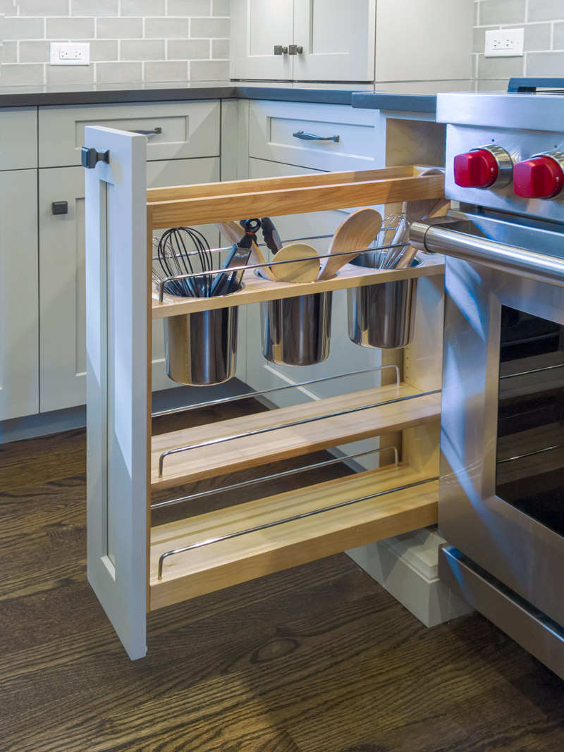
“The Drury process made this project turn out better than we imagined,” one of the homeowners told us during the final photoshoot. “There were so many features we didn’t know about – like charging drawers – and ways of going about the remodel that didn’t come to us naturally. We’re so glad Alicia had so much experience and so many checklists. We got to think through everything and arrive at the best possible design for our family.”
Cabinetry:
- Brand: Grabill
- Finish: Kitchen perimeter: Latte paint on maple. Island, hood & dining room: Greystone glaze on maple. Refrigerator panels and pantry: Smokestone glaze on alder.
- Door style: Kitchen perimeter and dining room: Madison Square. Island, hood, refrigerator panels and pantry: Halls Creek.
Countertops:
Kitchen perimeter and window ledge: Quartz, Silestone, Calypso polished.
Island & dining room: Quartzite Gabana, leathered
Appliances:
- Sub-Zero 42” refrigerator
- Sub-Zero 24” undercounter wine refrigerator
- Wolf 24” microwave drawer
- Wolf 48” dual fuel range w/griddle
- Blanco Silgranit sink
Size of Space:
- Kitchen 14’ x 16’
- Dining room 12′ x 14′
Special Features:
- Bay window seat in dining room
- Triple-sided glass door display cabinets on the dining room counter
- Walnut roll-out shelves in tall pantry
- Pull-out compost bin
