The Setup
The kids go off to college. It feels like a change is in order. Do you get a new place to match your new life? Or do you stay where you’re at and give your old home a refresh?
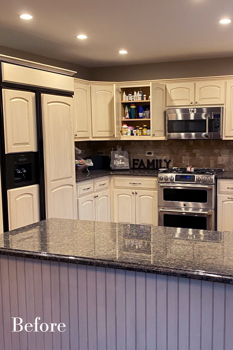
Designer Samantha Schoell’s clients decided to stay and remodel their home. The house was barely 20 years old so it didn’t feel old, per se – it just didn’t feel new. The kitchen was the biggest part of the project. It needed to be opened up. It needed updated materials and a new color palette. The decision to get started turned into an exciting journey toward a new way of living. They also added a dry bar and gave the nearby family room a makeover. Upstairs, they updated their primary bathroom and a hall bathroom.
“We knew exactly what was going to happen,” one of the owners told us after the project was complete. “Sam had a great drawings. We talked about them and changed things a bit here and changed things a bit there until everything was perfect. So yeah, we knew exactly what it was going to look like and how it was gonna be.”
Design objectives for the remodel were aimed at giving the kitchen a larger feel, more room for cooking and extra seating for entertaining:
- Island with seating
- Space for a larger range/cooking area
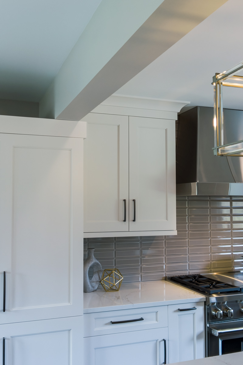
- More storage with cabinets to the ceiling
- Making the original dining room blend with the kitchen so it all feels like one space
The Remodel
Design challenges to be solved:
- Making the header between the kitchen and the old dining room make sense as we combined the two spaces
- Avoid feeling crammed – a large island with seating still needed space for people walking around the space
- Refrigerator location – the header and window placements needed to stay, so finding a new and functional place for the fridge was a priority
- Add a large hood for wow-factor appeal
The Renewed Space
Design solutions fell into place as the overall layout came together:
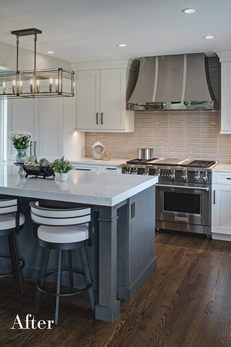
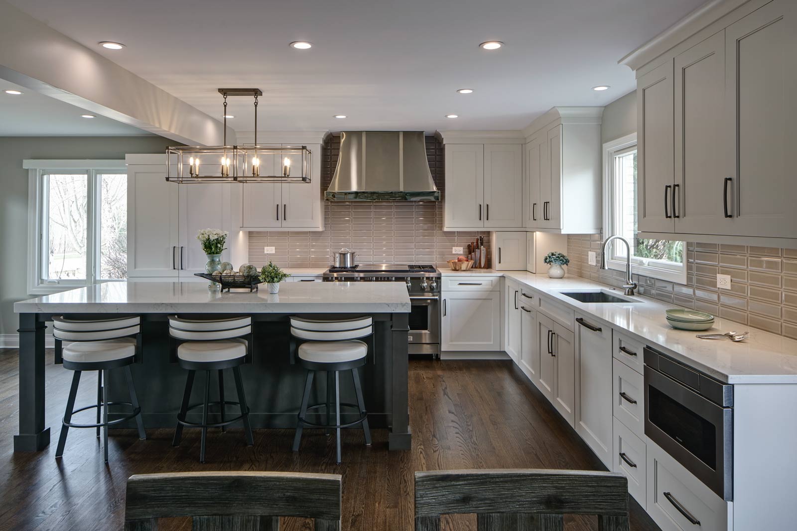
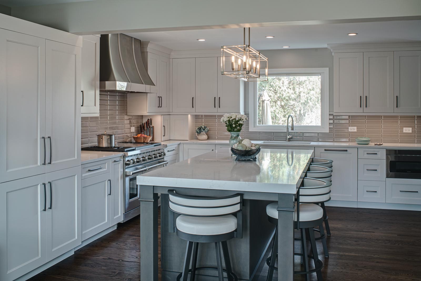
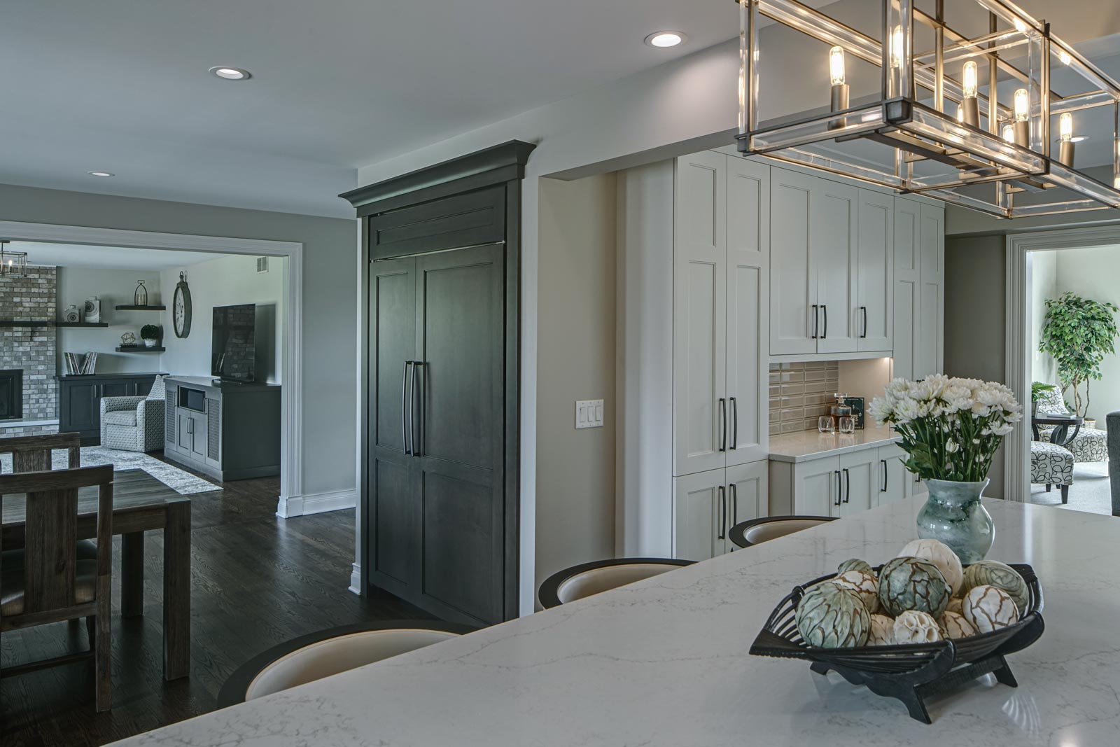
- A large island to seat their four-person family comfortably. Seating on two sides of the island improves conversation and has a great look.
- Knocking out a dining room wall gave us more room for the island. The leftover part of the dining was perfect for a dry bar/beverage area.
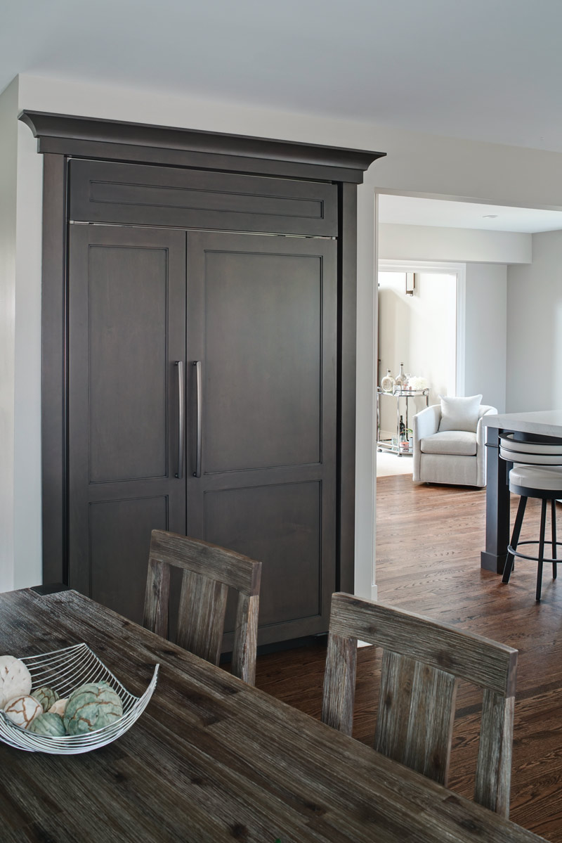
- The refrigerator needed to blend in and also be easily accessible. We removed the built-in pantry and used this space to house the refrigerator/freezer. Then we added tall pantry cabinets throughout the kitchen to make up for the loss of space.
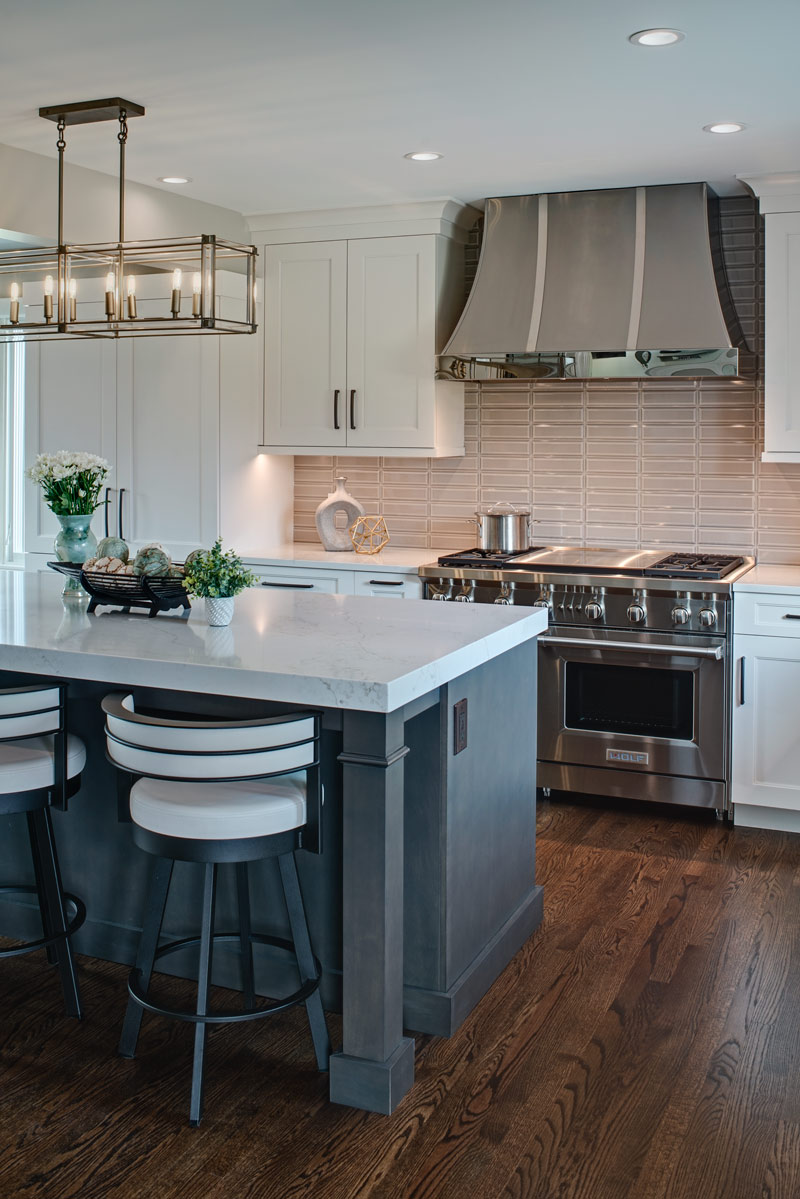
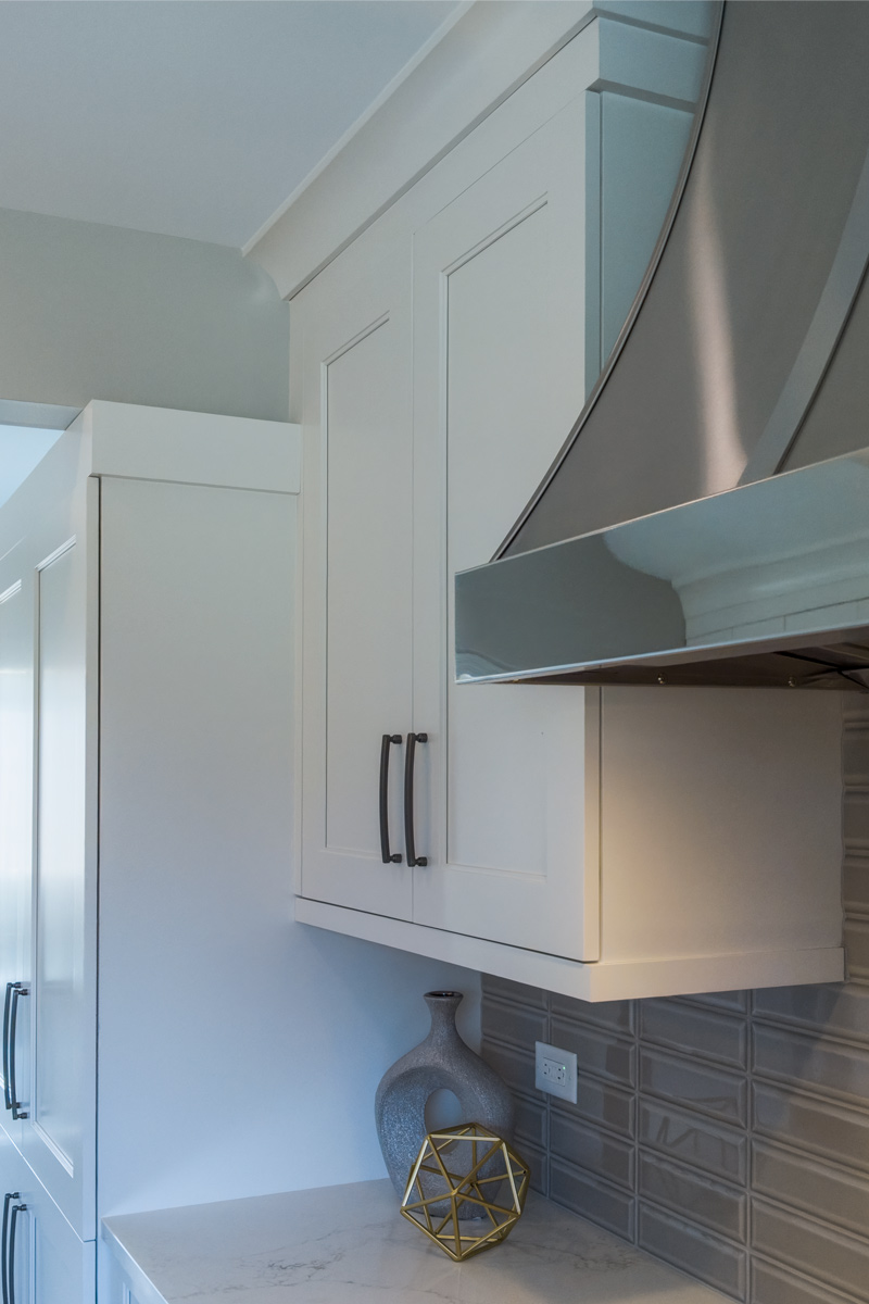
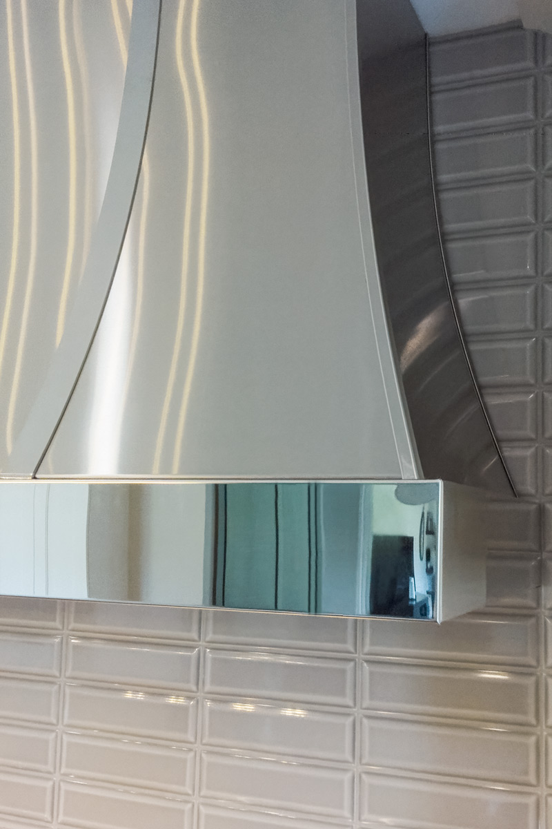
- A large metal hood broke up the space and made for a fun statement piece
The new space is perfect for family time when the kids are back. It’s more conducive for being together, hanging out together, and entertaining with different friend groups together… the family simply spends more time together when they’re together in their new space.
“It’s the design and the openness,” the mom says. “Everybody loves it and gathers around the island all the time. It’s the lighting, too – it’s brighter in here. It’s just more open. We love it!”
Size of Space:
- 15′ x 19′
Cabinetry:
Perimeter
- Brand: Grabill
- Finish: White Pepper
- Door style: Hampshire
Island/Refrigerator
- Brand: Grabill
- Finish: Greystone Glaze
- Door style: Hampshire
Countertops:
- Brand: Impact
- Type: Quartz
- Color: Stratus
- Standard thickness on perimeter, 2-1/2″ mitered on island
Appliances:
- Sharp – 24” Microwave drawer
- Wolf – 48” Gas range with 4 burner and double griddle
- Best – Ventilation system
- Sub-Zero – 48” Refrigerator and freezer
- Scotsman – 15” Icemaker
- Cove – Dishwasher
Plumbing:
- Kohler Vault single bowl stainless steel sink
- Kohler Tone faucet in vibrant stainless
Special Features:
- Custom Modern Aire hood
- 2-1/2” thick island top
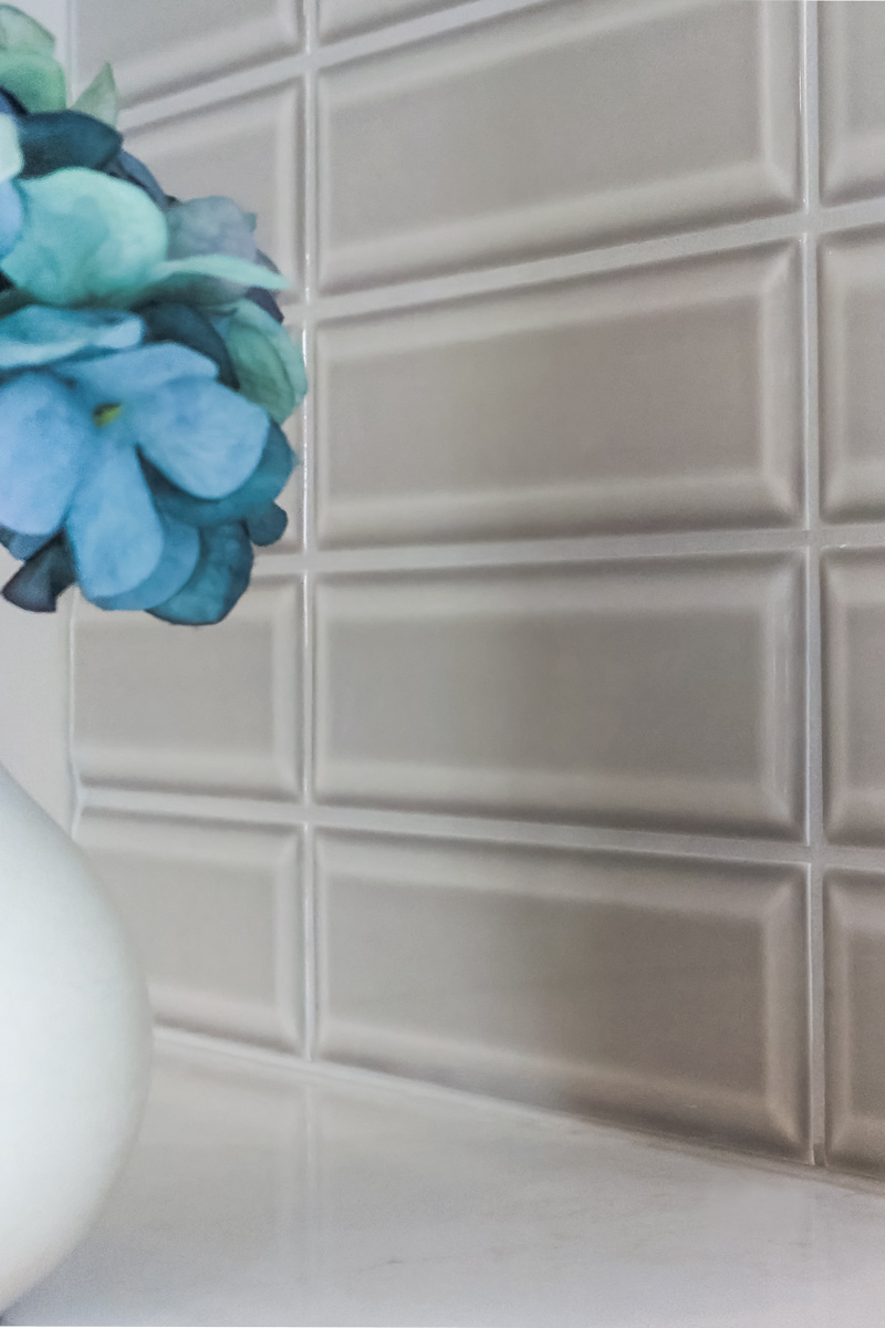
- Fun beveled tile
- Built-in refrigerator/freezer to look like a piece of furniture in the wall
Before/After:
