The Setup
Creativity and welcoming vibes flow from the East Rogers Park neighborhood directly North of Loyola University Chicago. Residents cherish the area’s historic foundations but take pride in nurturing a bright future through education and mindfulness. Putting an astute, positive spin on things is what the area is all about. That’s an appropriate description for this kitchen remodeling project, actually – the homeowners have young children and love their home, but the kitchen was in need of a thoughtful refresh.
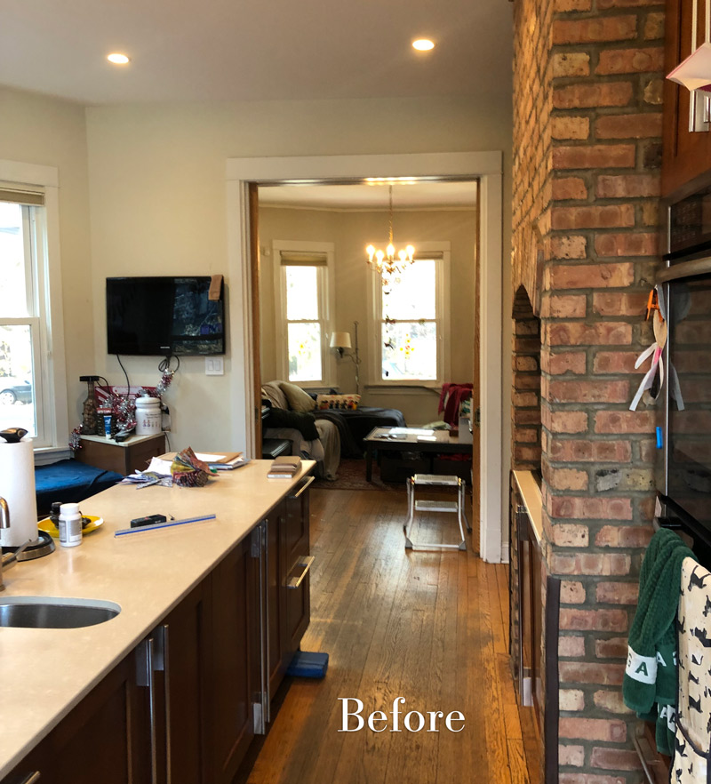
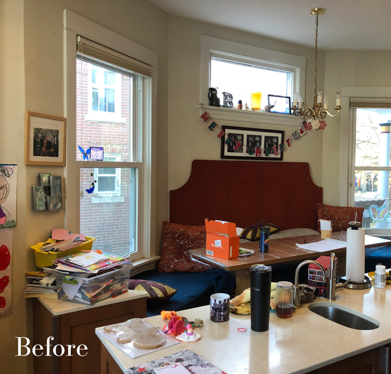
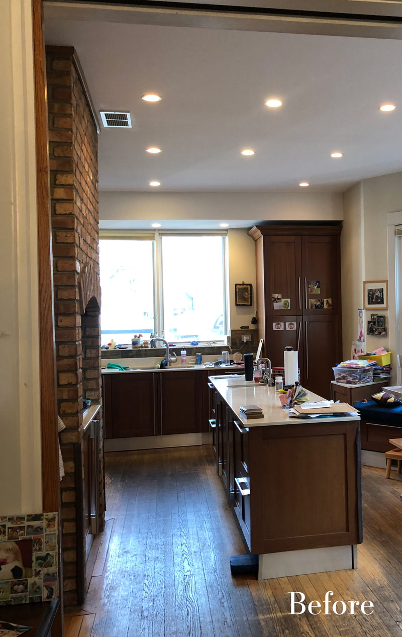
The design’s aesthetics and functionality weren’t aligned with what this active family needed. Everyone likes to cook and hang out in this space but the layout was challenging. They wanted a new kitchen that fit the home and their lifestyle.
Alicia was excited to design a kitchen that would solve their problems and maximize their use and enjoyment of the space.
The Remodel
Design Objectives
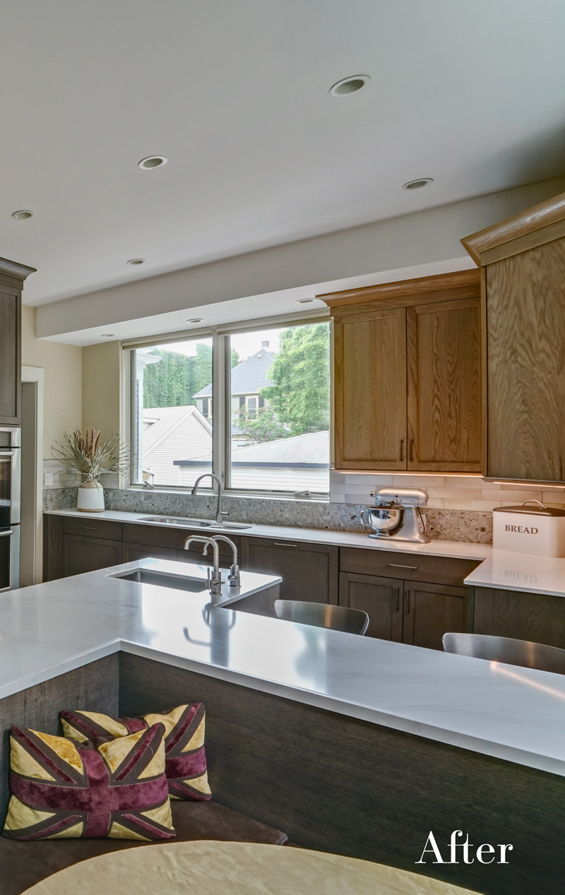
- Create a space that is bright and flows with the rest of the first floor. The previous kitchen was dark – lighter cabinets would definitely brighten the space.
- Keep the character of the 1920s home.
- Every cabinet should have a specific function so that everything has its place.
Design Challenges:
- Providing more built-in seating for everyday family meals and also for entertaining, but keep seating out of the work areas.
- Defining a specific storage “home” for everything and committing to a one-step open motion for cabinet drawers, doors and roll-outs. The main cook wants a clearly defined spot for everything. The new kitchen is to usher in a new era of organizational ease!
- Modernizing while harmonizing with the home’s 1920s character.
The Renewed Space
Design Solutions:
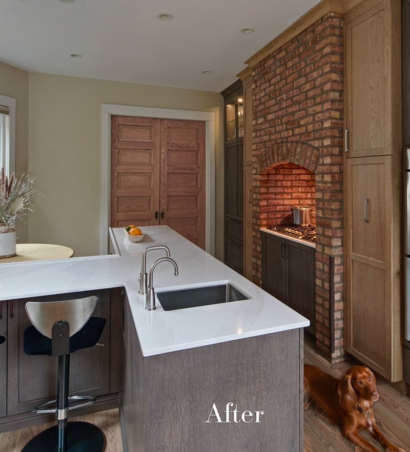
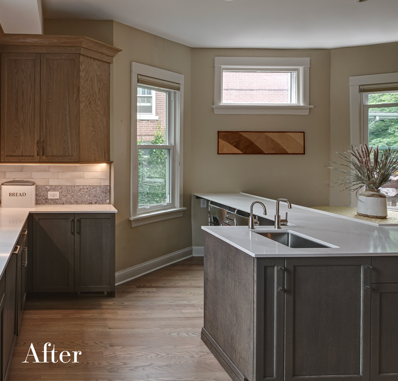
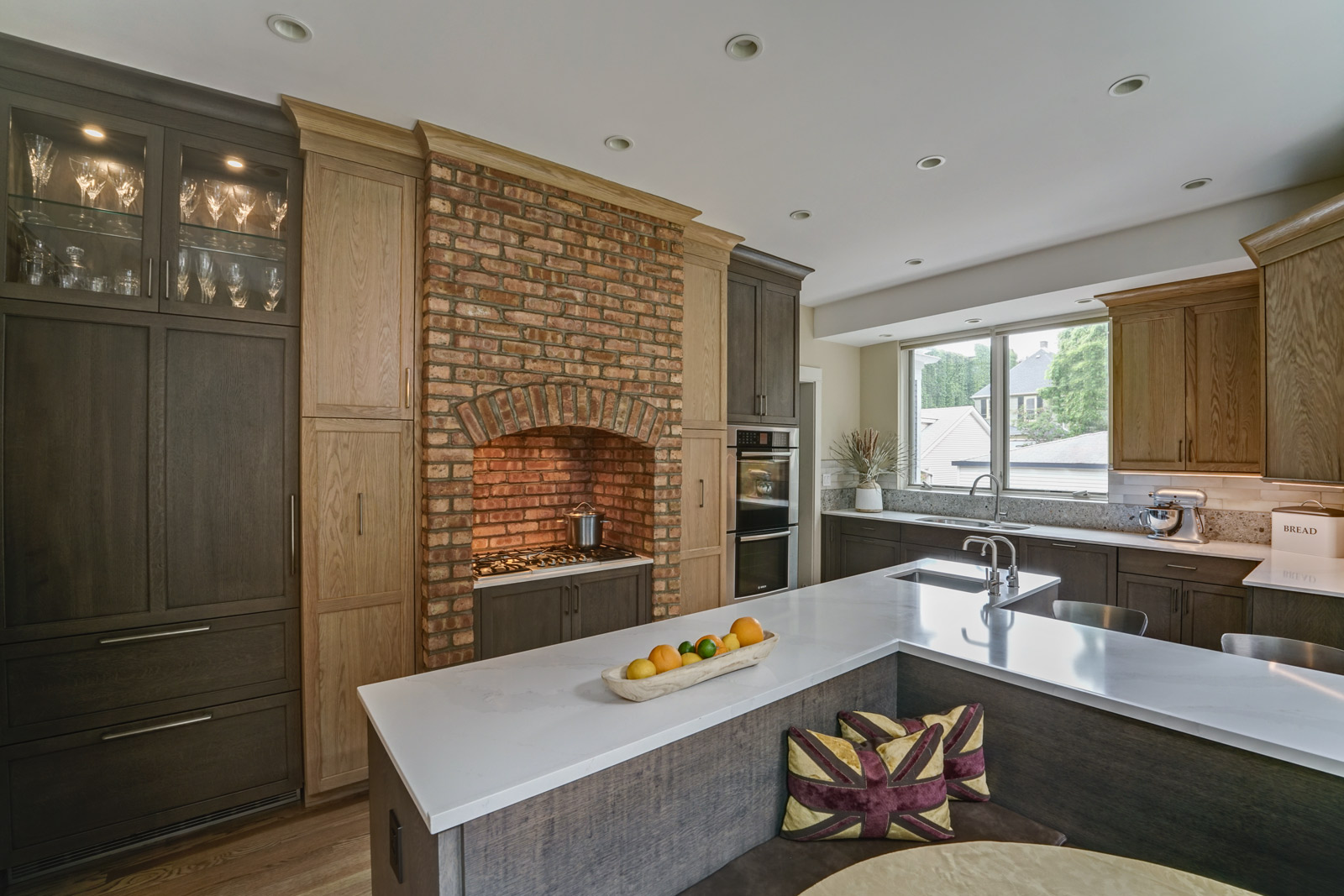
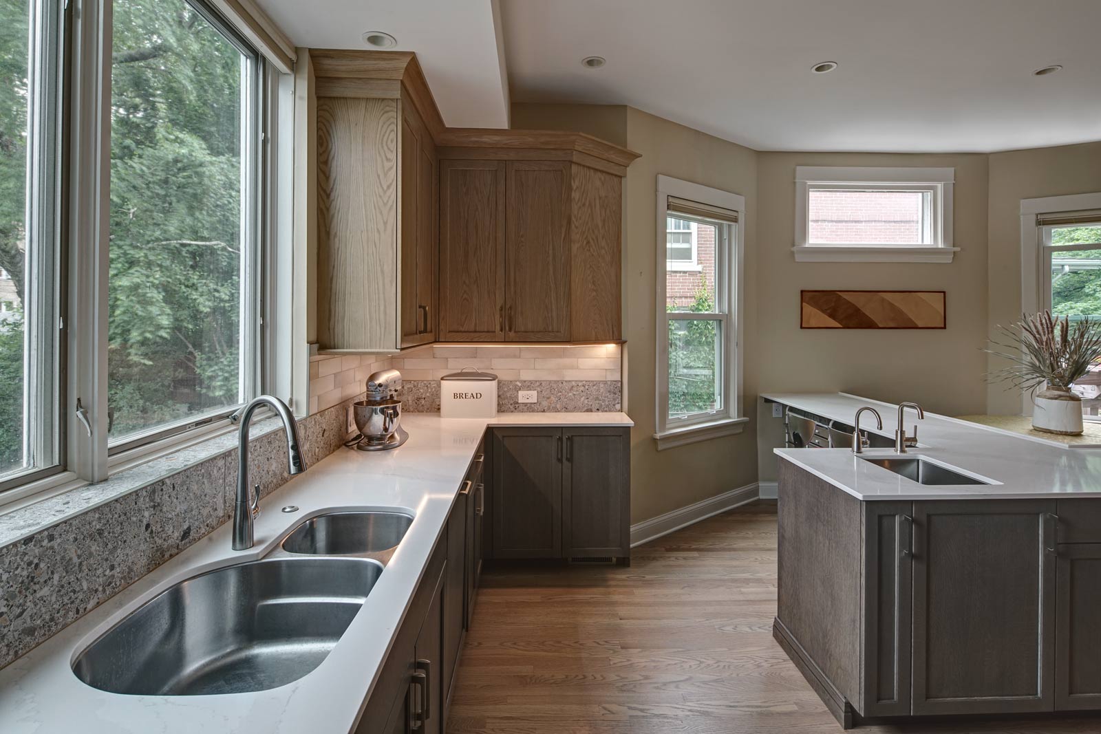
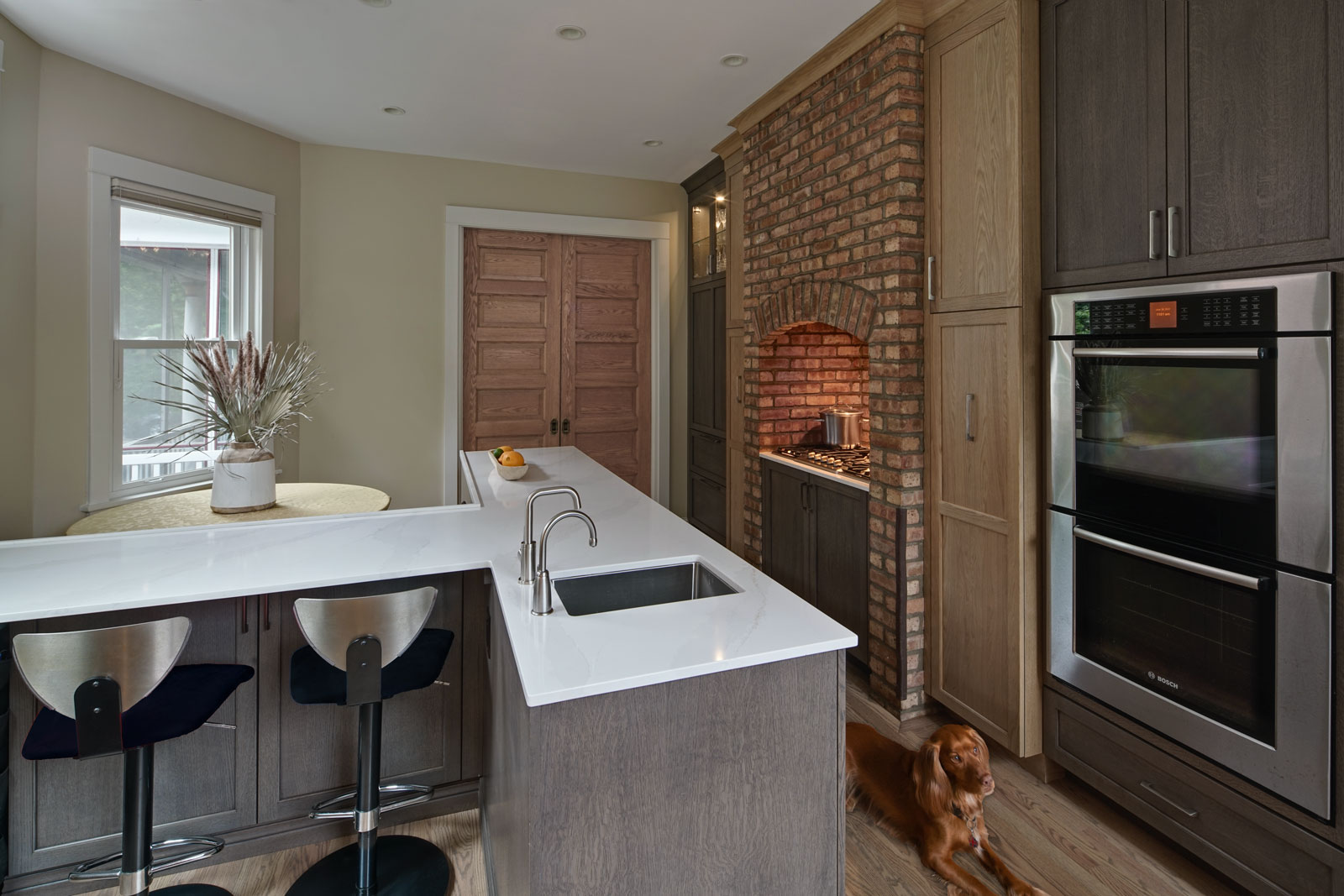
- The existing kitchen had two main walkways that limited the workspace capacity. A long, narrow island made it feel like a bowling alley. A new “T” shaped island will incorporate maximum workspace for multiple people (food prep and homework/crafts). There are now two seating areas flanking the island, one side is a built-in banquette with both bench and chair seating and the second area is opposite the banquette with space for two stools. Both seating areas provide easy conversation spaces and separate workspaces for everyone. Only one walkway is needed – family members can now spread out and not be in each other’s way.
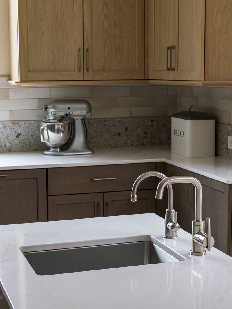
- Each cabinet is designed for a specific function and/or item. In addition to standard pull-outs for waste/recycling, cutlery and utensil storage, we defined spaces for tea towels, countertop appliances and pantry items (split between two tall pantry cabinets). There is an in-cabinet microwave on a pull-out, and spaces for craft supplies, a toe-kick stepstool and more. It was very important for the main cook in this family to be able to stand at the island and open a drawer or door to grab something easily in one step (versus opening a door then having to pull out a roll-out).
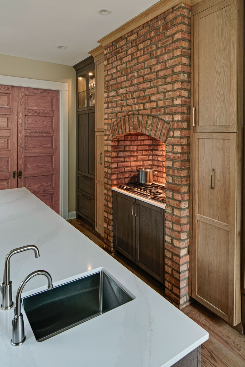
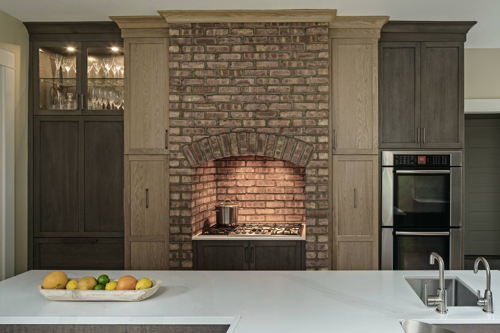
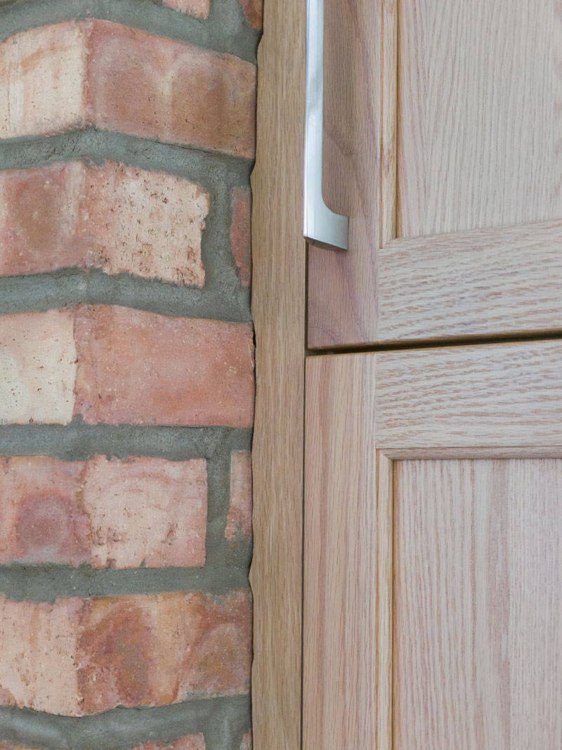
- We kept the hearth-like floor-to-ceiling brick surround that encompasses the cooktop and ventilation. Crown molding connects the two tall pantry cabinets that flank the brick surround. Hardwood flooring was refinished on the entire first floor – it blends with the kitchen cabinets and warms up the family room and living room spaces that can be seen from the kitchen.
The kitchen is now set up for a busy family to make the most of the space and their family time together.
“Alicia is fun and works within the budget,” one of the clients told us during the photoshoot. “She didn’t push for the higher bracket. If something’s wasn’t there, she sourced it. The project was done on time and within budget. It was really a great process.”
Cabinetry:
- Mouser
- Wall & pantry: plaza door bases
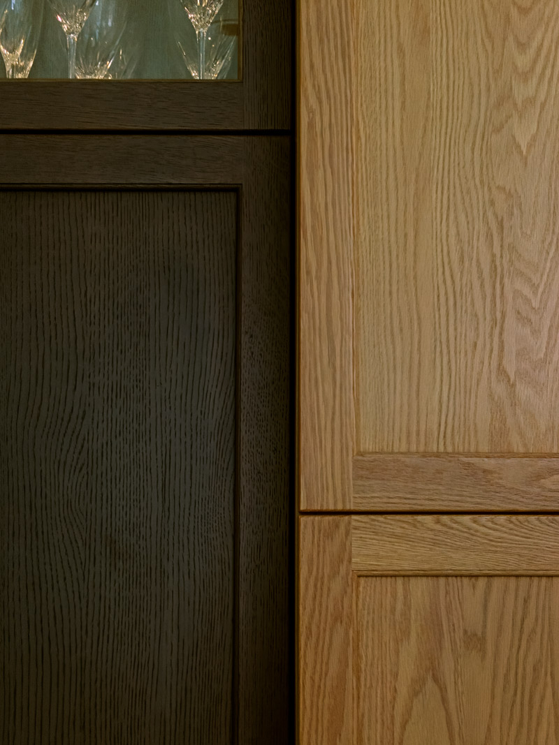
- Oven, banquette and wood top: peppercorn on quarter-sawn white oak, plaza door
Countertops:
- Brand: Silestone
- Type: Quartz
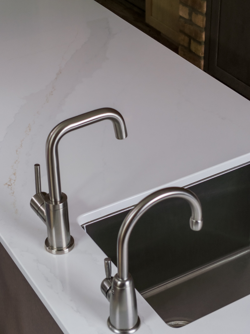
- Color: Calacatta gold polished, 2cm
Appliances:
- Existing Microwave, Cooktop, Double Oven, Ventilation and Dishwasher
- Liebherr Refrigerator
Size of Space:
- 179 x 14′
Special Features:
- Island toe-kick slot for storing pop-up step ladder
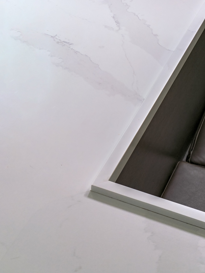
- Drip ledge build-up on island back edges
- Existing brick surround
- Custom craftsmanship of overlay fillers cut around brick surround
- Banquette benches with storage
Before / After photos:
