The Setup
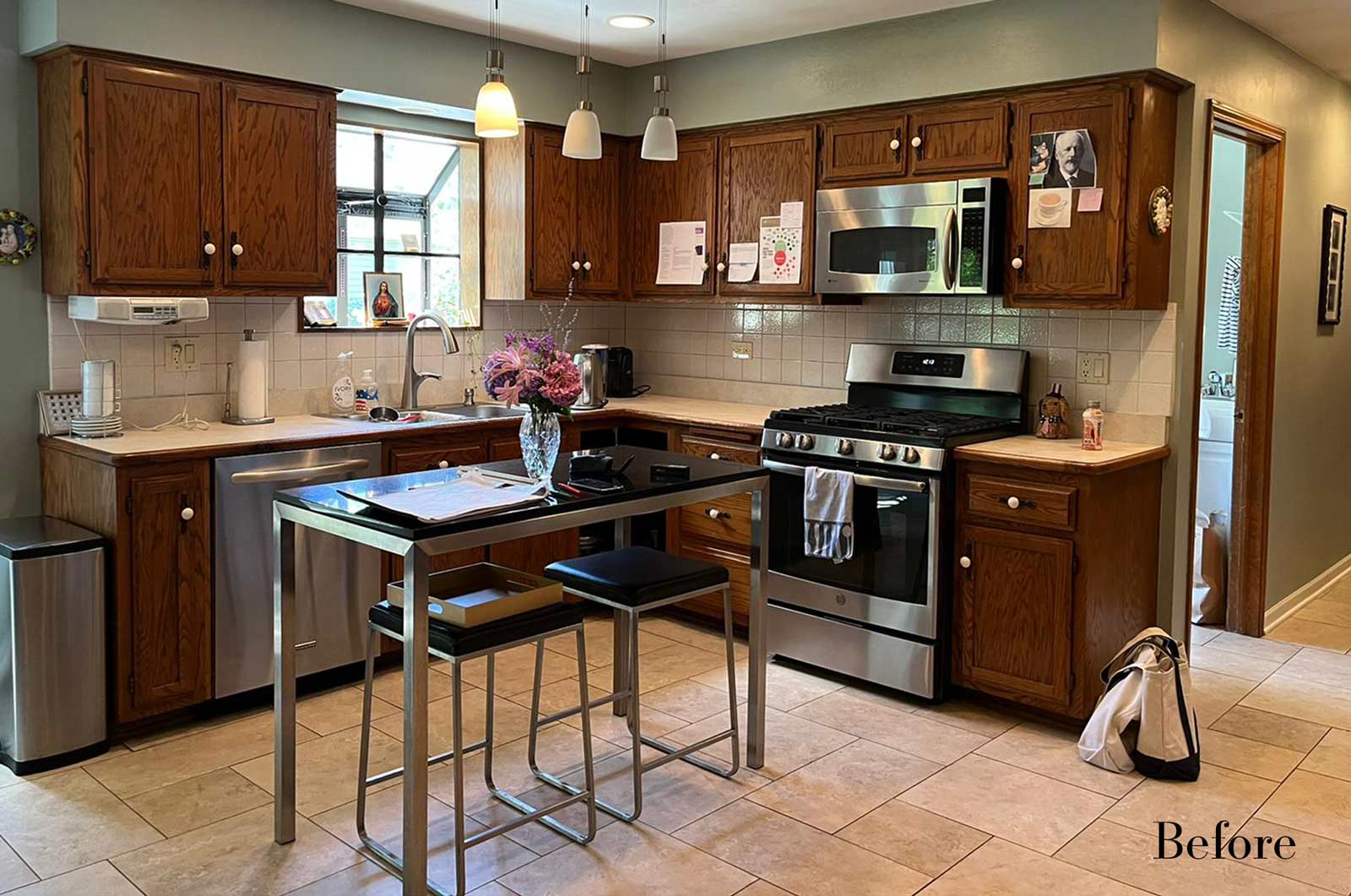
Client Background: Our clients, a couple who have transitioned into the empty nest phase, have cherished their home for over three decades without undergoing any significant renovations. With a newfound desire to adapt their living space to better suit their current lifestyle, they’ve embarked on a journey to reimagine their kitchen — the heart of their home. Their aspiration is to cultivate a serene, neutral-toned sanctuary on the first floor that seamlessly merges with their family room, ensuring a harmonious and inviting environment.
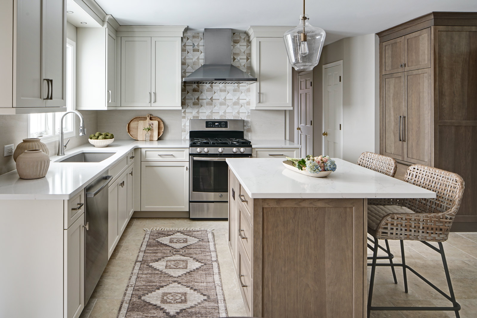
Design Inspiration: The renovation is inspired by the couple’s penchant for soft, calming neutrals, using their cherished family room and the kitchen’s existing tile flooring as the cornerstone for the color scheme. This approach aims to foster a sense of warmth and tranquility throughout.
Design Objectives:
- Harmonize the kitchen with the family room by adopting a soothing, neutral color scheme, ensuring a seamless flow across the first floor.
- Enhance kitchen functionality with thoughtfully designed cabinetry, providing a designated place for every item and maximizing storage efficiency.
- Cultivate an inviting and comfortable atmosphere that reflects the homeowners’ desire for a calm and relaxing space.
Design Challenges:
- The homeowners wish to retain the existing kitchen tile flooring and integrate it into a refreshed, modern design.
- Accommodating a dining area spacious enough for family visits without compromising the kitchen’s open feel or functional layout.
- Despite liking the current placement of plumbing and appliances, the homeowners aspire for a more open floor plan to facilitate better movement and interaction.
- The need to amplify natural light in the kitchen, especially around the sink area, where existing lighting is insufficient.
- Preserving the half-wall between the kitchen and family room, a feature the homeowners want to keep, while ensuring it complements the new design.
The Renewed Space
Design Solutions:
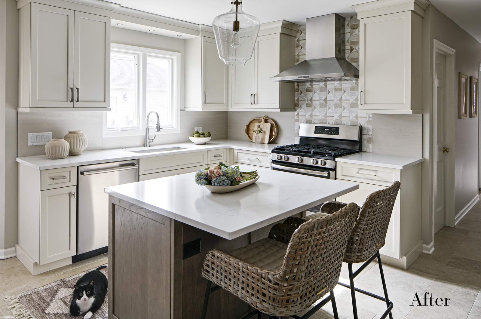
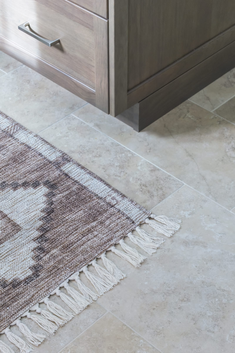
- By choosing a neutral color palette that complements the existing tile, the design unifies the kitchen with the adjacent spaces. The tile’s grout was cleaned and restored, enhancing the floor’s appearance and integrating it seamlessly with the new kitchen aesthetic.
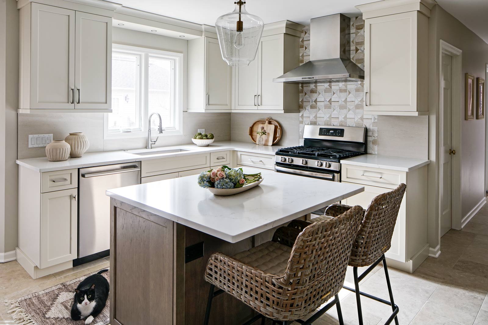
- The inclusion of a larger island with seating for two, alongside maintaining a substantial dining table, was achieved by optimizing the spatial layout. This allowed for a sociable yet functional kitchen, accommodating large family gatherings without feeling crowded.
- Minor adjustments to the kitchen’s layout maintained the preferred locations for plumbing and appliances while introducing an ‘open’ design concept. Strategic modifications, such as angling the pantry wall, improved the flow and accessibility within the space.
- Replacing the garden window with a broader, standard window significantly increased natural light, transforming the sink area into a bright, welcoming space with enhanced views of the outdoors.
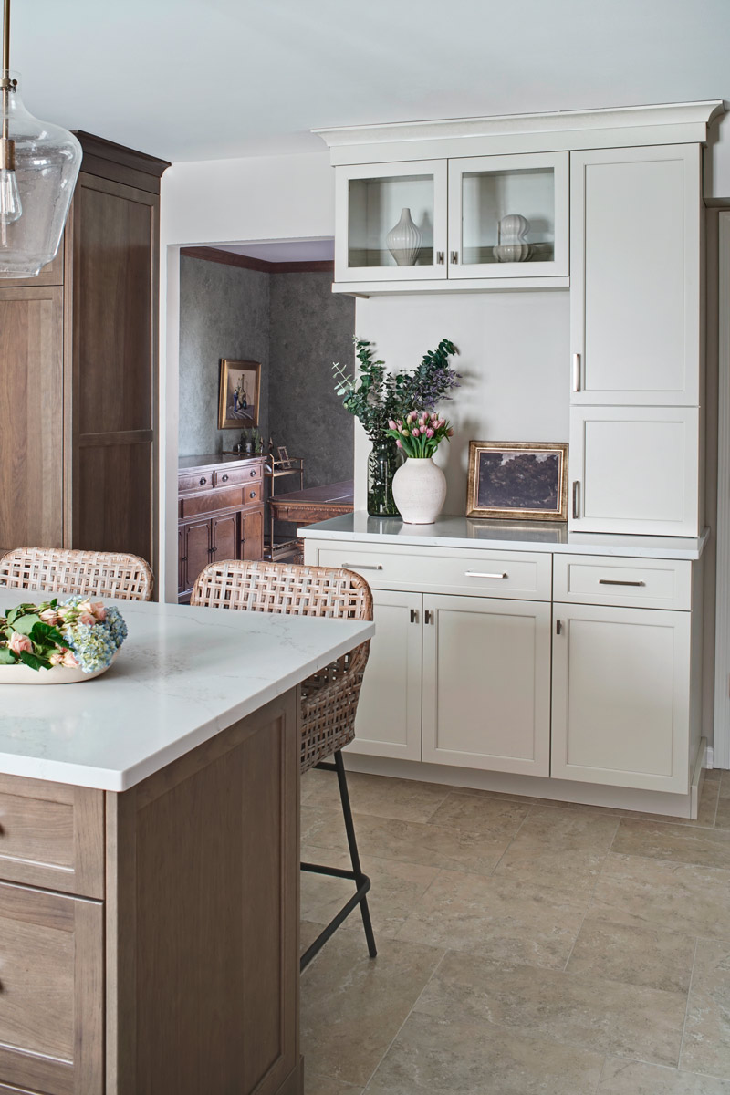
- The decision to keep the half-wall was ingeniously leveraged to define the dining area while maintaining an open connection to the family room. This feature not only serves as a visual separator but also ties the two spaces together through the shared color scheme and design elements.
The homeowners are thrilled with their newly remodeled kitchen, which has become a hub of warmth and hospitality. Hosting a wedding shower and a birthday party, they have shared their renewed space with friends and family, who have been equally enamored. This remodel has not only met their functional and aesthetic desires but has also enriched their home with a fresh sense of serenity and joy.
The upstairs part of the home is shaping up nicely. Here’s their newly remodeled primary bathroom.
Size:
15’ x 18′
Cabinetry:
Brand: Mouser
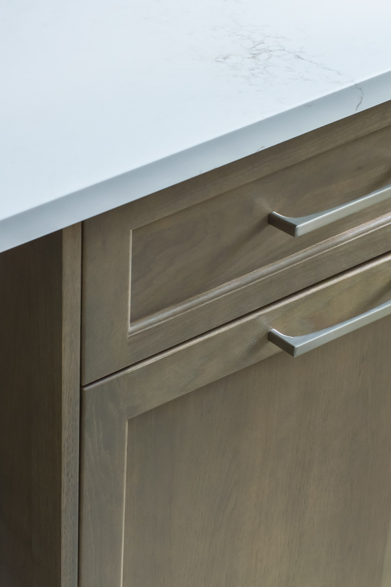
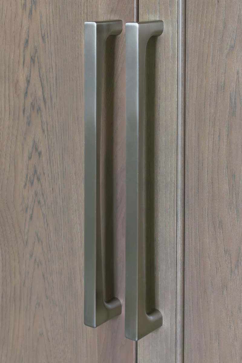
Finish: Eggshell Paint on maple (perimeter & dry bar), Nimbus stain on hickory (refrigerator & island)
Door style: Plaza, full overlay
Countertop:
Brand: Impact
Finish: Quartz
Door style: Stratus
Plumbing:
Blanco sink, Kohler faucet
Appliances:
- Zephyr hood
- Fisher Paykel refrigerator
- Bosch dishwasher
- Existing range
Special Features:
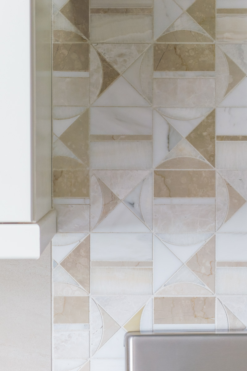
- Marble mosaic tile behind range: Artistic Tile – Hidden Circles. This tile brought in a subtle focal point while incorporating all of the colors in the kitchen
- The upper glass door cabinets provided a subtle area for display while also drawing your eye into the dining room
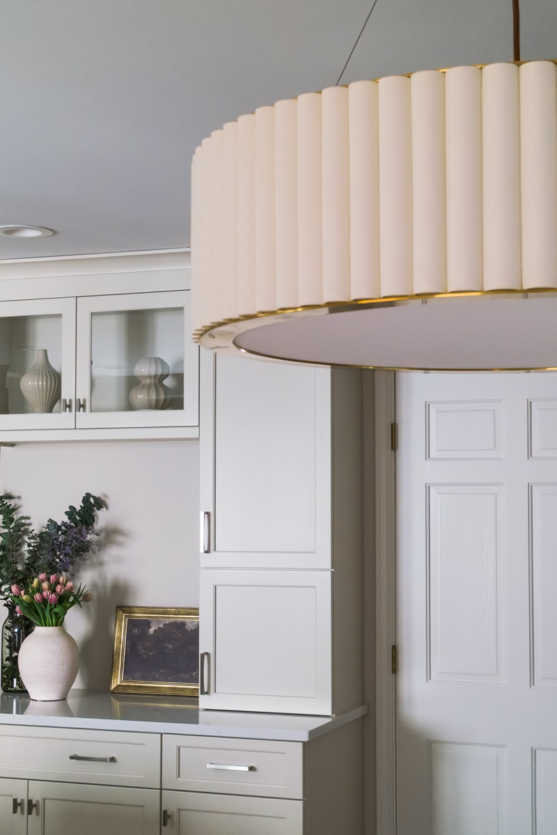
- Pleated ivory drum chandelier over the breakfast table. Alicia’s favorite piece in this kitchen!
“The whole project was a joy … Everyone from Drury Design who came to work in our home, from the planning to installation – the builders, electrician, plumbers, tile workers, painters and photoshoot crew – they are the nicest & most competent people!”
–Client
“A space doesn’t always need a pop of color, a major focal point or a large professional appliance for it to stand out. For a space to be stunning, it’s all about balance… a good mixture of creativity, inspiration and delivery!”
–Alicia Saso, CKBD
Before / After Photo:
