A Thoughtful Powder Room Makeover: From Vision to Completion
When an existing Drury Design client with experience in commercial construction approached us for help with their powder room remodel, they knew they wanted something special. Like most powder rooms, the space was small, but it needed a refresh that would punch above its weight class — something simple, yet undeniably elegant. Enter Senior Designer Alicia Saso, who had recently collaborated with the clients on bespoke dining room storage. Alicia understood that this remodel needed to reflect the evolving style of their home while incorporating existing features like the existing tile floor. She was ready to guide them through the process and transform their ideas into a beautifully cohesive design.
Designing a powder room is about more than just picking out a few fixtures. It’s about thoughtful planning, choosing the right colors, materials, and textures to make a small space feel both functional and elegant. In this case, it was a true collaboration, combining the client’s instincts from a career in construction with Alicia’s expertise in residential design to create a powder room that feels sophisticated and inviting.
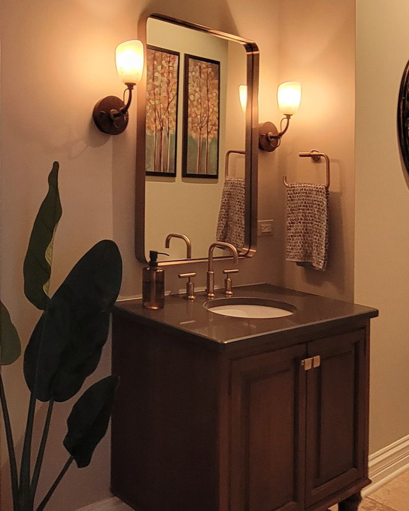
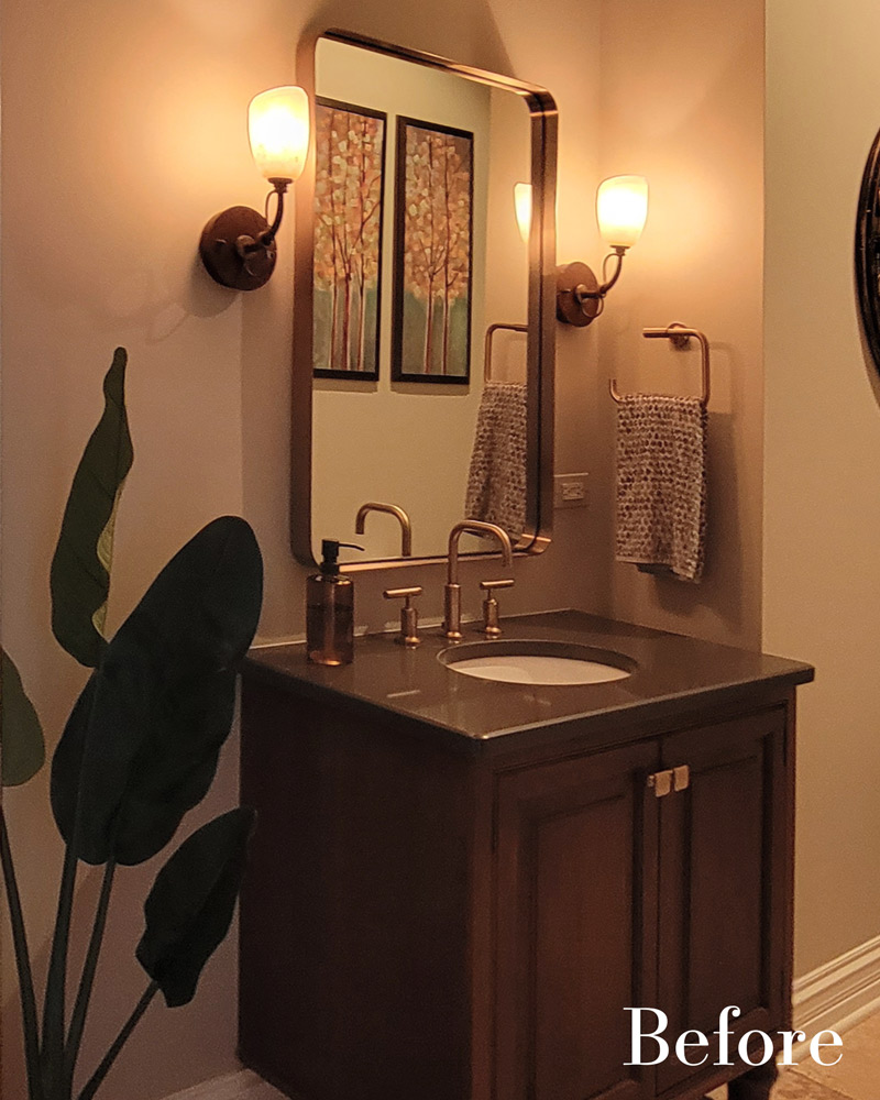
The old powder room is shown here.
The vanity is the focal point of any powder room. While the client’s existing vanity was functional and had served its purpose, it was ready for an upgrade, setting the stage for a fresh, cohesive redesign of the entire space.
Design Objectives
From the start, the project had clear goals:
- Refresh the powder room to reflect the client’s taste and coordinate with the existing tile floor.
- Reconfigure the vanity to improve both the functionality and flow of the space.
- Introduce a subtle color palette and refined materials to elevate the overall design without overwhelming the compact room.
- Thoughtfully utilize the corner space without introducing bulky features.
- Incorporate decorative elements, such as wallpaper and lighting, to bring the entire room together.
Exploring Design Options: Ideas for Materials
The first step in this remodel was to spend time with the clients in order to fully understand their goals, budgets, and preferences for design styles, colors, textures, etc. From there, Alicia gathered inspiration and samples. It was important to zero in on a counterop direction early on.
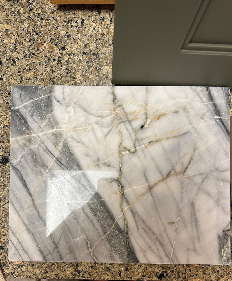
Alicia’s clients were drawn to the striking ‘Panda Polished’ marble. Its colors, natural movement, and subtle shimmer introduced new possibilities for elevating the entire space.
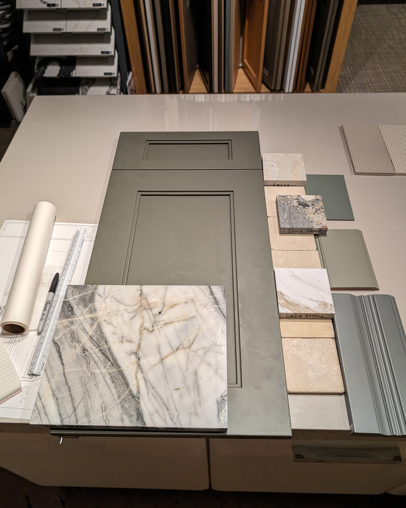
A glimpse into the design process: Alicia’s flat-lay arrangement featured the ‘Panda Polished’ marble sample, a custom Drury Design cabinet door in a subtle green hue, and a curated mix of materials for inspiration. Each element was thoughtfully selected to create a harmonious, elegant palette for the powder room.
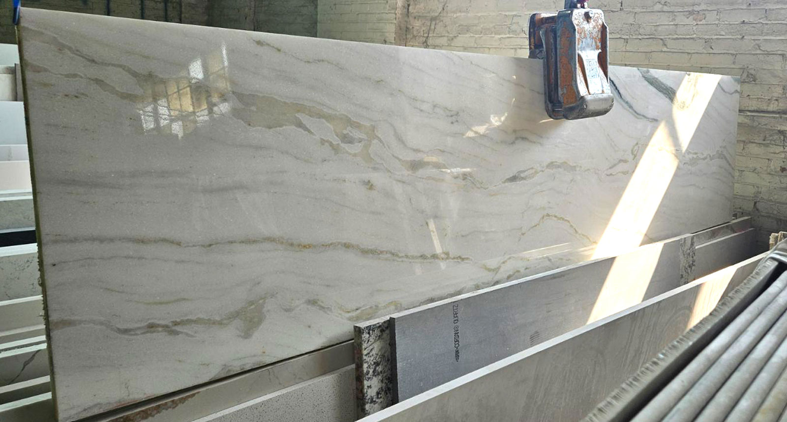
Among rows of beautiful options, the clients’ chosen marble slab stands out. Its striking veining and unique character will become the defining feature of the powder room.
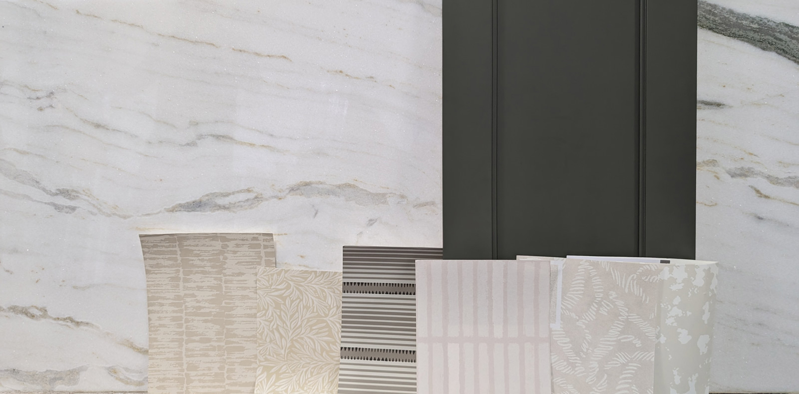
Exploring options with the chosen marble slab alongside various wallpaper samples helped set the creative direction. While the client ultimately chose a different wallpaper, trying out different combinations was an important — and enjoyable — part of the process.
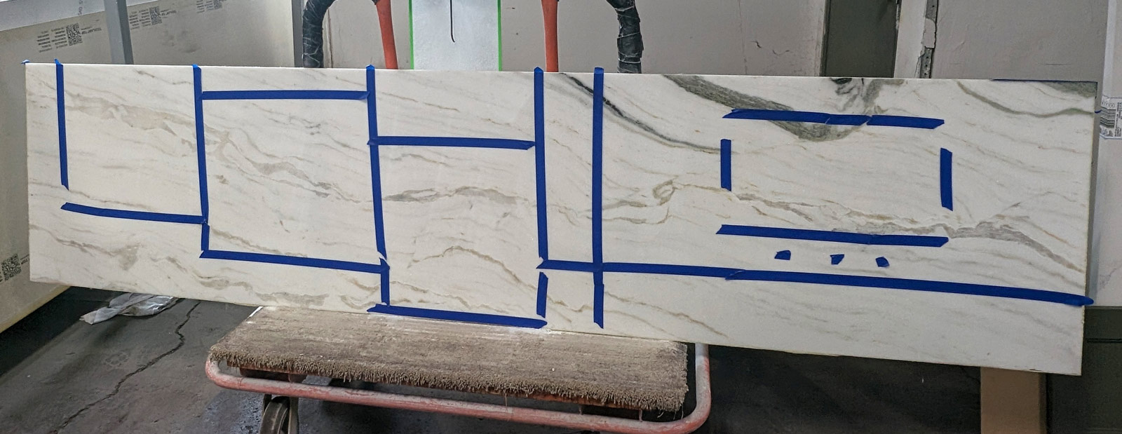
Painter’s tape marks where the slab will be cut, including special sections reserved for custom mitered-edge shelves in the room’s corner. This careful planning ensures each piece is perfectly tailored to the space.
Design Challenges
-
Existing Tile Floor:
The client wanted to retain the current tile floor, which set the foundation for the overall design palette. -
Vanity Proportions:
The original vanity was too deep for the narrow space and had minimal counter space, creating a disproportionate layout that needed to be rebalanced. -
Empty Corner Space:
The angled corner in the room presented a challenge in terms of how to utilize the space without adding a bulky or intrusive design element.
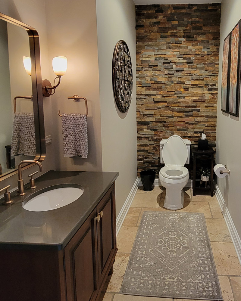
The old powder room is shown here.
While this powder room was functional and featured some nice elements, including a faux brick accent wall, its overall look no longer aligned with the home’s updated aesthetic. As the rest of the house evolved, it became clear that this space needed a fresh, cohesive redesign to keep pace with the home’s other transformations.
Design Solutions:
-
Complementing the Existing Tile:
Alicia selected a soft, muted green cabinetry finish with gray undertones that coordinated beautifully with the existing tile floor. This provided a fresh, modernized look while maintaining harmony with the original elements of the room. -
Custom Vanity for Better Proportions:
A new, longer vanity was designed to be shallower, making better use of the room’s narrow proportions while providing additional counter space. The marble countertop, with its subtle veining, introduced a touch of luxury without overpowering the small space. -
Maximizing the Angled Corner with Subtle Design:
To make use of the awkward angled corner, Alicia and the client collaborated to create custom marble shelves using the same material as the countertop. These shelves added functional storage and display space while maintaining the room’s sense of openness. The mitered edges gave the shelves a refined, substantial look without adding unnecessary bulk to the design.
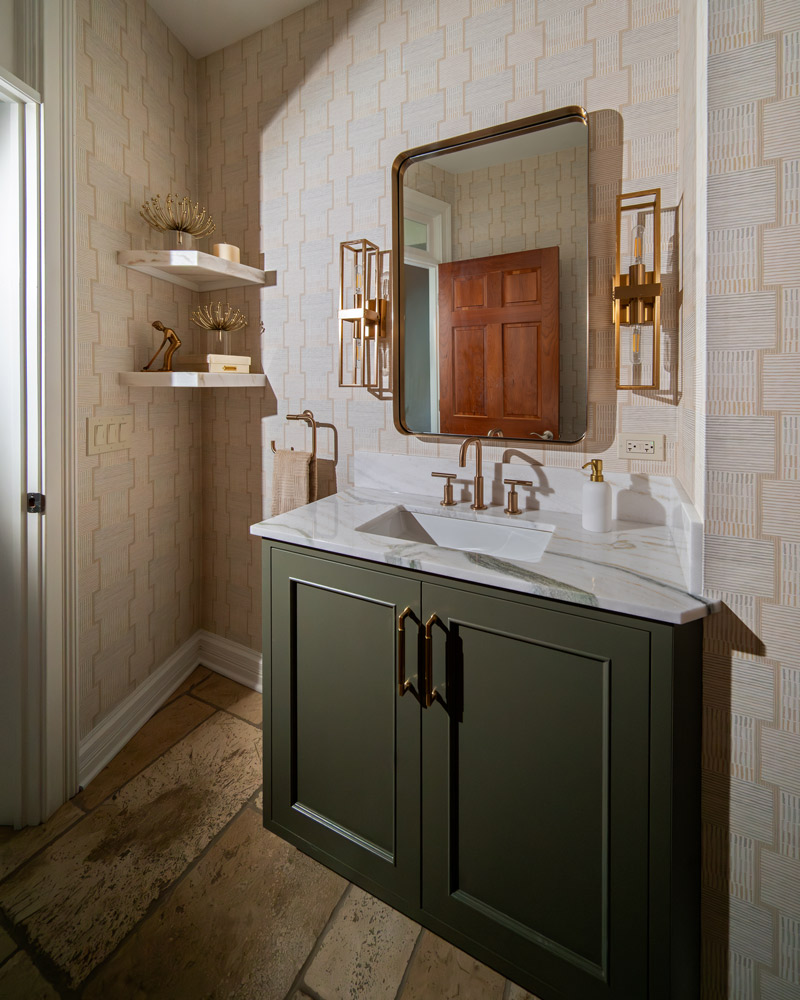
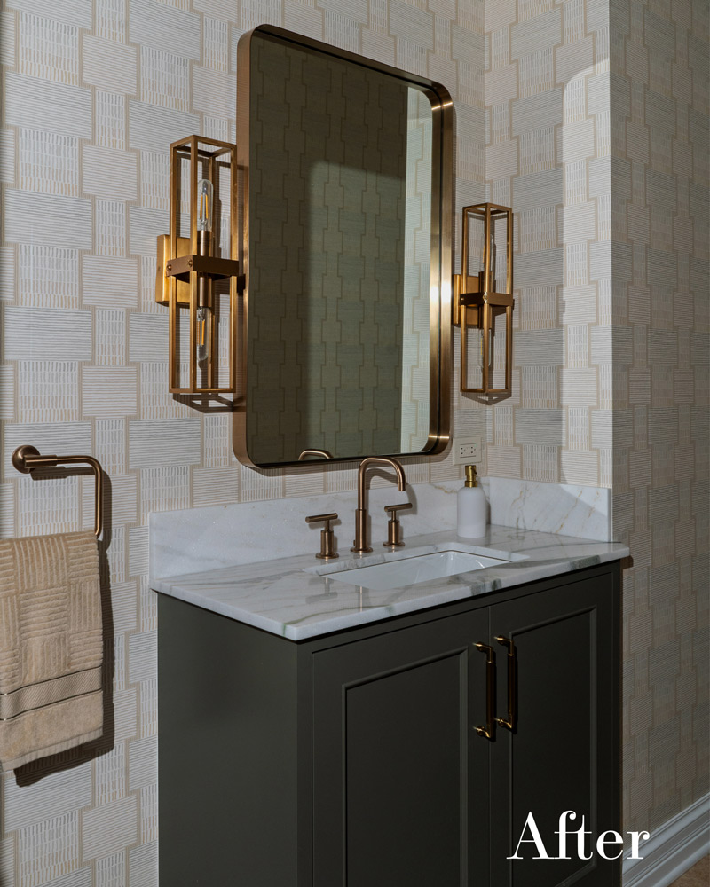
The transformed powder room now features a custom vanity in a muted green, topped with elegant marble. The addition of bespoke marble shelves brings both function and style, while brass accents and geometric wallpaper add a touch of sophistication, creating a space that feels both modern and timeless.
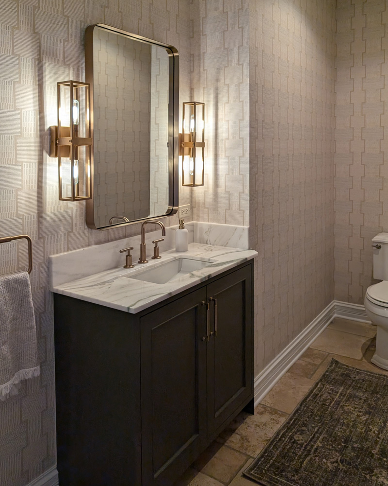
A new perspective on the completed powder room highlights the custom vanity in muted green, paired with a marble countertop and brass fixtures. The geometric wallpaper and warm lighting from the brass sconces create a layered, inviting atmosphere, perfectly balancing elegance and subtle sophistication.
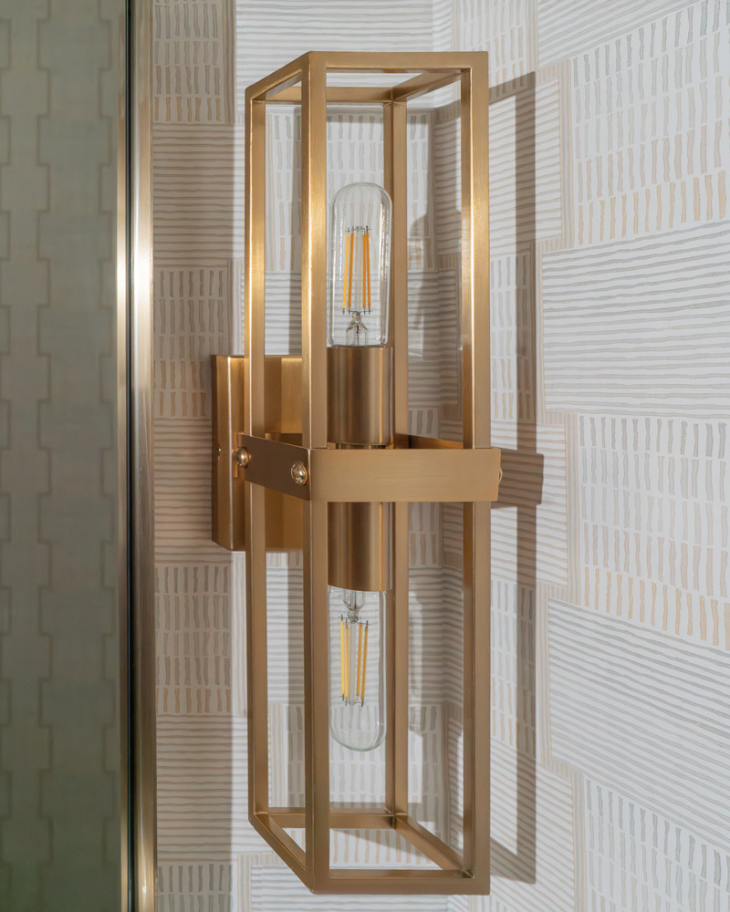
A close-up of the elegant brass sconce, which brings both warmth and modern flair to the powder room. The geometric design and exposed bulb perfectly complement the room’s sophisticated wallpaper, adding a sleek yet timeless touch to the overall aesthetic.
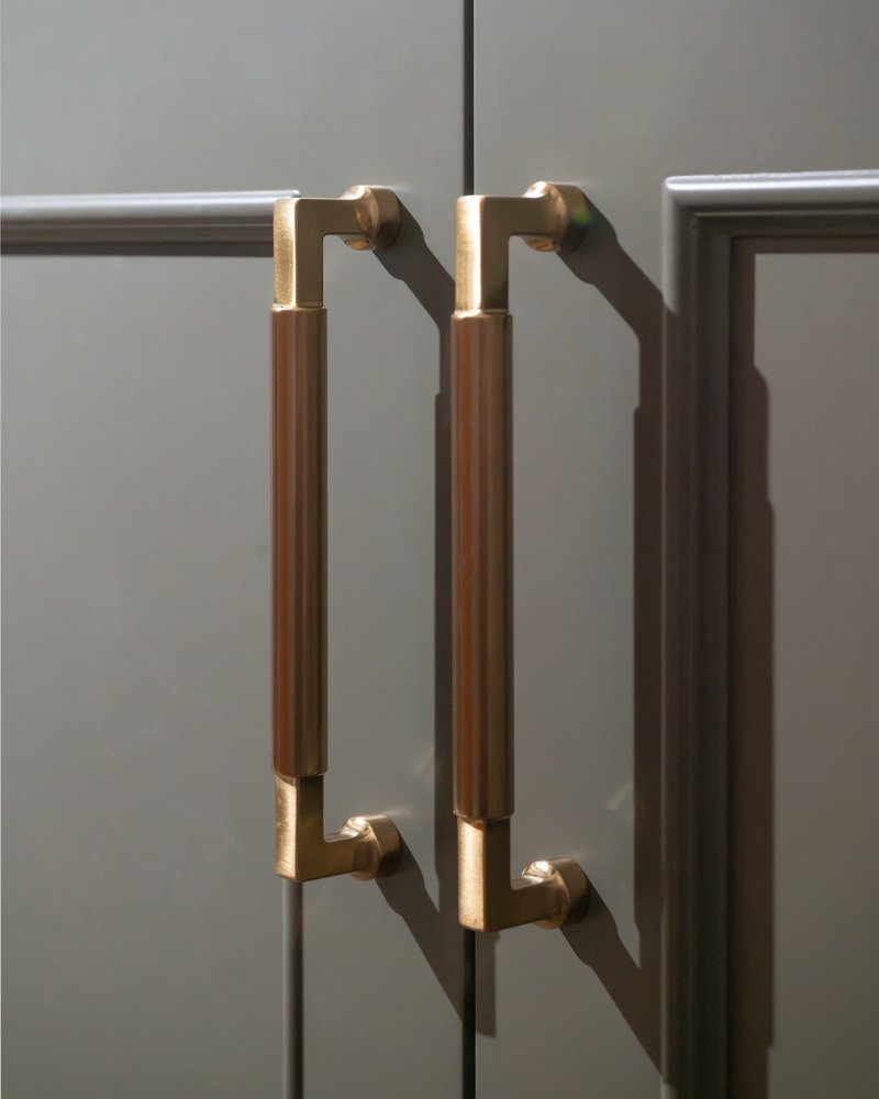
A close-up of the custom vanity showcases the brass pulls against the muted green finish. The sleek lines and warm metallic tones add a touch of understated luxury, bringing a refined elegance to the powder room’s design.
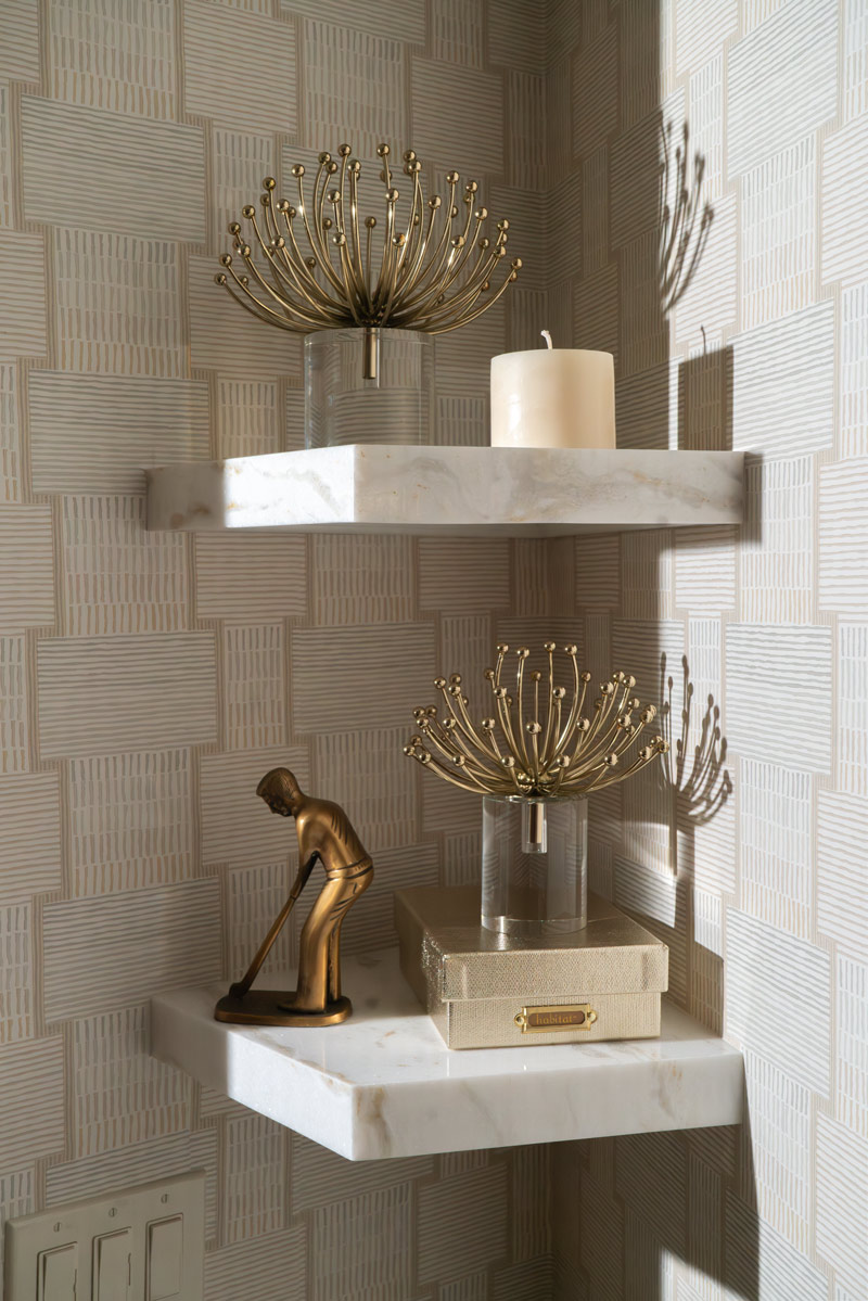
The custom marble shelves in the powder room’s corner add both style and function. The mitered edges create a substantial, elegant look, while the display of carefully curated decor enhances the room’s sophisticated and personalized feel.
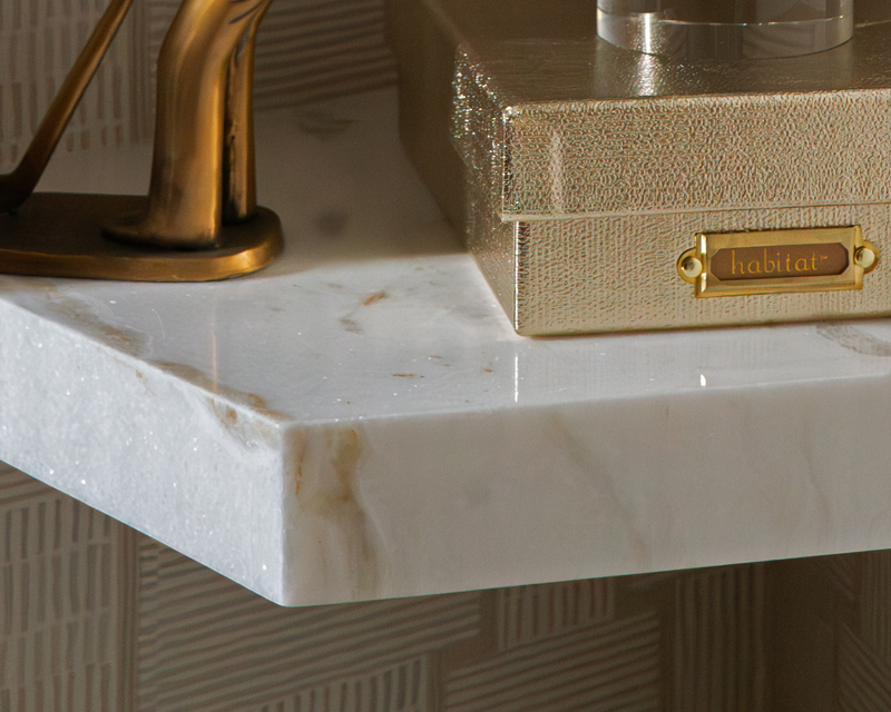
A close-up of the custom marble shelf reveals the beautiful shimmer and natural veining in the stone. The mitered edges and soft sheen elevate the design, adding a touch of luxury to this elegant powder room corner.
This powder room remodel tells the story of collaboration, thoughtful design, and careful attention to detail.
From slab shopping to finalizing flat-lay options and balancing the room’s layout, each step of the process was driven by a desire to create a space that felt both sophisticated and timeless.
