The setup
“We wanted something pretty much completely different,” the homeowners told us.
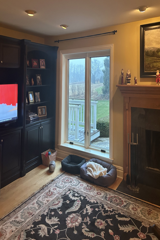
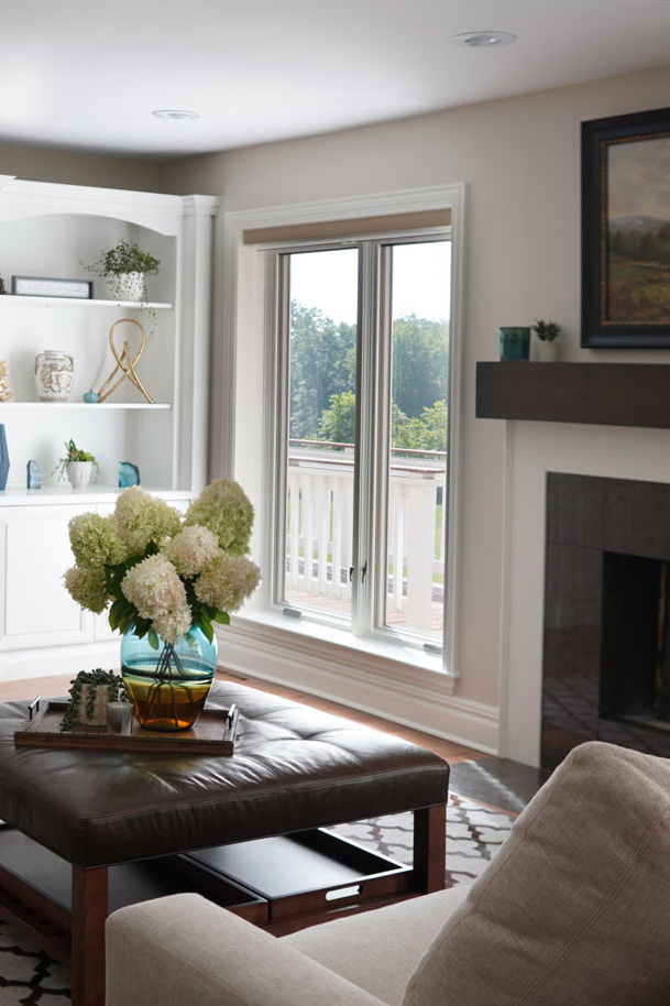
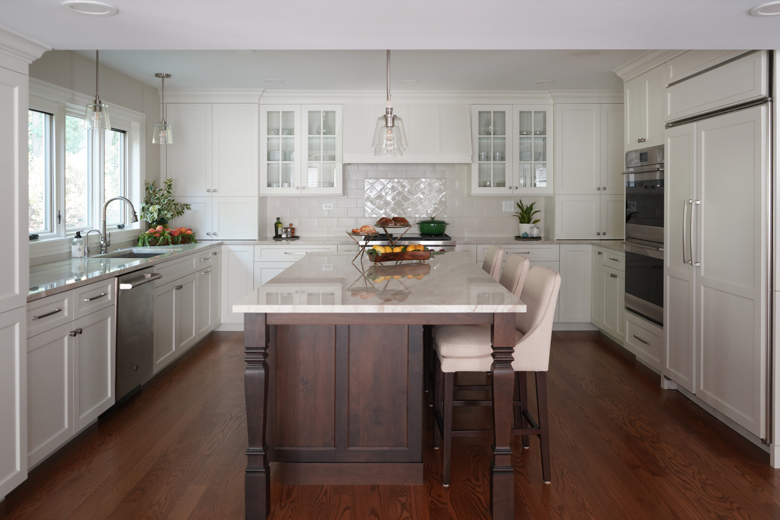
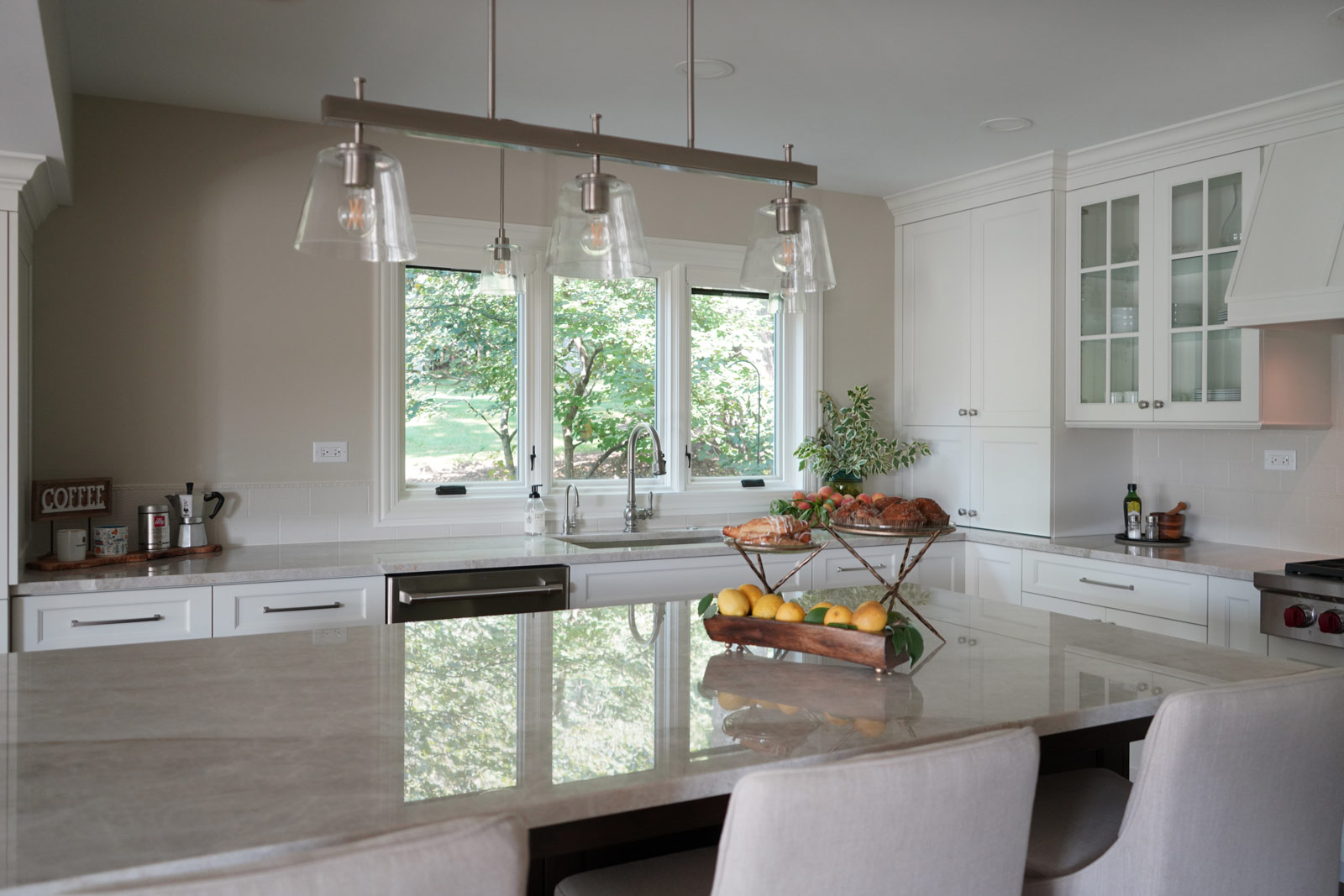
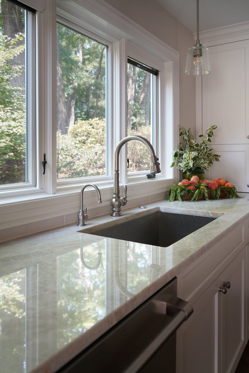
Their house was 45 years old and the most recent kitchen update was past its due date. It was also time to update an adjacent family room, eating area and a nearby bar. The idea was to refresh the space with a transitional design that leaned classic – something that would be elegant and comfortable. Something that would welcome and enhance natural light.
The remodel
The objectives were:
- Keep things simple – classic, comfortable and easy to keep clean
- Cohesive design between the kitchen, family room, eating area and bar
- Comfortable walkways, especially between the island and sofa
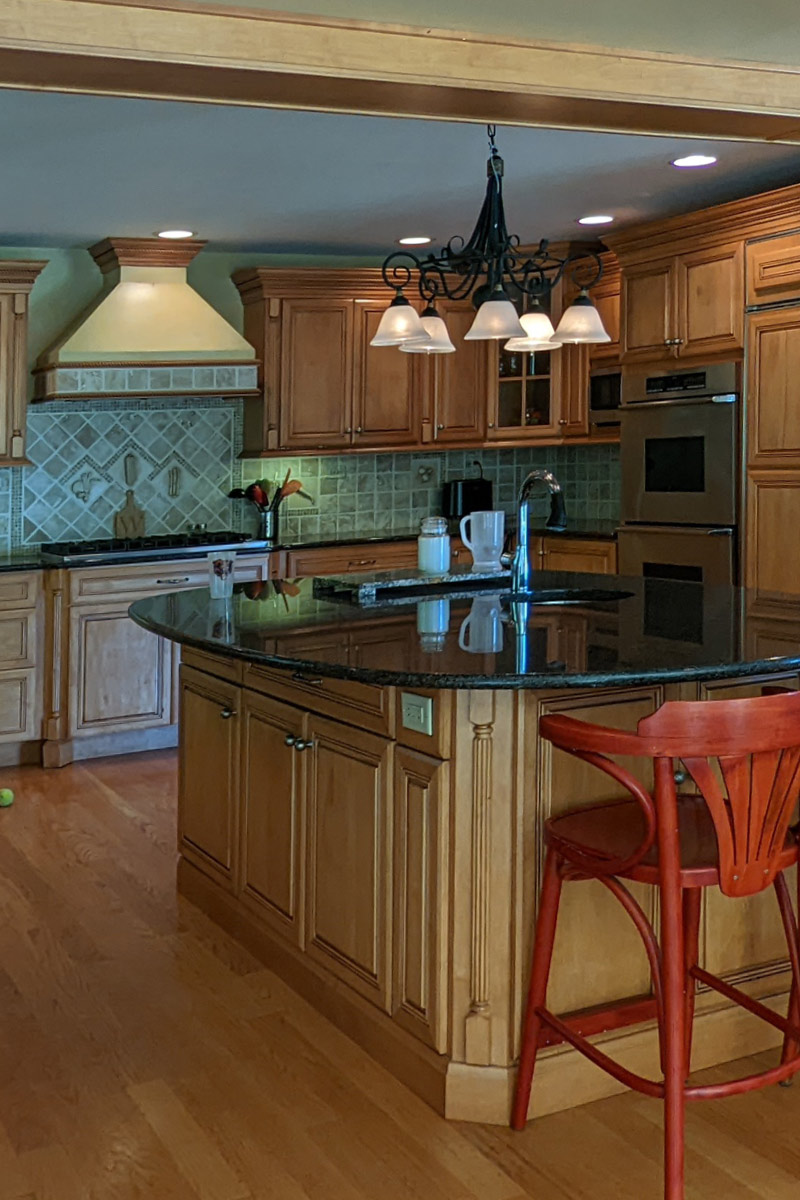
- Get rid of the kitchen’s dated 3D vegetable tile and island top shaped like a painters pallet
Design challenges:
- Incorporate a structural beam so that it flows with the entire space
- Proper ventilation for the hood
- Update the floor finish to get rid of the ’90s red oak
The Renewed Space
Design solutions:
- After reviewing multiple design options we decided on keeping appliances in their exsiting locations
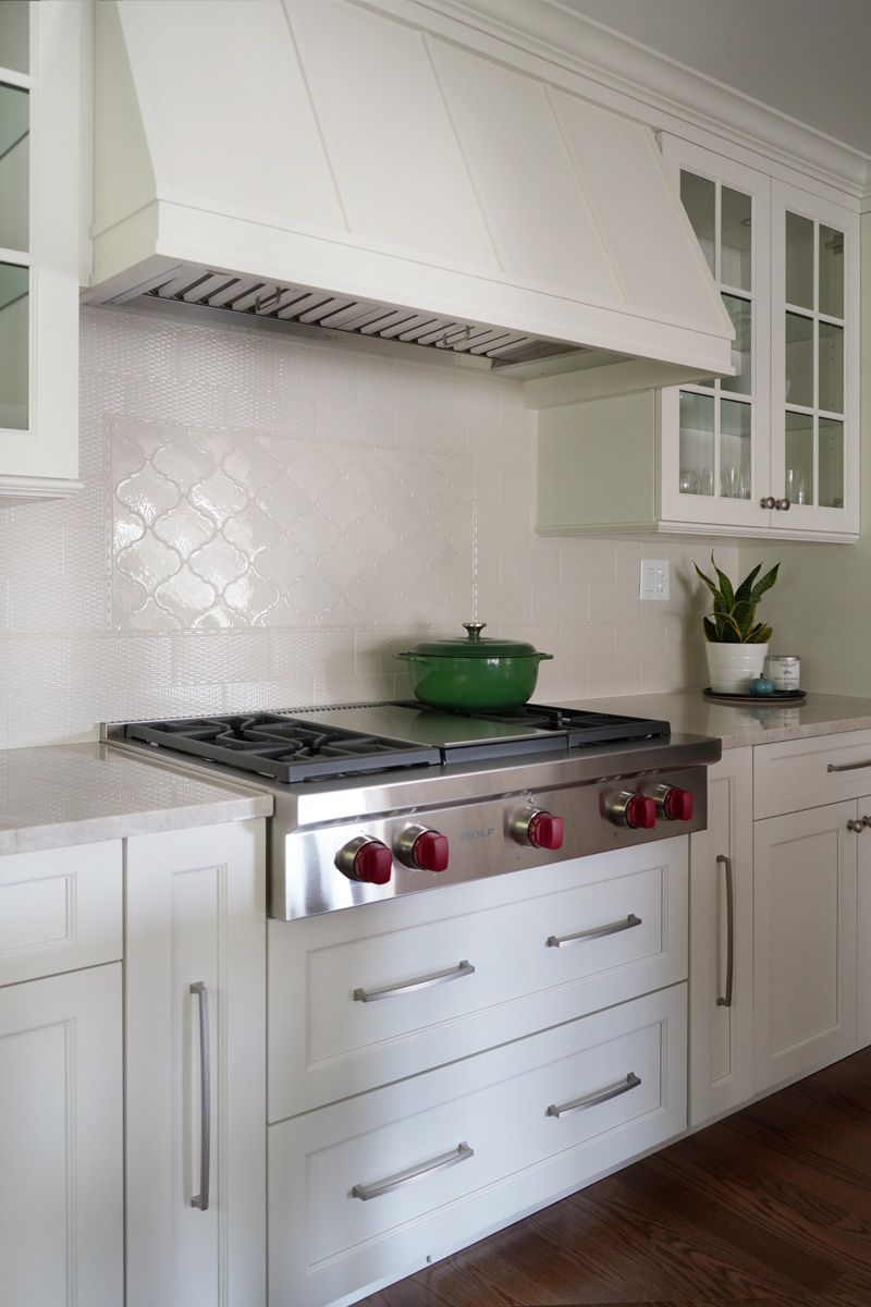
- Made the cabinet on the back wall deeper than standard to fit and conceal the exhaust vent within the crown molding space and provide proper ventilation for the rangetop
- Omitted the sink on the island because it was not being used
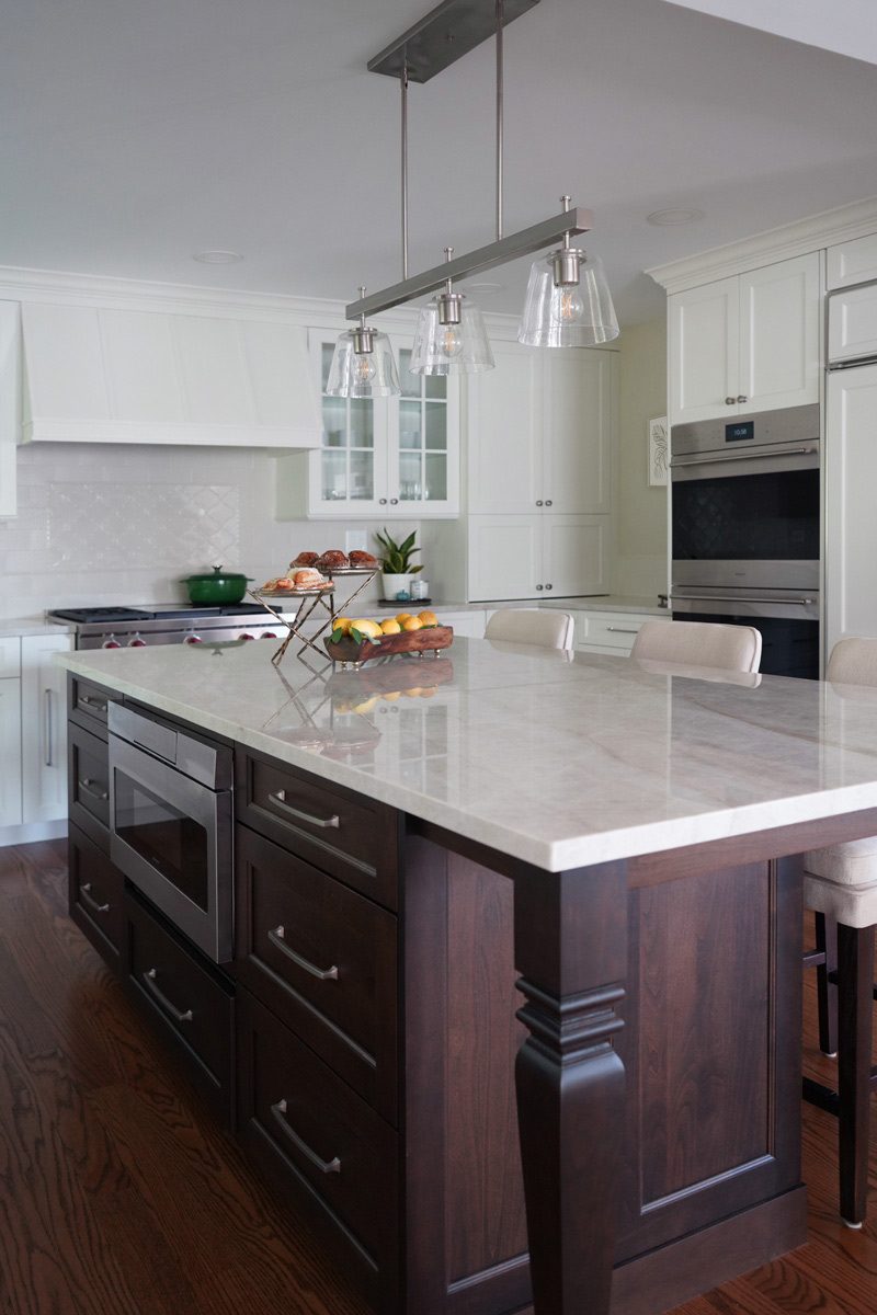
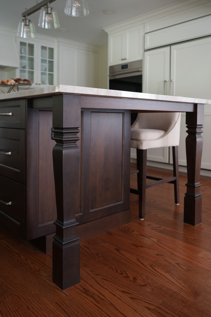
- Squared off the island to provide more seating and functionality
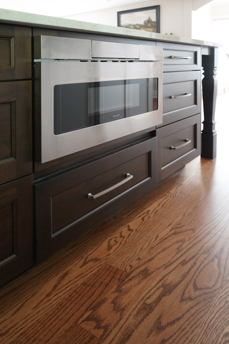
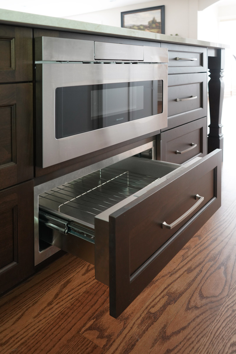
- Relocated the microvawe from the wall to the island and fitted a warming drawer directly below
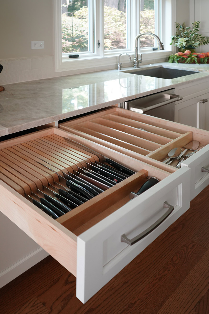
- Added a tray partition over the oven so that cookie sheets and cutting boards are easily accessible and neatly stored
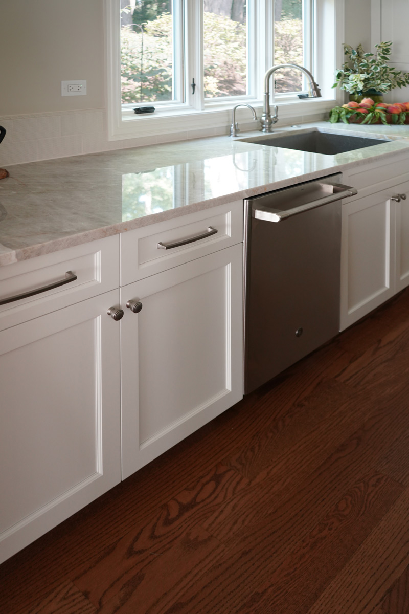
- Omitted all the decorative fillers to make the kitchen feel current
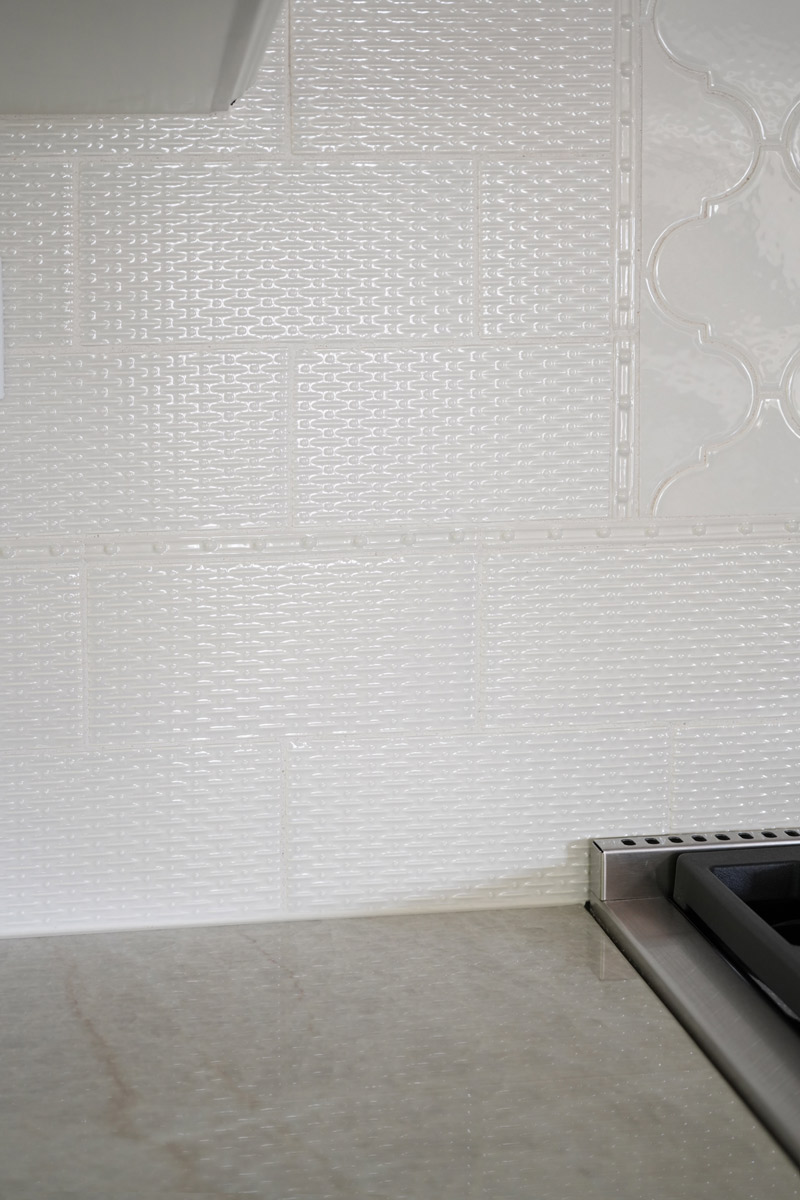
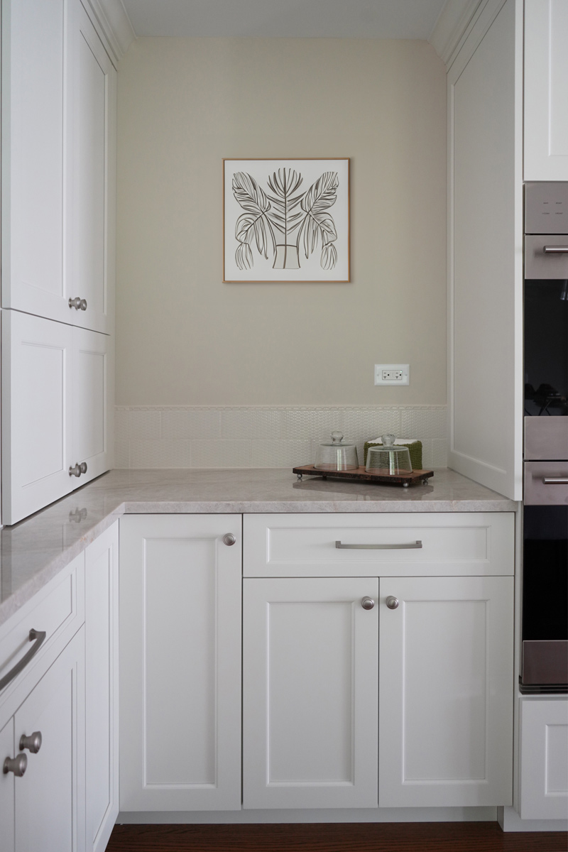
- Detailed yet simple tile backsplash design to add interest
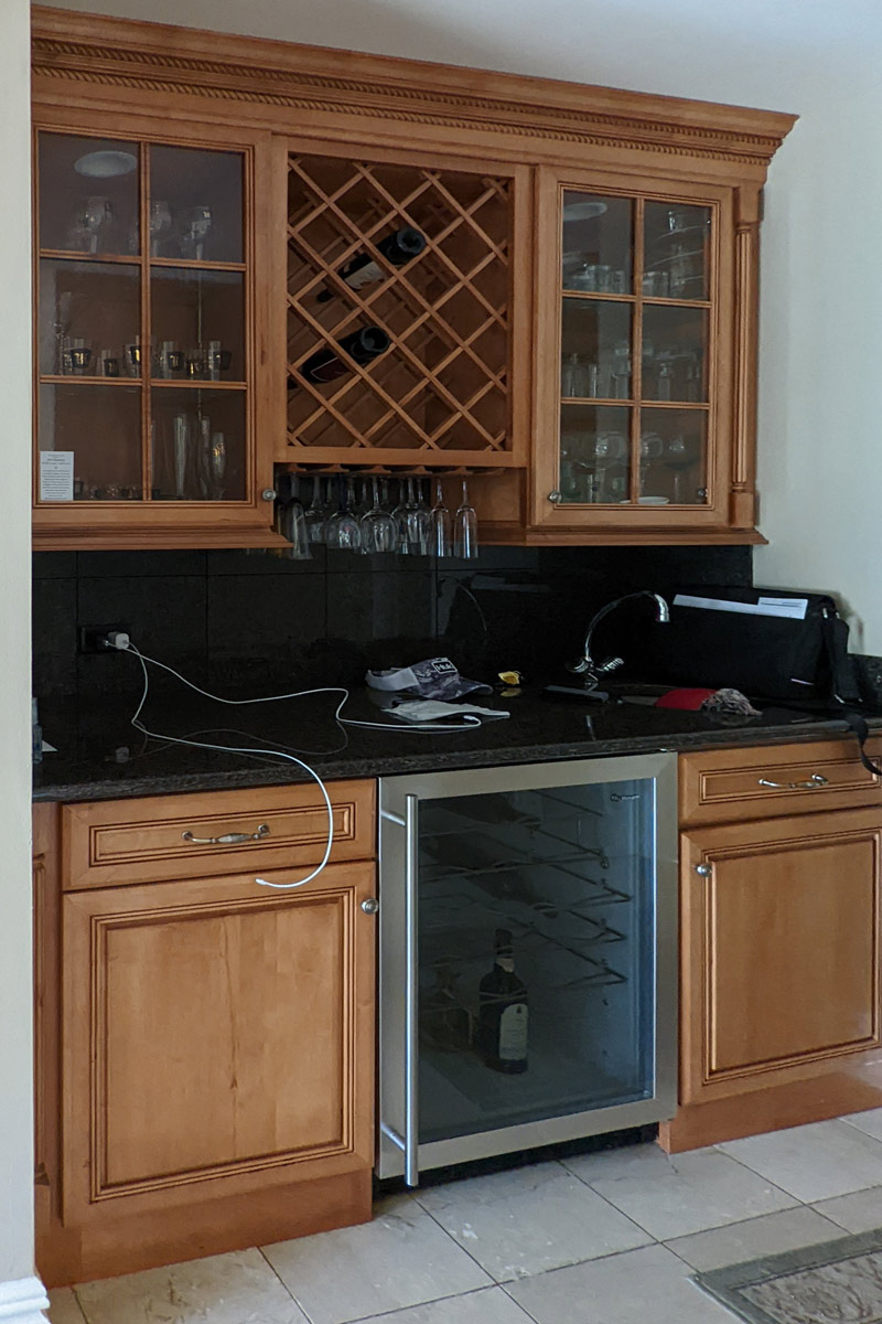
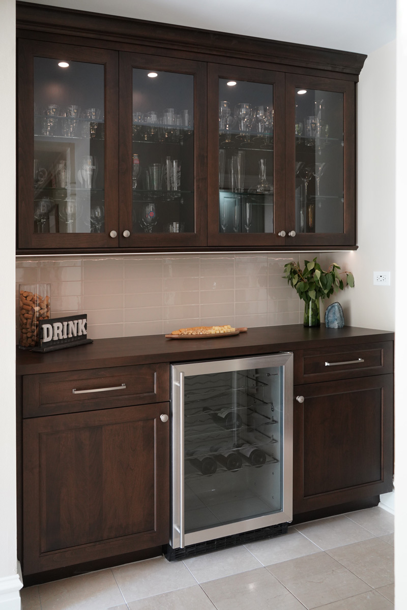
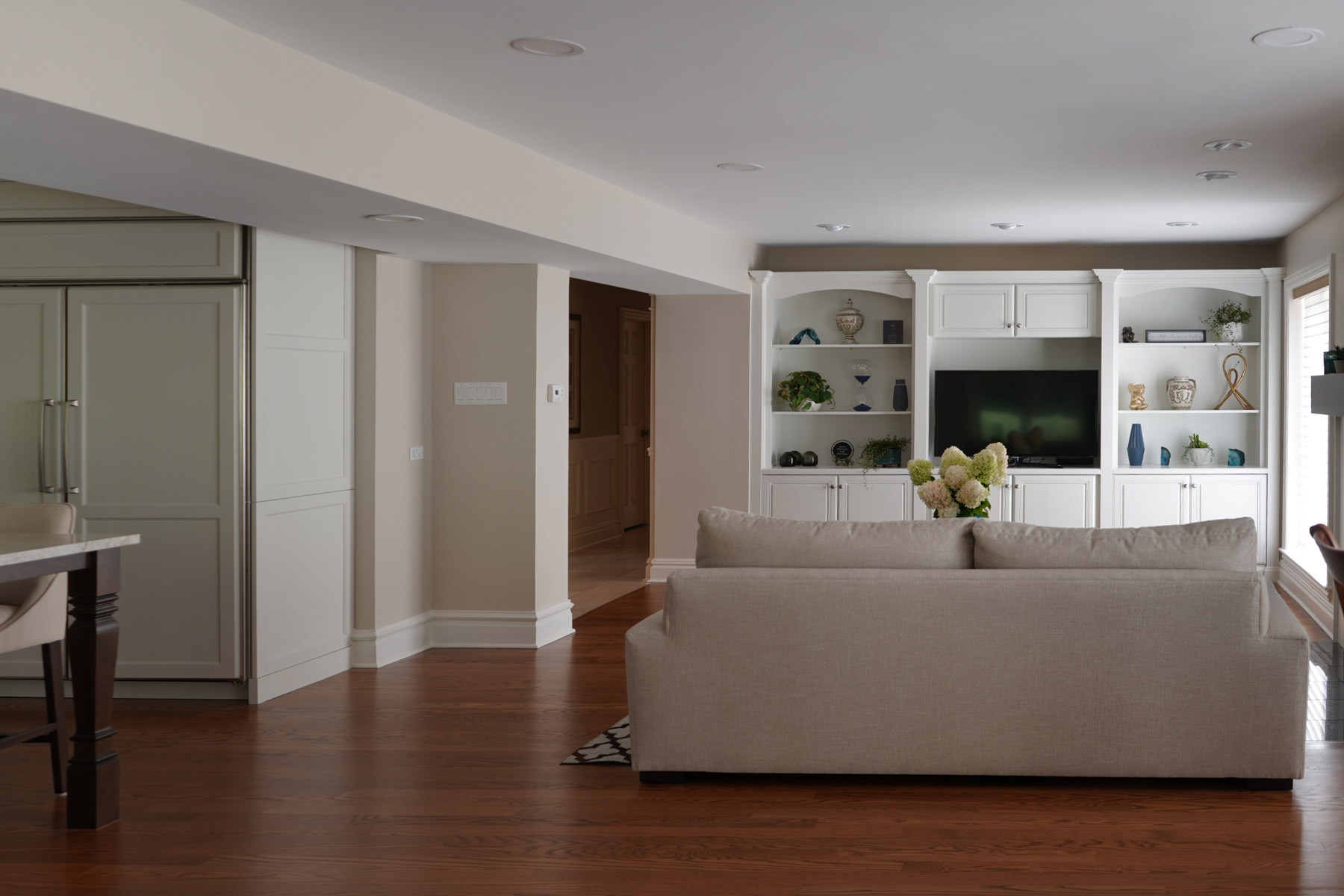
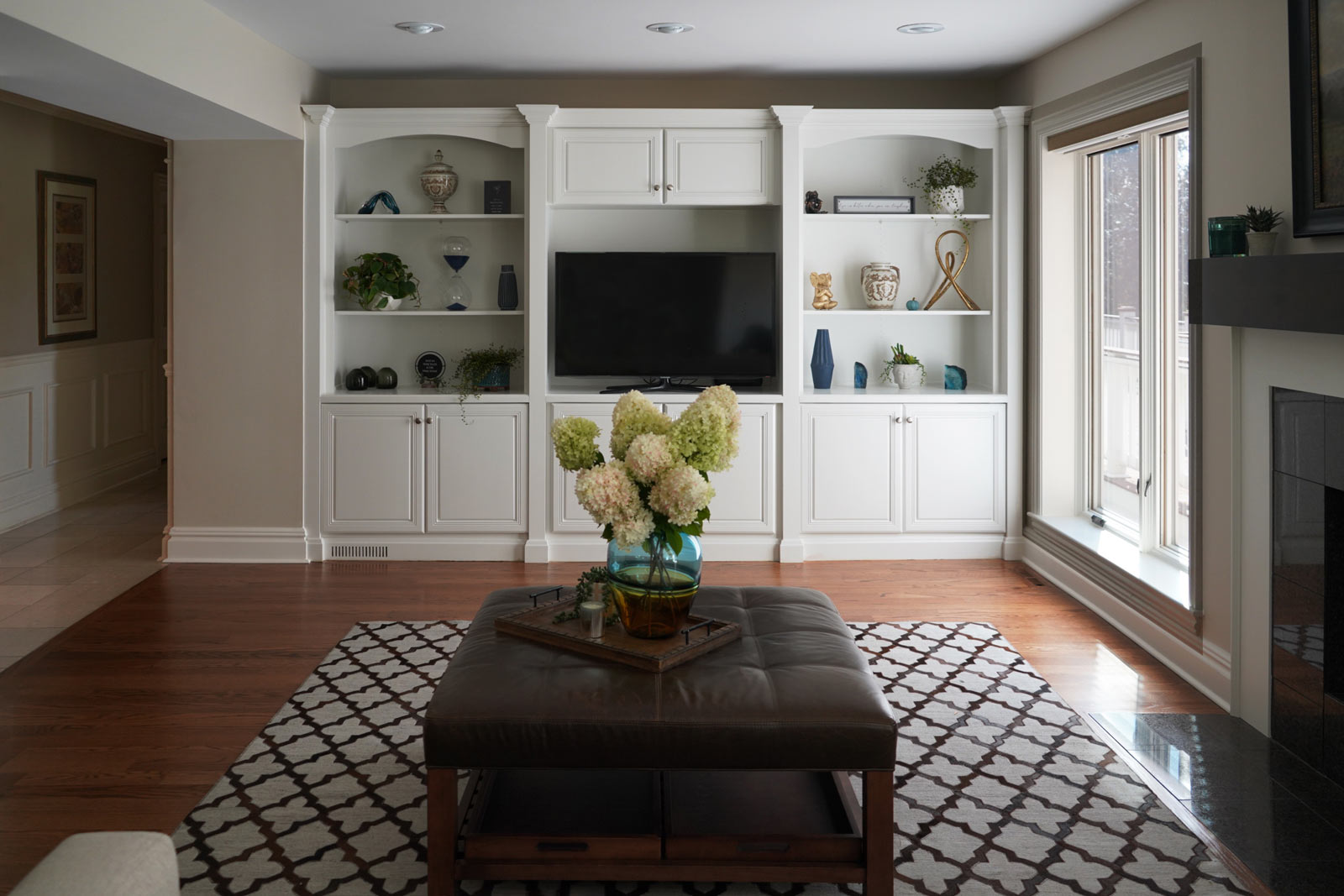
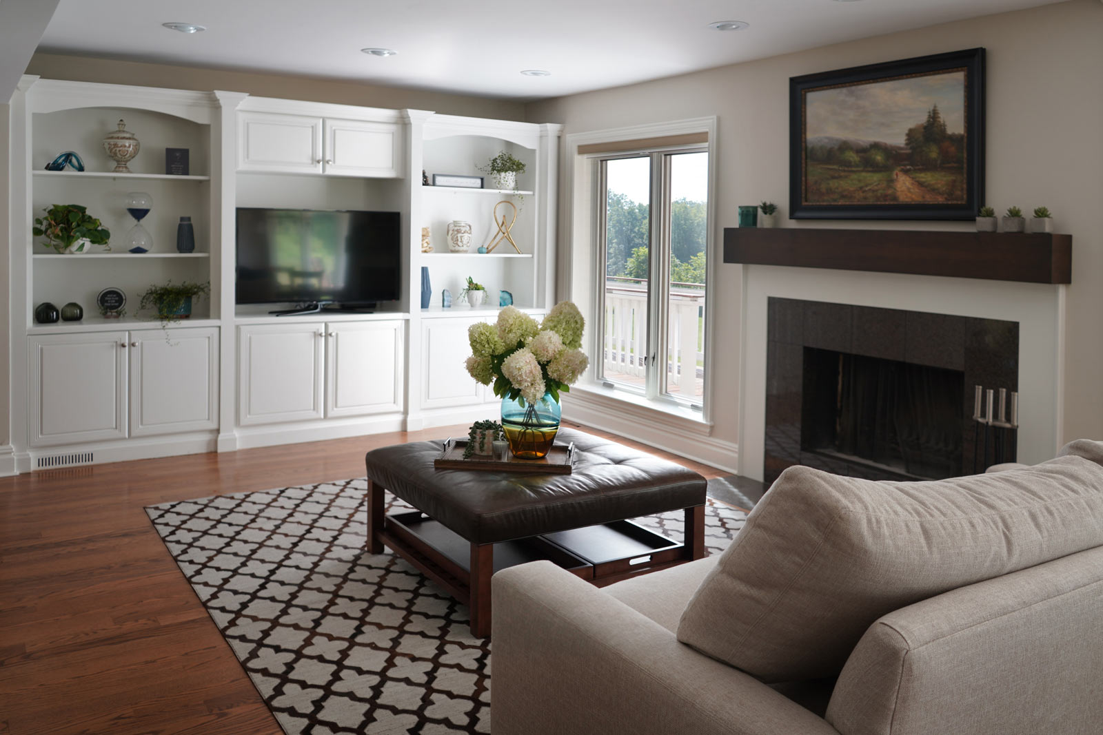
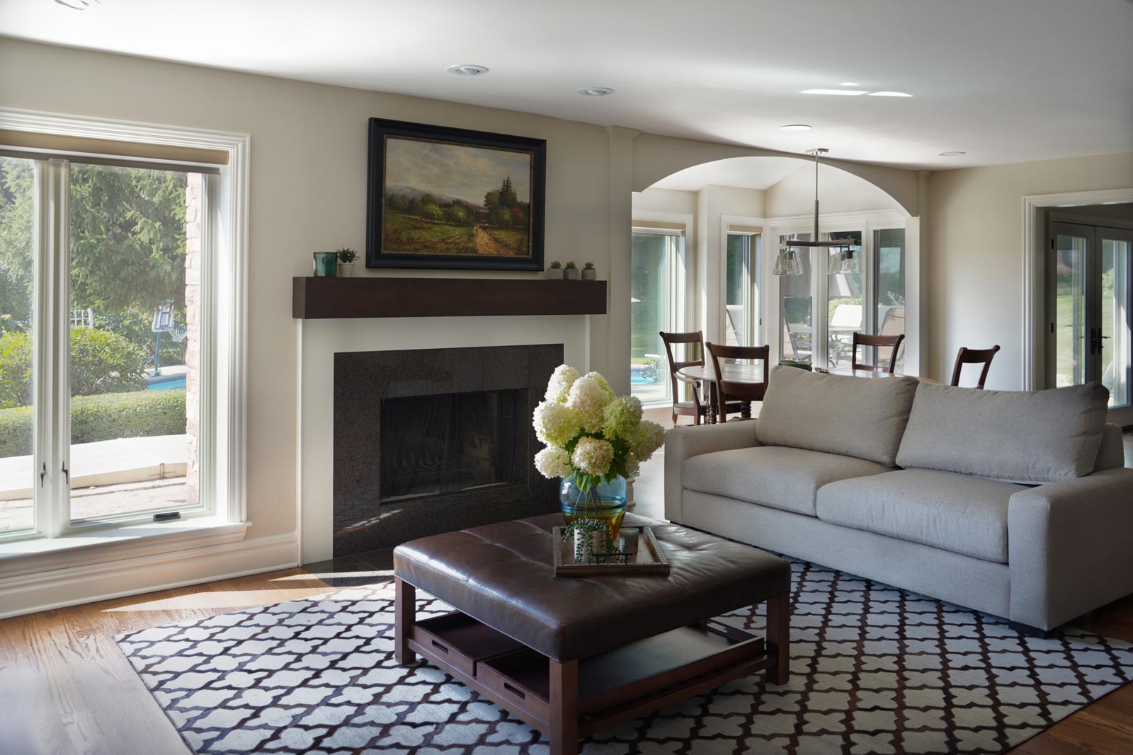
- Refinished the already functional entertainment cabinetry to match new cabinets – good flow throughout area
Even though the appliances all stayed in the same locations, the cabinet finish created a dramatic change. This is a very large kitchen and the client embraces minimalist design so we decided to omit quite a few wall cabinets.
“Basia did such a great job of kind of narrowing down the choices for us so that it wasn’t so overwhelming,” one of the homeowners told us after the project wrapped up. “We just went with the process and went with our instincts. Basia guided us and it came out beautiful.”
“Every person was so professional and ‘high-end’ in their area of expertise. If you’re going to do a renovation in your house, this was exactly how you’d want the process to go.”
Cabinetry:
- Brand: Mouser
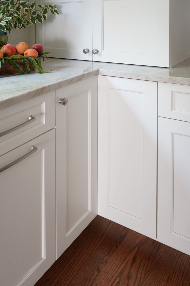
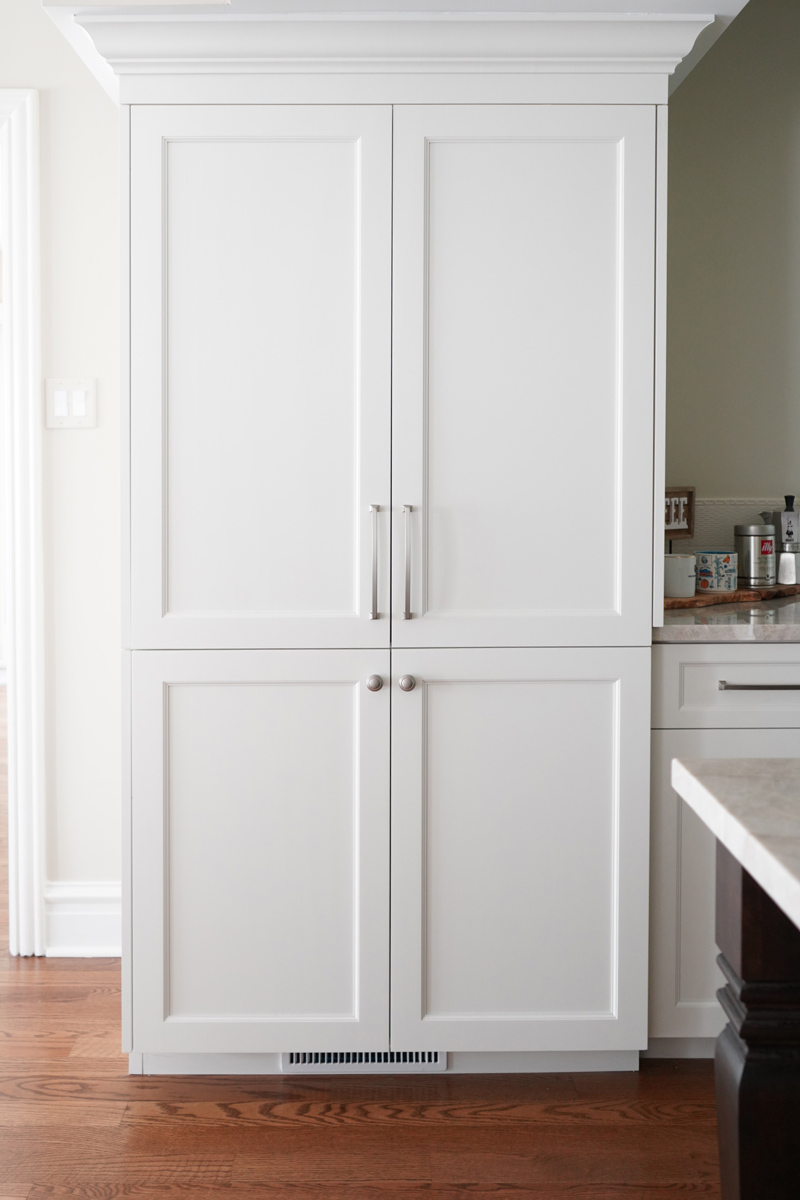
- Maple Linen paint – perimeter, fireplace surround, bookcases
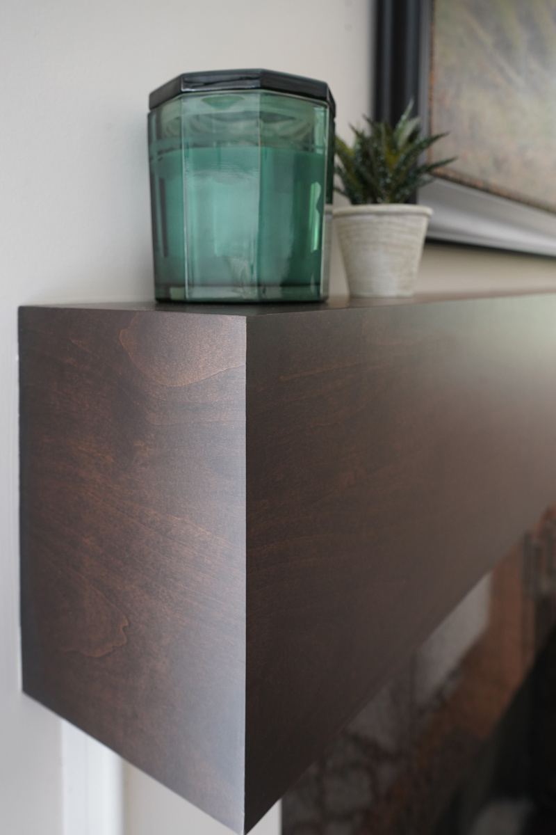
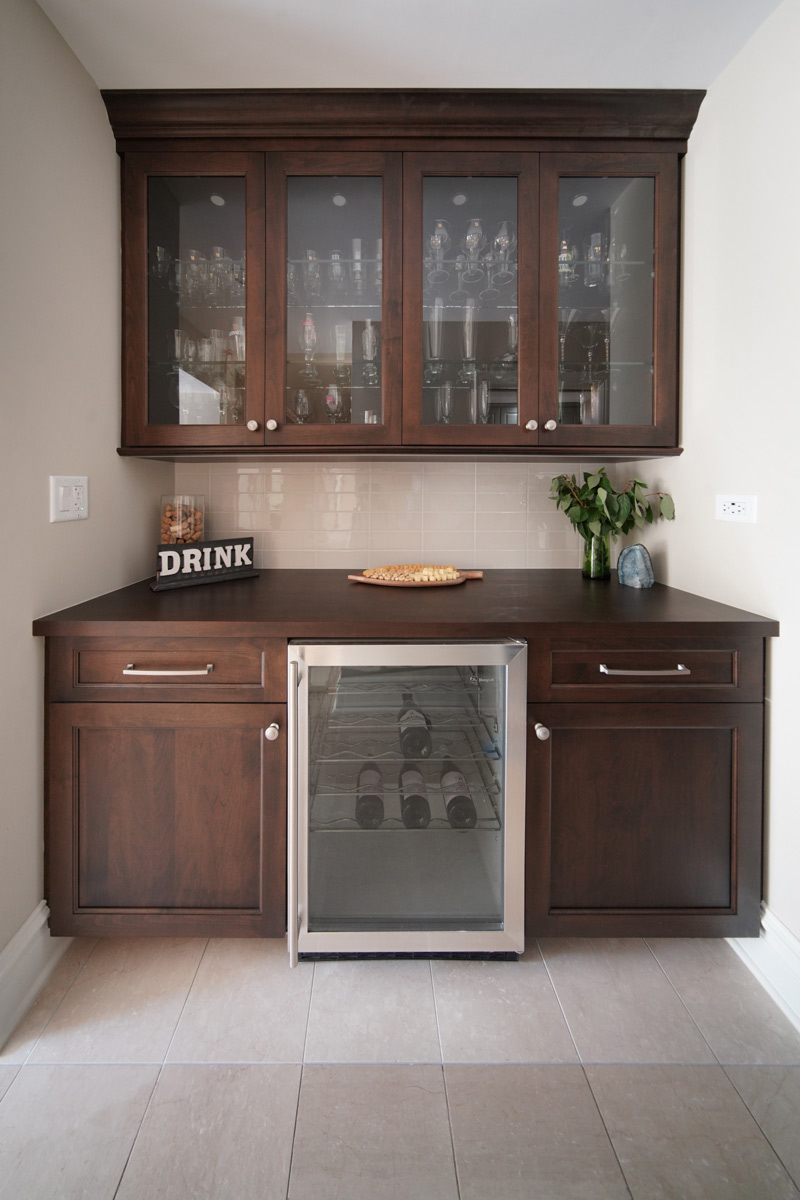
- Alder Sorel stain – island, fireplace mantel, bar
- Custom paint to match bookcases
Countertops:
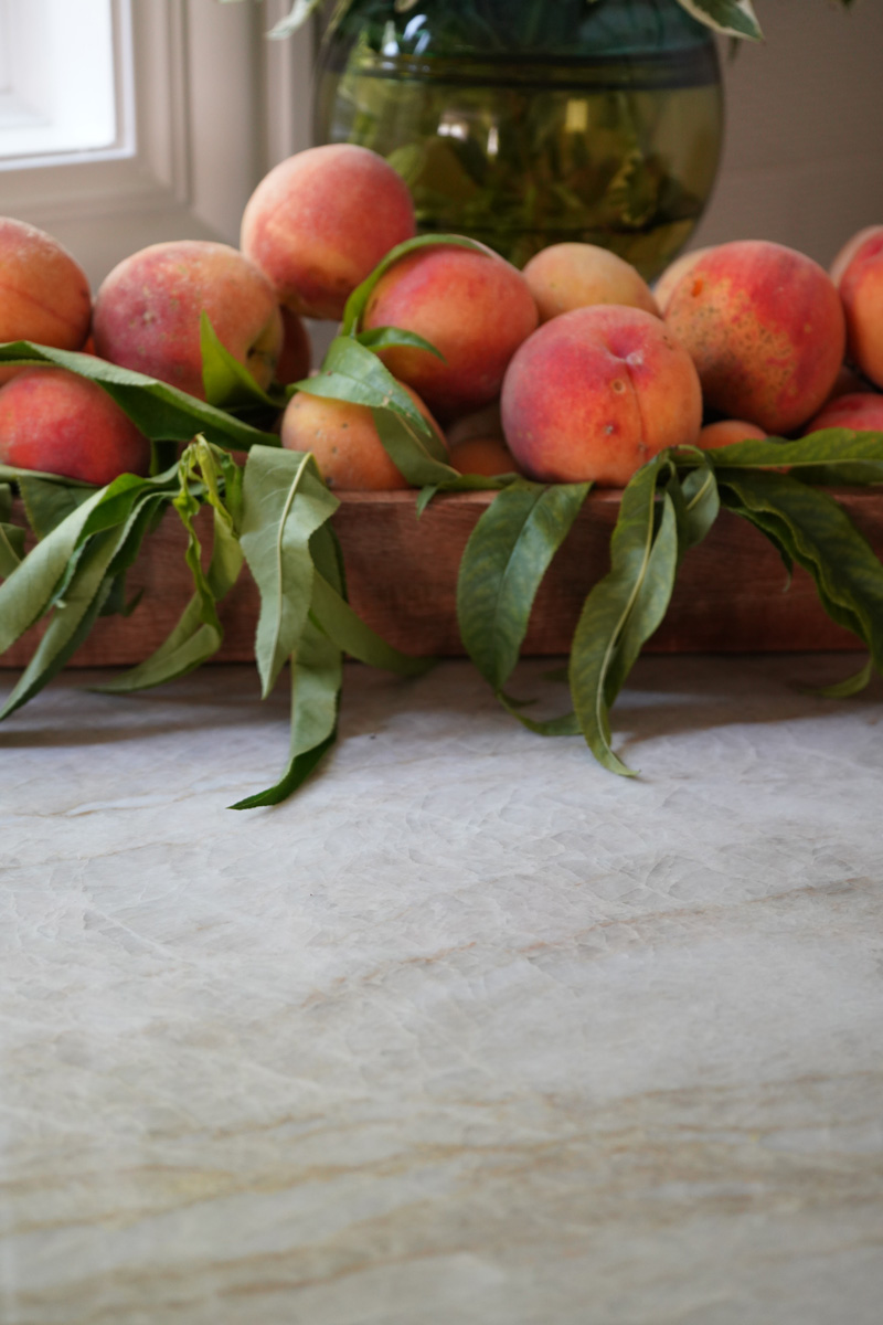
- Taj Majal Quartzite in kitchen
- Wood top to match cabinet in bar
Size of Space:
17′ 6″ x 15′ 8″ kitchen
Appliances:
- 48” Sub-Zero paneled refrigerator
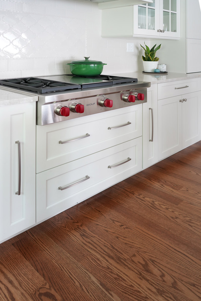
- 36” Wolf rangetop
- 30” Wolf E Series double oven
- 30” Sharp microwave
- 30” Wolf warming drawer
Special Features:
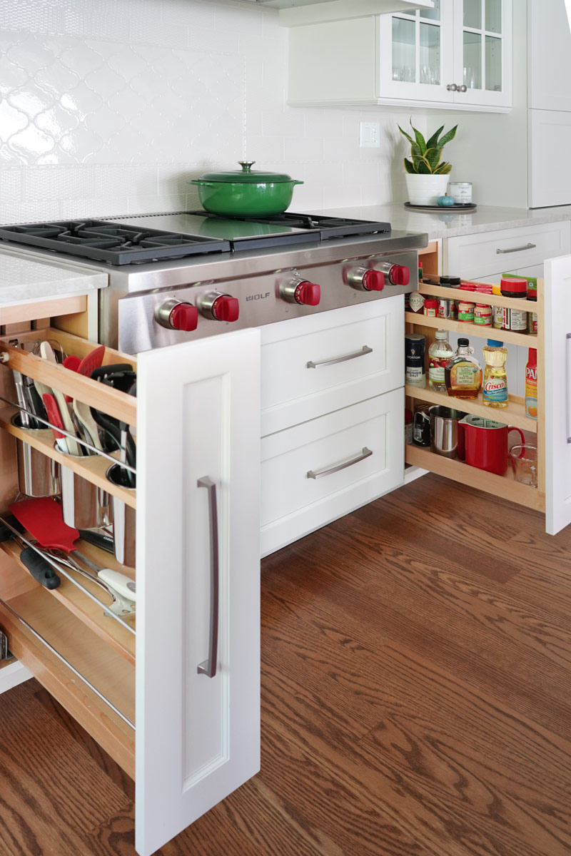
- Utensil and spice pullouts on either side of the rangetop
- Appliance garages on either side of the back wall to hide all small appliances and keep the kitchen clean
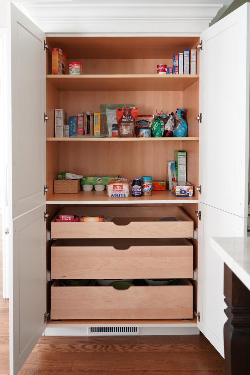
- Tall pantry cabinet by sink for easy food prep
- Island large enough to seat four people

Before / After
