The Setup
When it comes to artful design and functionality, the hyper-focused intentionality of designing a business space can teach us a lot about how to design the spaces in our homes.
Barber Haus in Naperville, a commercial design project for Drury Design owner/creative director Gladys Schanstra’s Schanstra Design Group, isn’t your average barber shop. Owner Eric Sowa saw a gap in the barbershop business landscape and needed a very purposeful design to make his vision come together. Men’s haircare businesses tend to fall into two categories: 1. old-school barbershops that specialize in no-fuss/no-muss men’s haircuts, and 2. unisex salons that cover men’s styling needs while also catering to women. Sowa’s idea was to give men an evolved barbershop that is specifically for them. His vision: a true barber shop that is sophisticated yet comfortable, well-versed in lifestyle cuts and straight-razor shaves, and expert in beard detailing and color treatment blends.
The design of such a space is critical to success. It defines the brand while setting the tone for every customer interaction.
Design Objectives
- Evolve the wheel: No need to reinvent the barber shop. Just evolve it so that men who care about how they look can enjoy the experience of grooming.
- Sophisticated masculinity: The colors, textures and overall design should appeal to a “man’s man.” It will be “the kind of place 007 or John Wick would go to.”
- Classic and timeless: Dial in a design aesthetic that will not expire.
- Community: Inspire conversation and interaction among barbers and clients.
The Remodel
Design Challenges
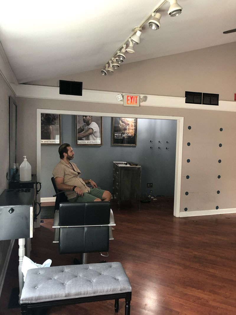
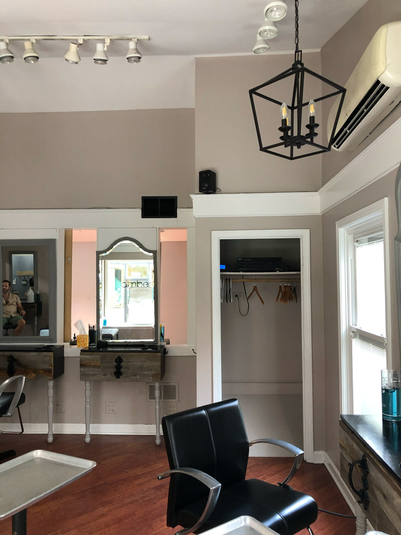
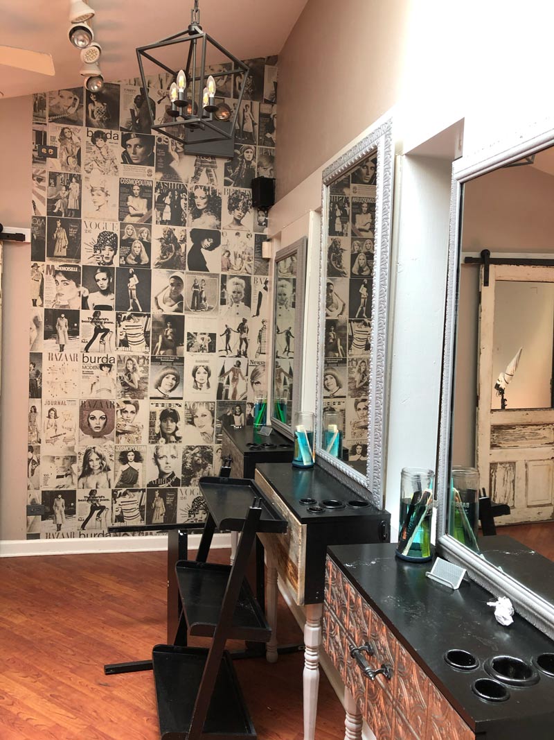
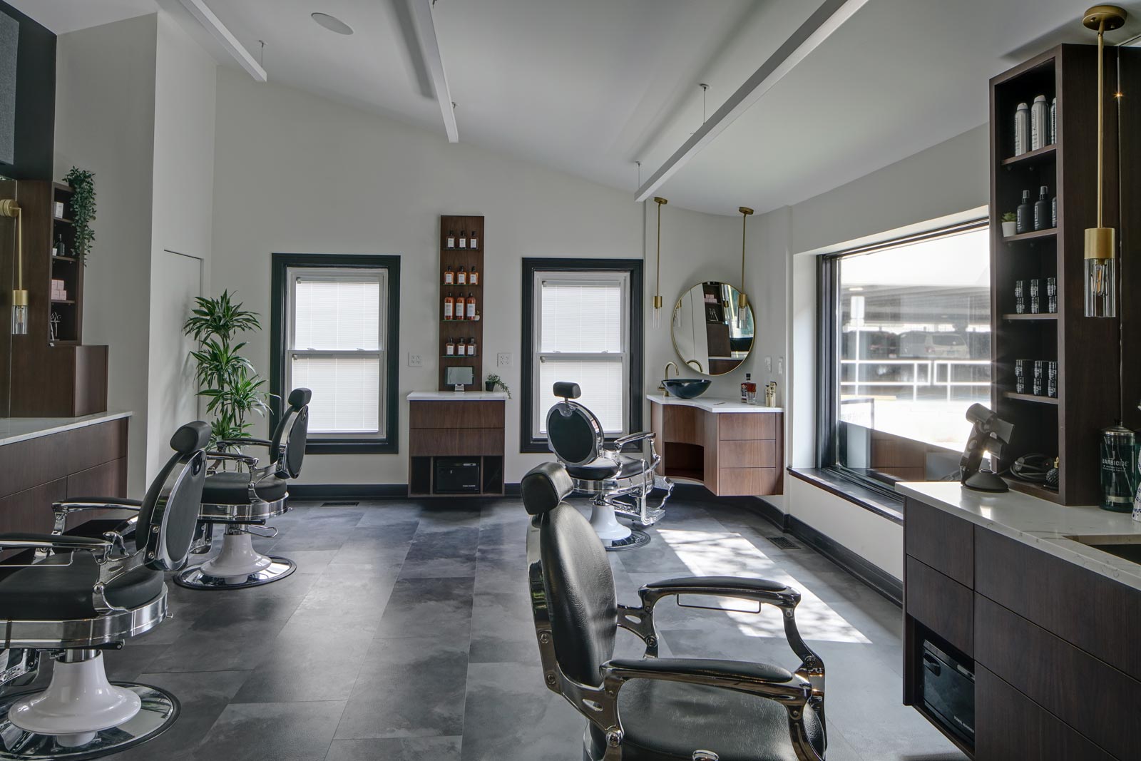
- Reduce existing space’s nine spread-out workstations to four
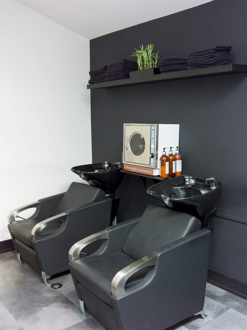
- Convert part of the space to a lounge/bar/shampoo area
- Relocate a reception desk/product display area
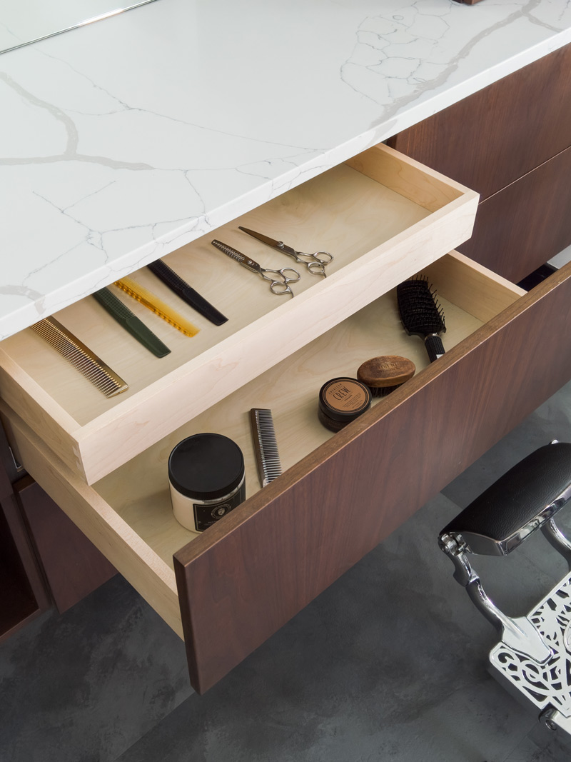
- Create enough storage at each station to minimize clutter
Design Solutions
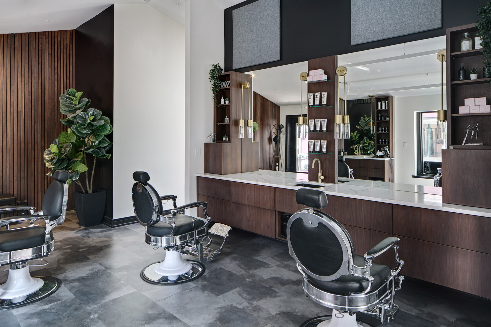
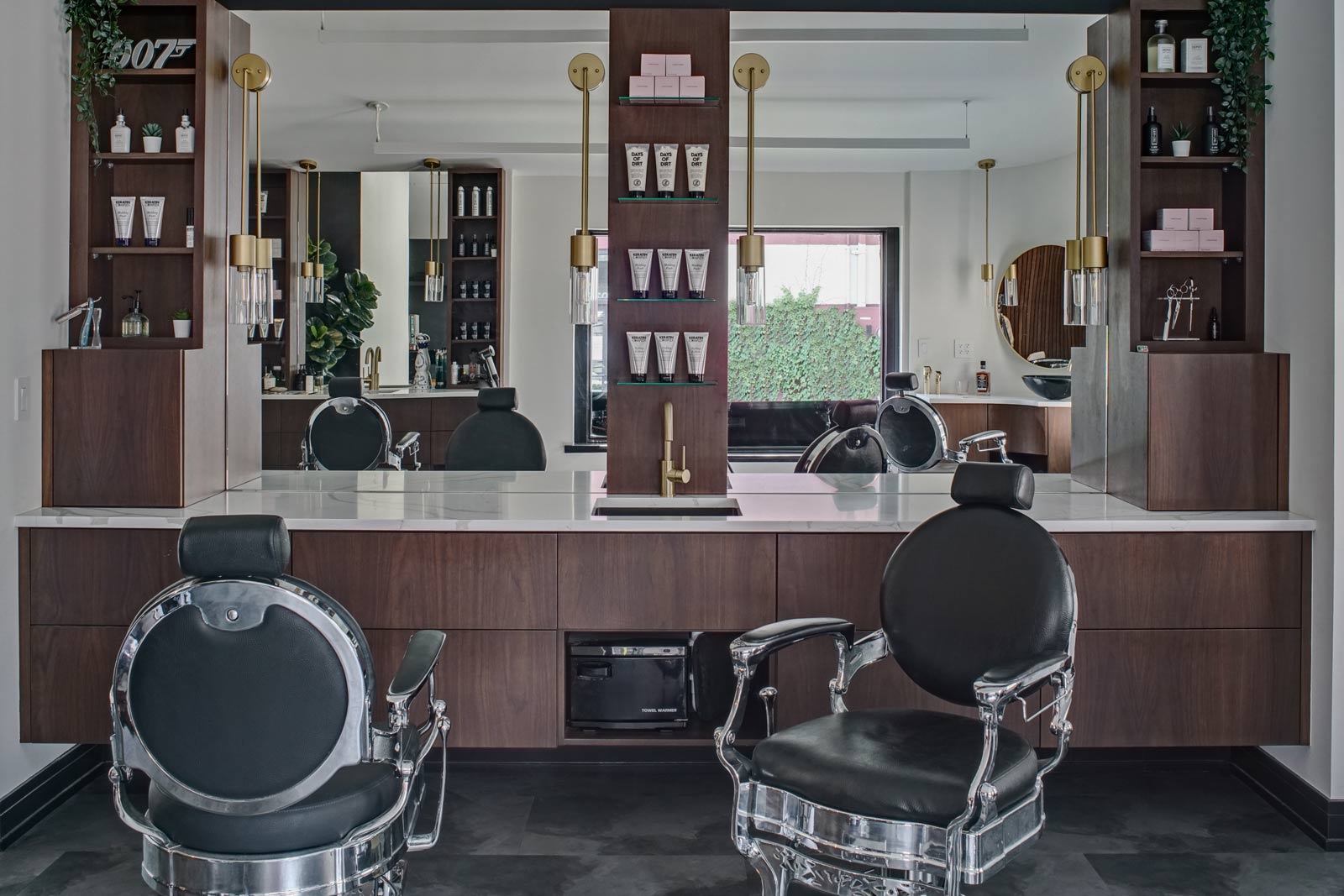
- Reconfigure main area to feature four conversation-friendly workstations in main area.
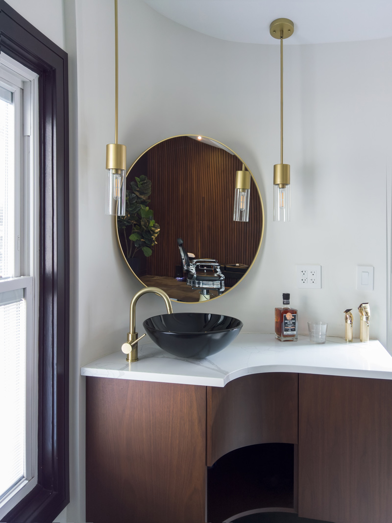
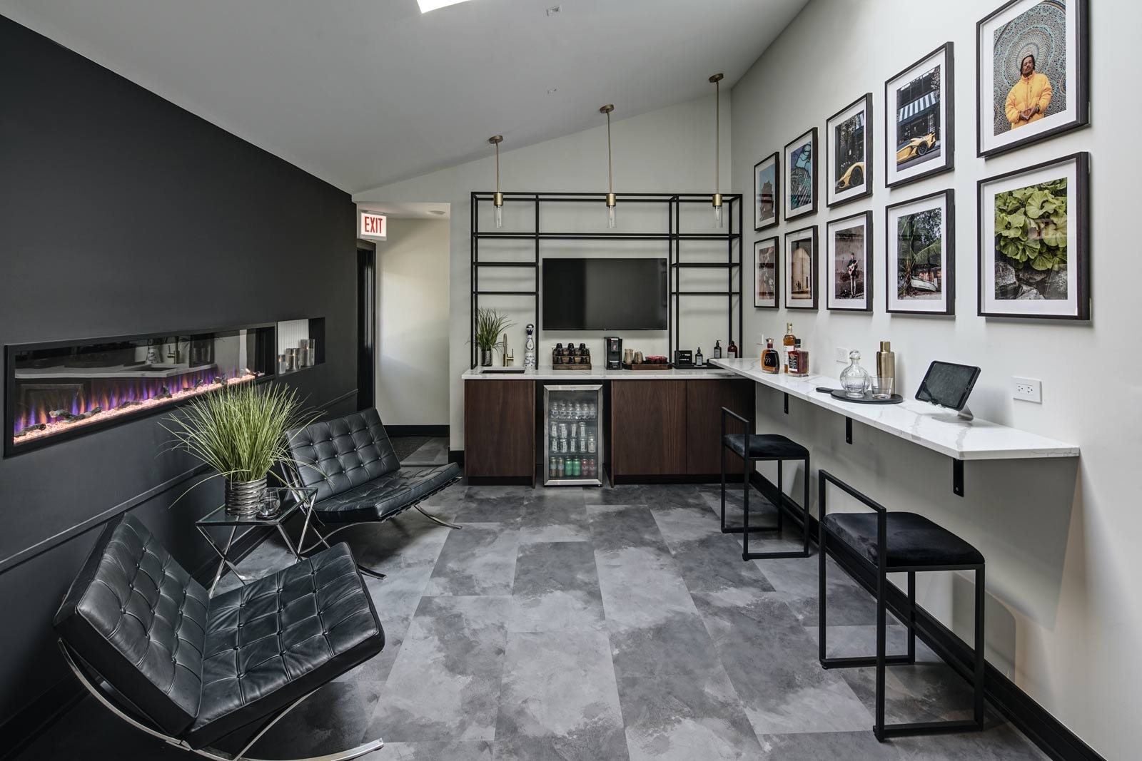
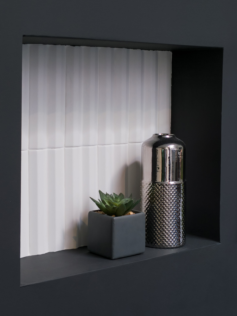
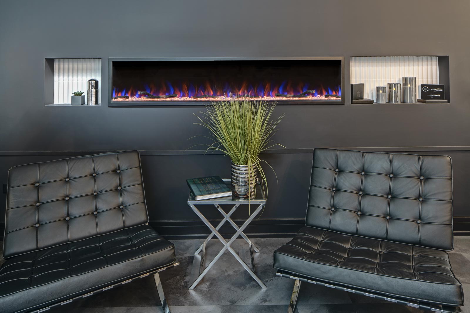
- Reconfigure secondary area to feature a shampoo zone and a lounge area with a fireplace, comfy chairs, a bev station and a long bar for clients to perch with their devices.
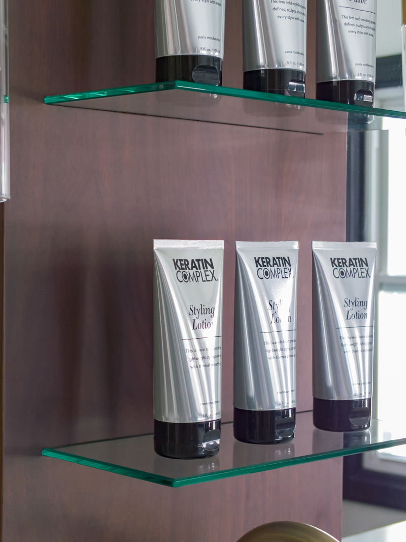
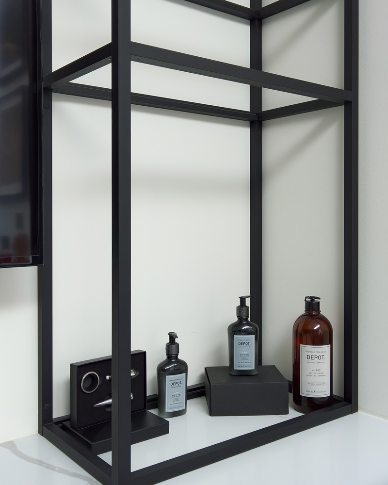
- Win space by eliminating the reception desk/product display area. Transactions will be handled via iPad. Build product display shelving at each work station.
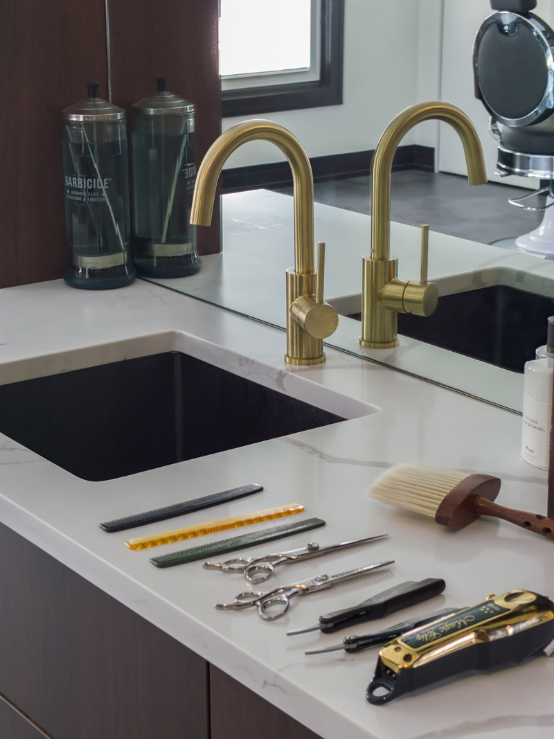
- Build appliance garage doors and drawers-within-drawers for supplies.
Size of Space:
30’ x 30’
Cabinetry:
- Custom
Countertops:
- Quartz
The Renewed Space
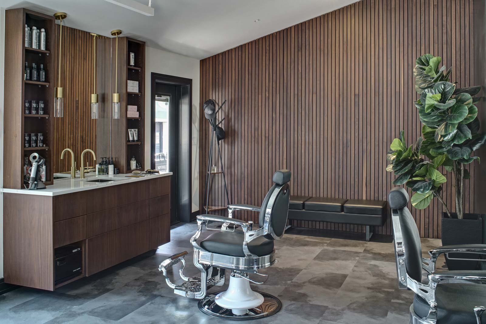
The visual and vocal reception you get when you walk into Barber Haus makes you feel like Norm walking into Cheers. A friendly in-unison greeting harmonizes with the cool, comfy setting and you just feel like you’re in the right place. Guys are in there being guys but there’s a sophistication to it – it’s a blend of easygoingness and the classy side of masculinity. And it’s all by design.
“My clients sit in my chair and I’m the professional, so they trust that I’m gonna do a great job and I do.” Eric told us during our recent photoshoot. “I did that with Gladys. She’s a professional. I was just like, ‘Here’s my vision. I’m gonna trust you. Help me bring it to life.’ And boom, she did. It was just magic.”
The friendly reception is the reception. In other words, there’s no need for a dedicated reception area. After the warm hellos, you walk back to the lounge area to get something to drink and relax in a Barcelona chair. Or maybe you’ll perch along the long bar, plug in your device and check your email and newsfeeds.
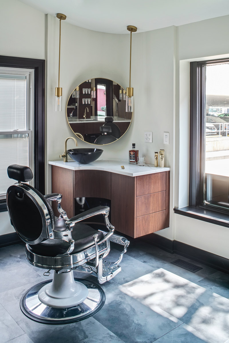
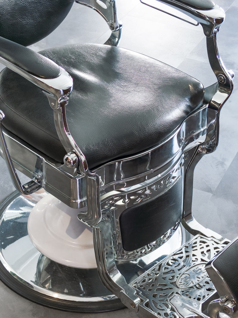
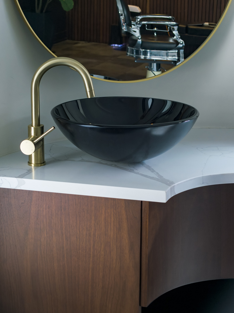
By the time you’re in a classic barber chair, you’ve acclimated to the space and the topics everyone is chatting about. Your mirrored image is the focus of each barber station, contoured by clean lines and a bold blend of walnut tones and dark colors. The glass shelves featuring hair products float magically with no visible support brackets. The cabinetry features appliance garage doors and drawers within drawers that keep barber supplies hidden until needed.
Lighting is strategic and on-point. The vertical lines and woody tone of the main wall add a sense of artistry to the experience. Upon leaving, you exit as you came in – with a chorus of men reminding you that your presence is always appreciated. If you think about it, you realize the space was designed around the community, not the cash register.
“What are the activities being conducted in a space?” Gladys mused when asked about the parallels between barber shop design and home design. “Eric is really dialed in to his clients and the experience he wants them to have. It’s very similar to mindful home design, really – it’s about how you want to feel, guiding what you know will be happening and creating a space for comfort.”
Before Photos
