Chic High-Rise Primary Bathroom Makeover – Chicago, IL
The Setup
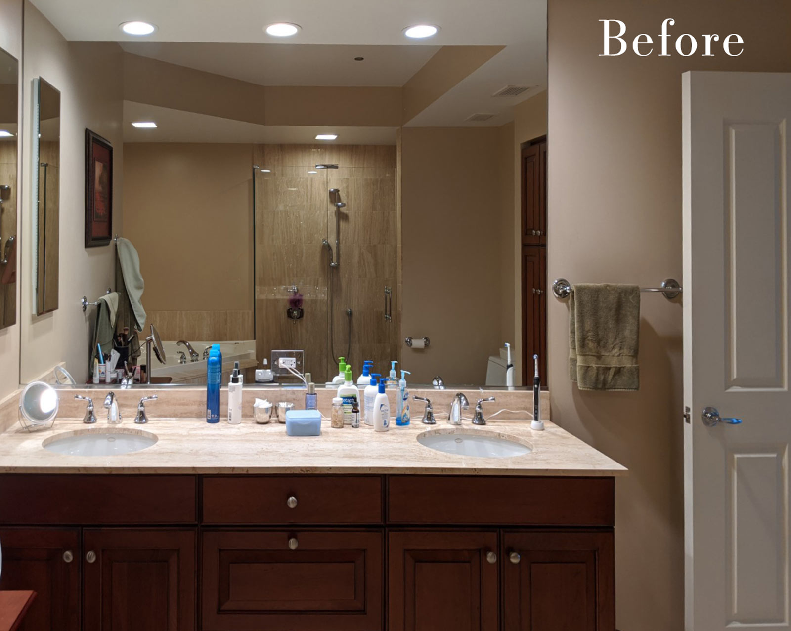
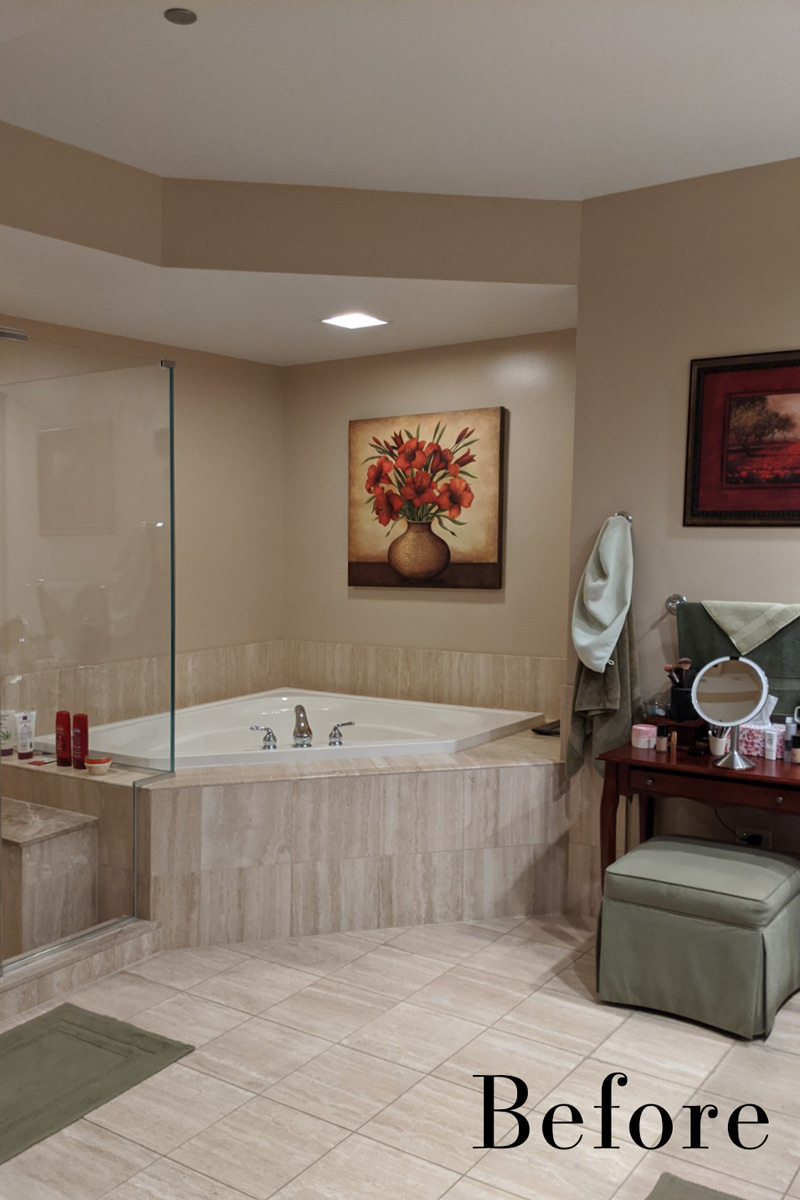
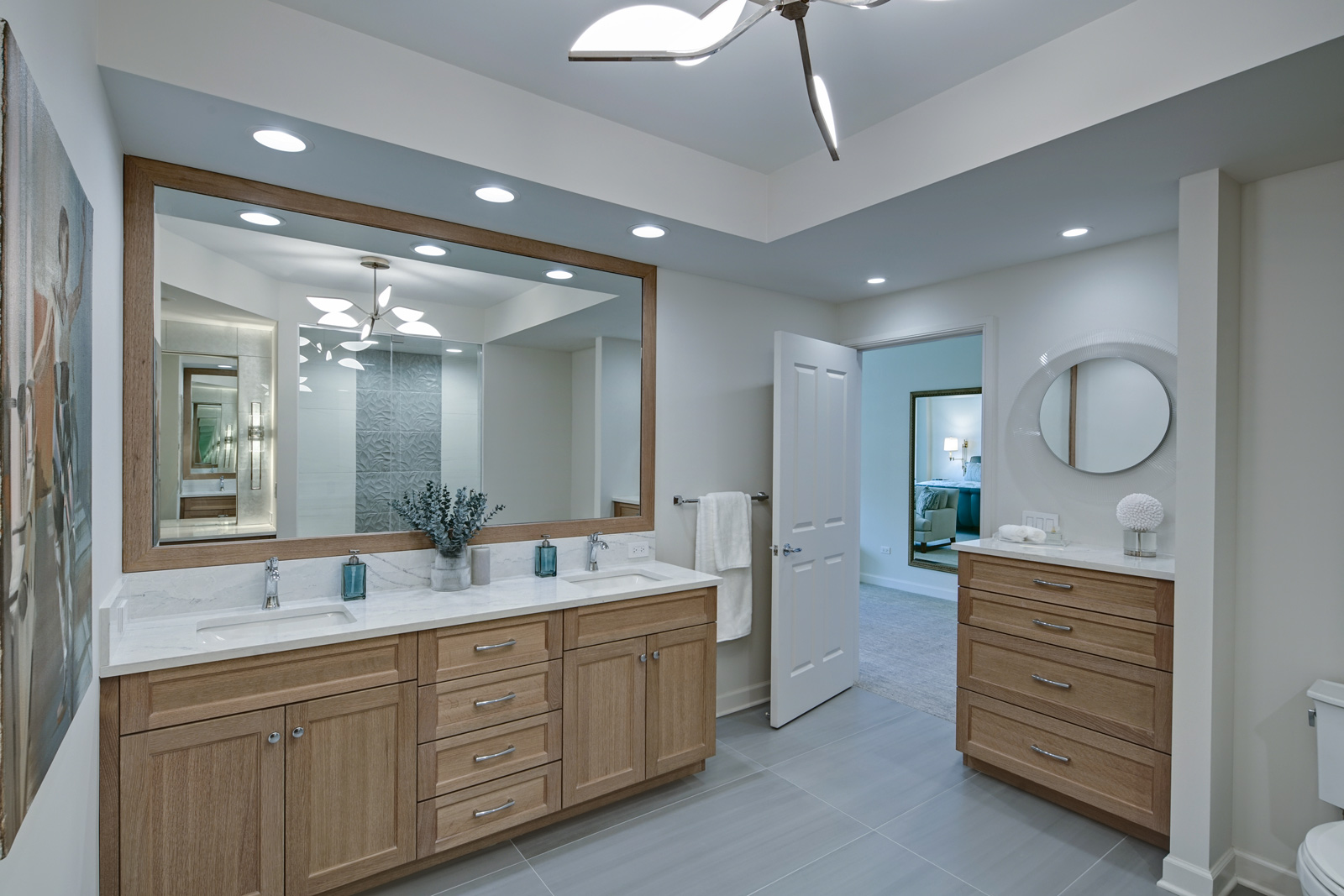
This client lives in a great high-rise condo in downtown Chicago. Alicia has already remodeled a few areas of her home, including her kitchen and home office. The bathroom is one of the last big places the client wanted to update. The existing bathroom had a large, outdated whirlpool tub in the corner. It was a darker space that had a lack of natural light. There are no windows (due to the bathroom’s location within the high-rise building). So, the idea was to brighten up the space and give the client an updated, elegant primary bathroom that is more her style and tailor-made for her routines.
Design Objectives:
- Make the space brighter.
- Create different daily routine stations to maximize functionality while keeping things clutter-free – a makeup station, a blow-dry station, and a sink-needs station.
- Achieve the client’s specific style and function needs while also keeping the look and design open to future possibilities: different users of the space/resale clients.
Design Challenges:
- Toilet cannot be moved. (In a high-rise, you can’t really move plumbing around too much when reimagining a space)
- Existing bathroom had a soffit that hid a lot of electrical wiring, so completely removing the soffit wasn’t an option.
- The blow-dry station needs to accommodate the client’s preference for standing up.
- Finding a place for the make-up station, which the client wants oriented for sitting.
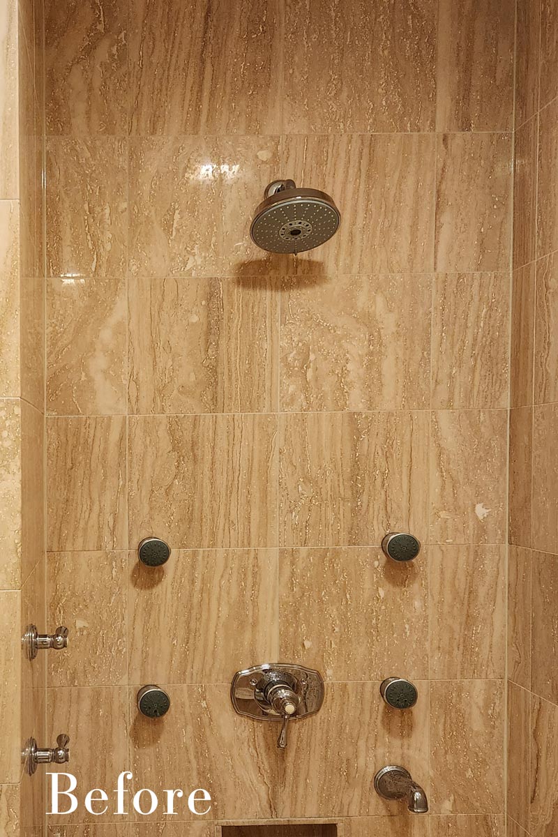
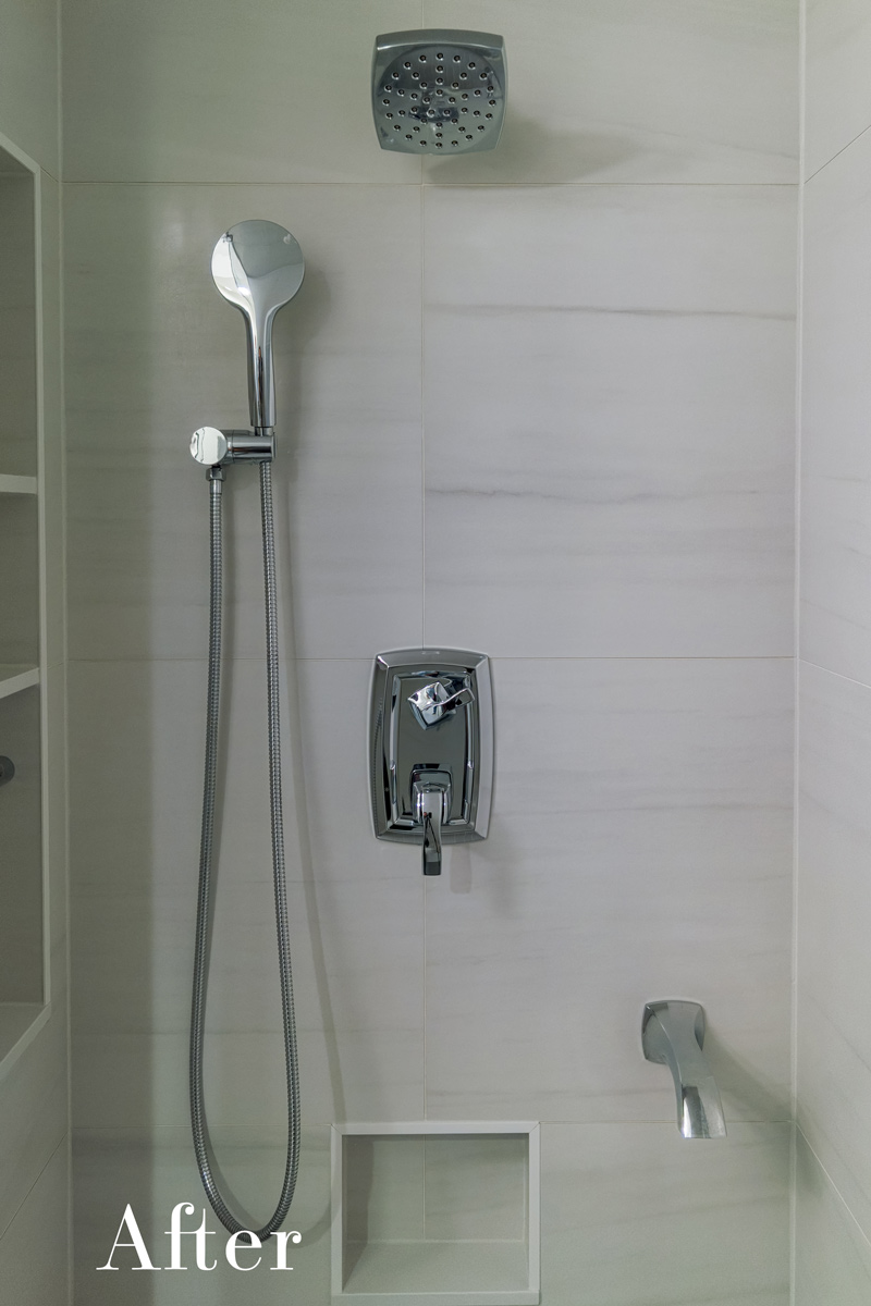
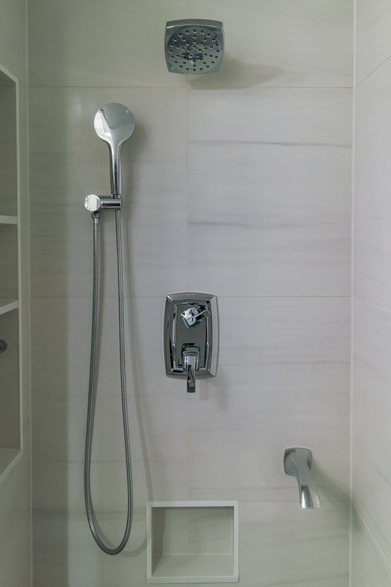
- Create storage within the shower that can eliminate the clutter of personal care products that are actually needed every day. Do this, while keeping the client’s favorite things about the existing shower: the shower bench, a tub filler faucet (for rinsing shaving cream when shaving legs) and a low niche for placing her foot when shaving her legs.
The Renewed Space
Design Solutions:
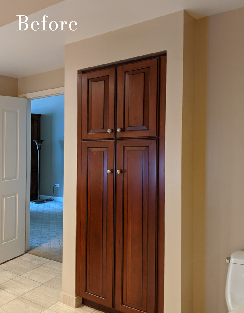
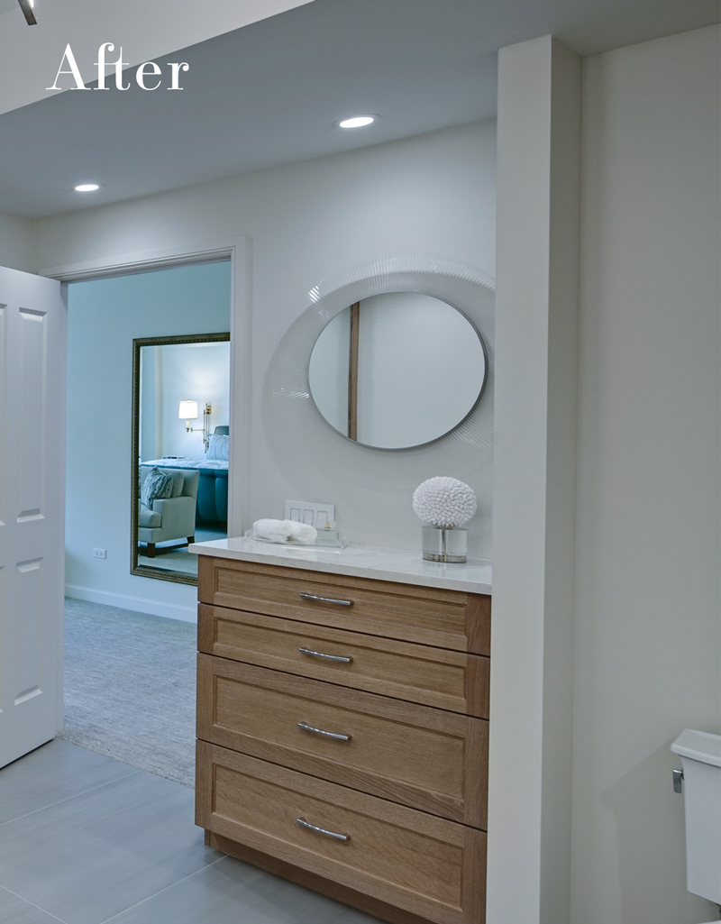
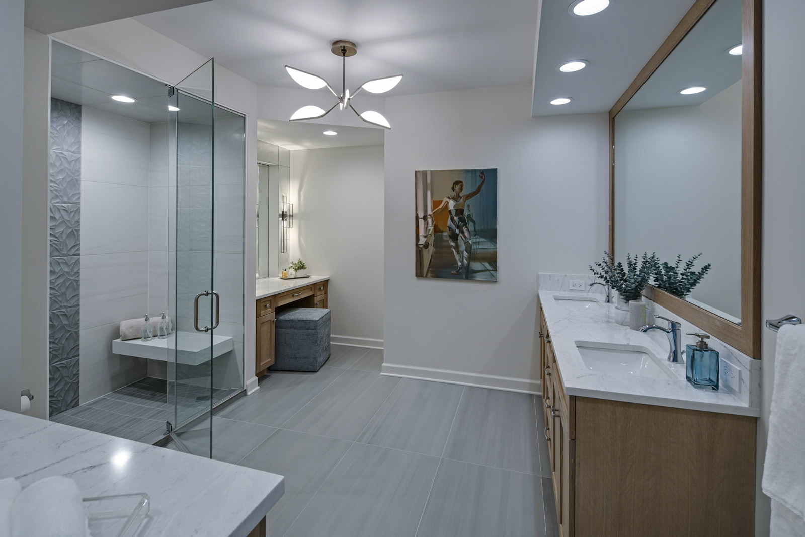
- Extended a bit of wall near the toilet to give the commode its own area within the space, but without closing it off into a claustrophobic WC.
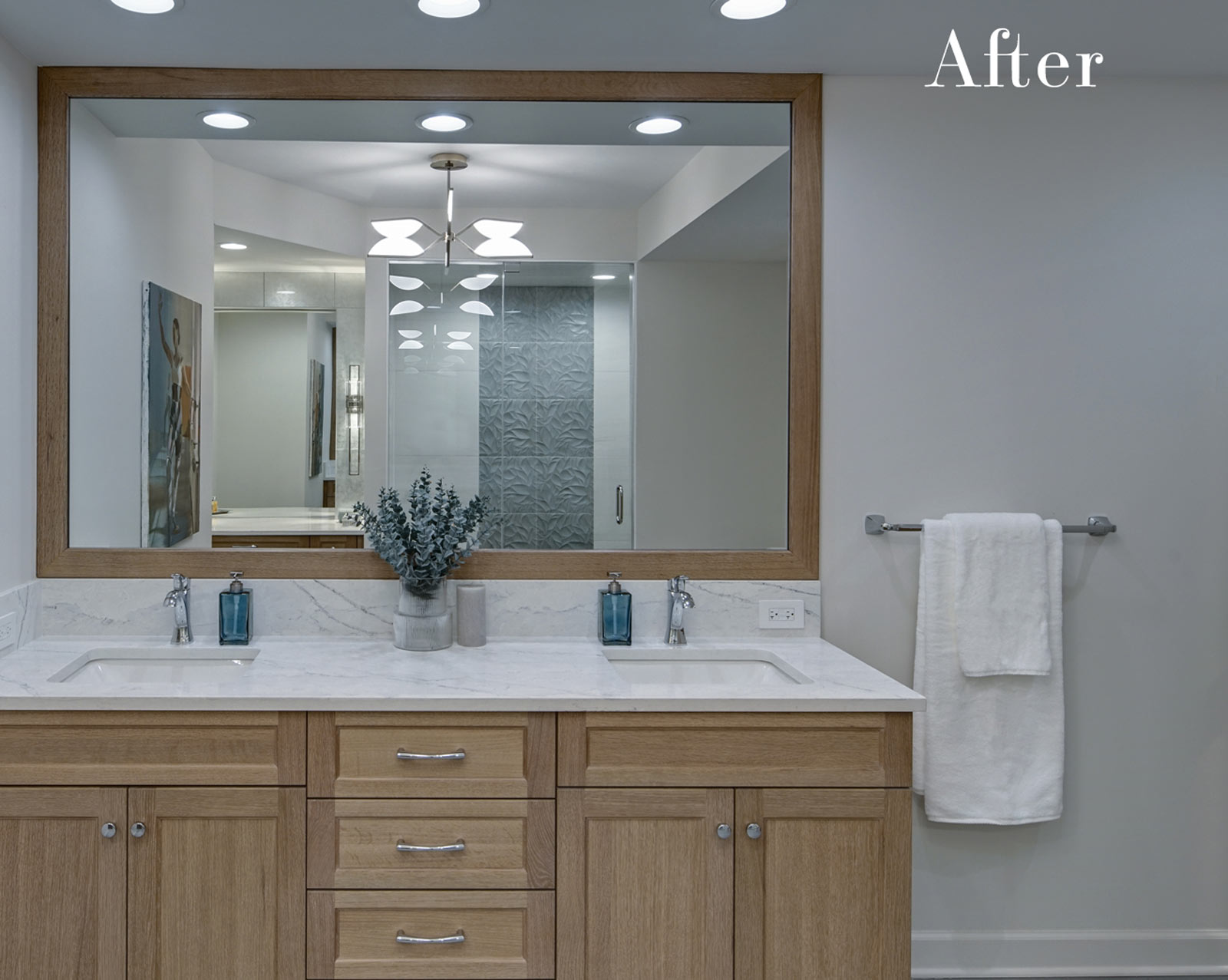
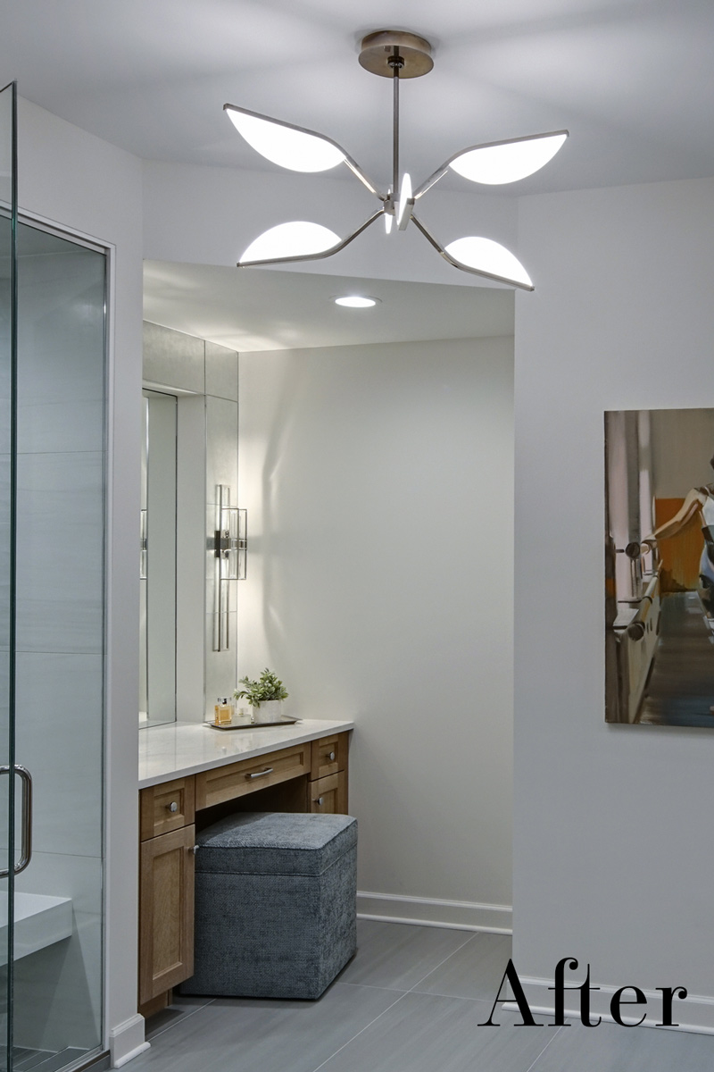
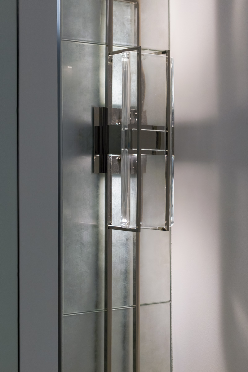
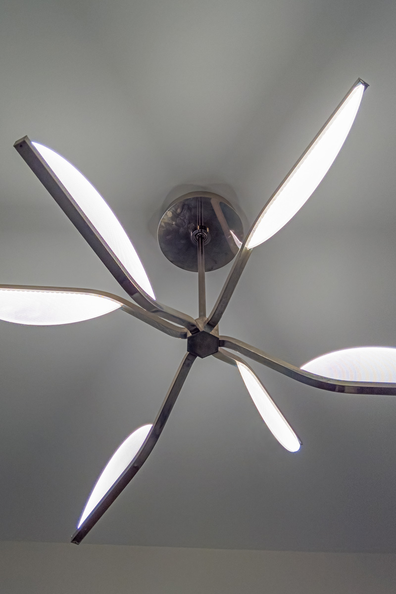
- Worked within the reality of the existing soffit situation, reshaping it to align with the new shower. Can lights were also added. Installed a beautiful ceiling light fixture that works within the new soffit shape, commanding attention and adding light, as if the sofit shape was chosen for it.
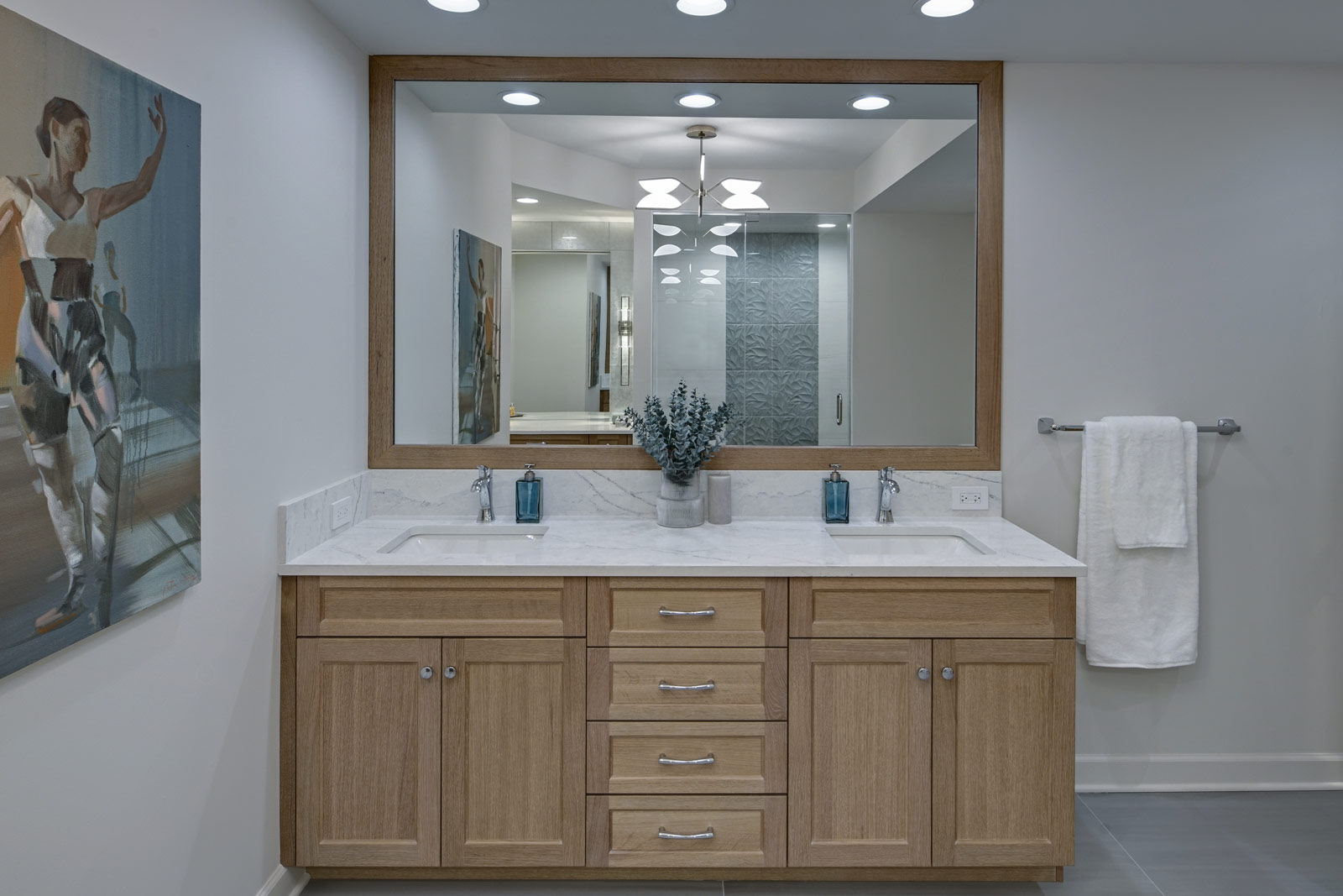
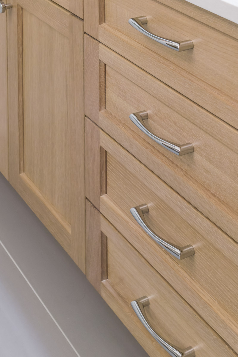
- Created a nice, furniture-looking 42”-high cabinet with pullout drawers to be the blow-dry station, complete with a mirror and a nice top. The pullout drawers are all powered, concealing a Dyson dryer and curling iron (and all the accoutrements) while keeping them plugged in, which is ideal for easy usage and put away. A stylish mirror on the wall above the cabinet, and proper lighting, make this the perfect blow-dry station. The top has a grommet that can accommodate a power cord should the client ever want to have a powered device on top of the cabinet.
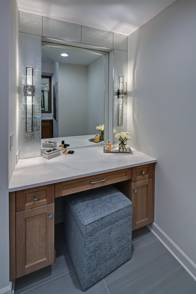
- Put the sit-down makeup station where the tub used to be, putting the mirror back into a new recessed wall just a bit, allowing the area to have more room.
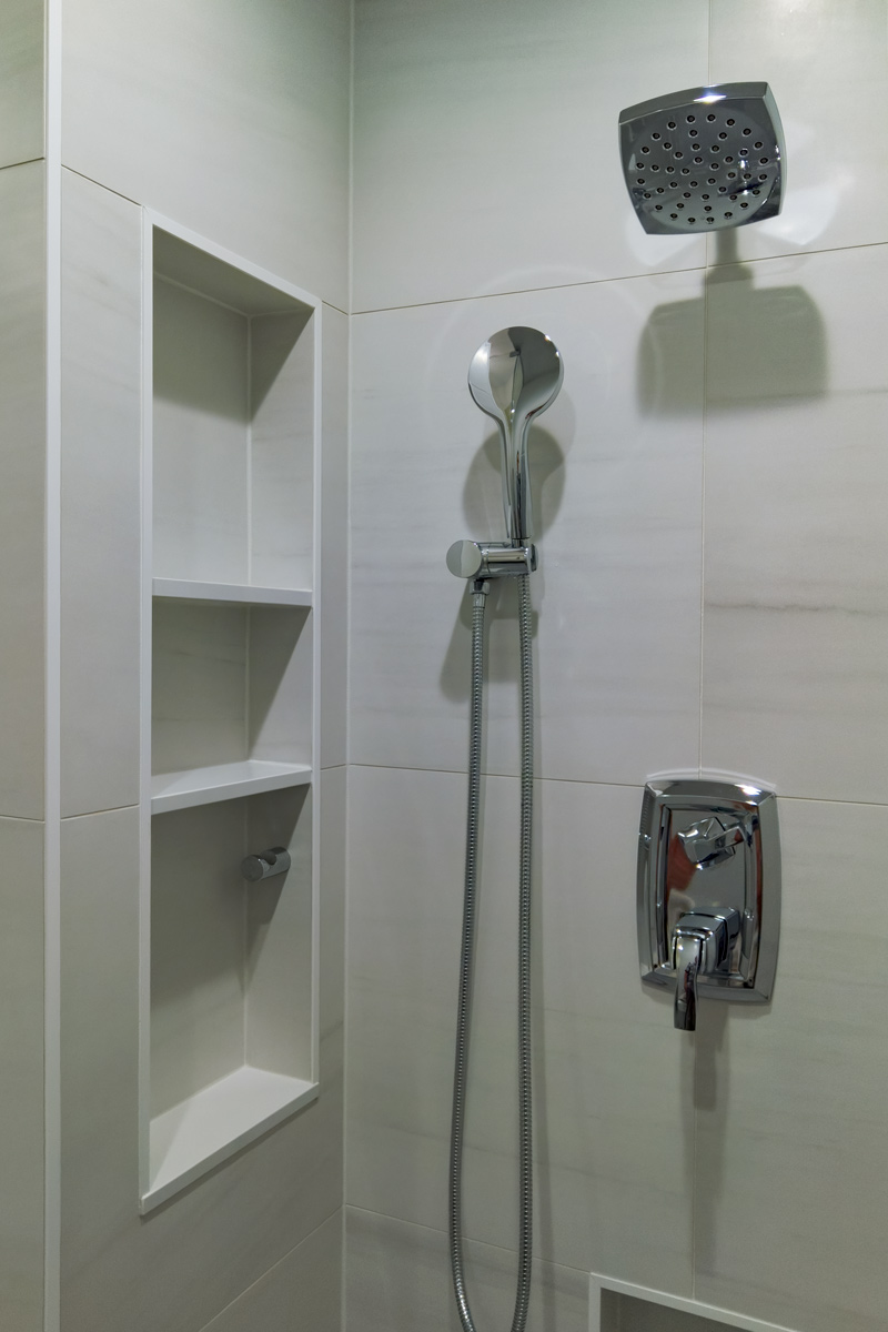
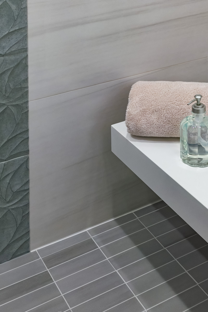
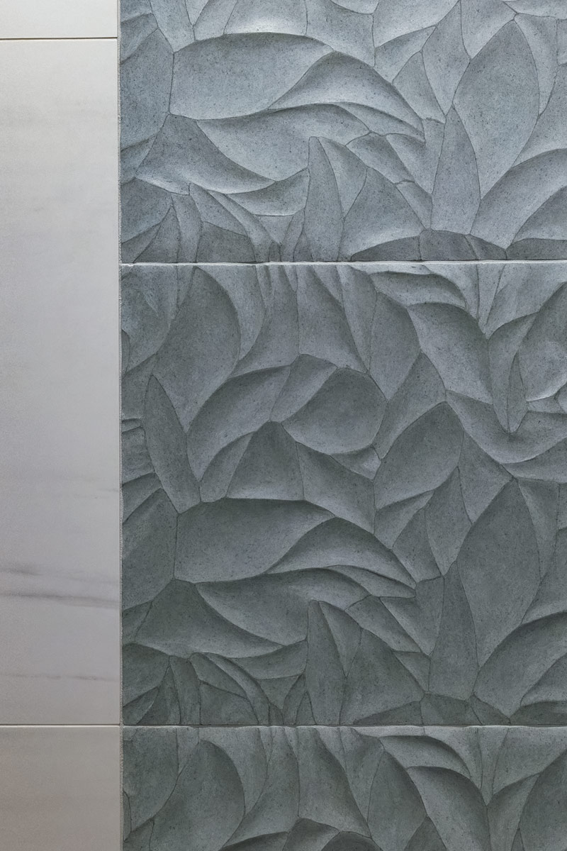
- Created a niche in the shower’s inner wall so that you can’t see it unless you are literally inside the shower. At the client’s request, it also has a hook so she can hang her loofa. Hiding the utility niche in this way allowed us to use the full main wall of the shower as a canvas for a beautiful accent stripe of raised decorative tile. The new shower has her old favorites, too: the tub filler, foot niche and bench.
Alicia’s client loves her new primary bathroom, especially the blow dry area. It is very accommodating for her, as a tall lady, while being very easy to use. The drawers store everything. Being powered, they make using already-plugged in appliances very easy to use and put away.
Her previous makeup station was a freestanding vanity with a single drawer, so beauty products were all over the surface top. With her new makeup station, everything is nicely tucked away and organized in drawers.
The new lighting is fantastic and the colors are light and soft. The clients loves the overall look and feel of her new bathroom and raves about how well the functionality-minded design makes her morning routine – and her life – easier and enjoyable!
Size:
12’ x 13’6″
Cabinetry:
Mouser – Quarter-sawn oak, Essence door style, cadet stain
Countertop:
Vicostone Marino quartz (3cm)
Plumbing:
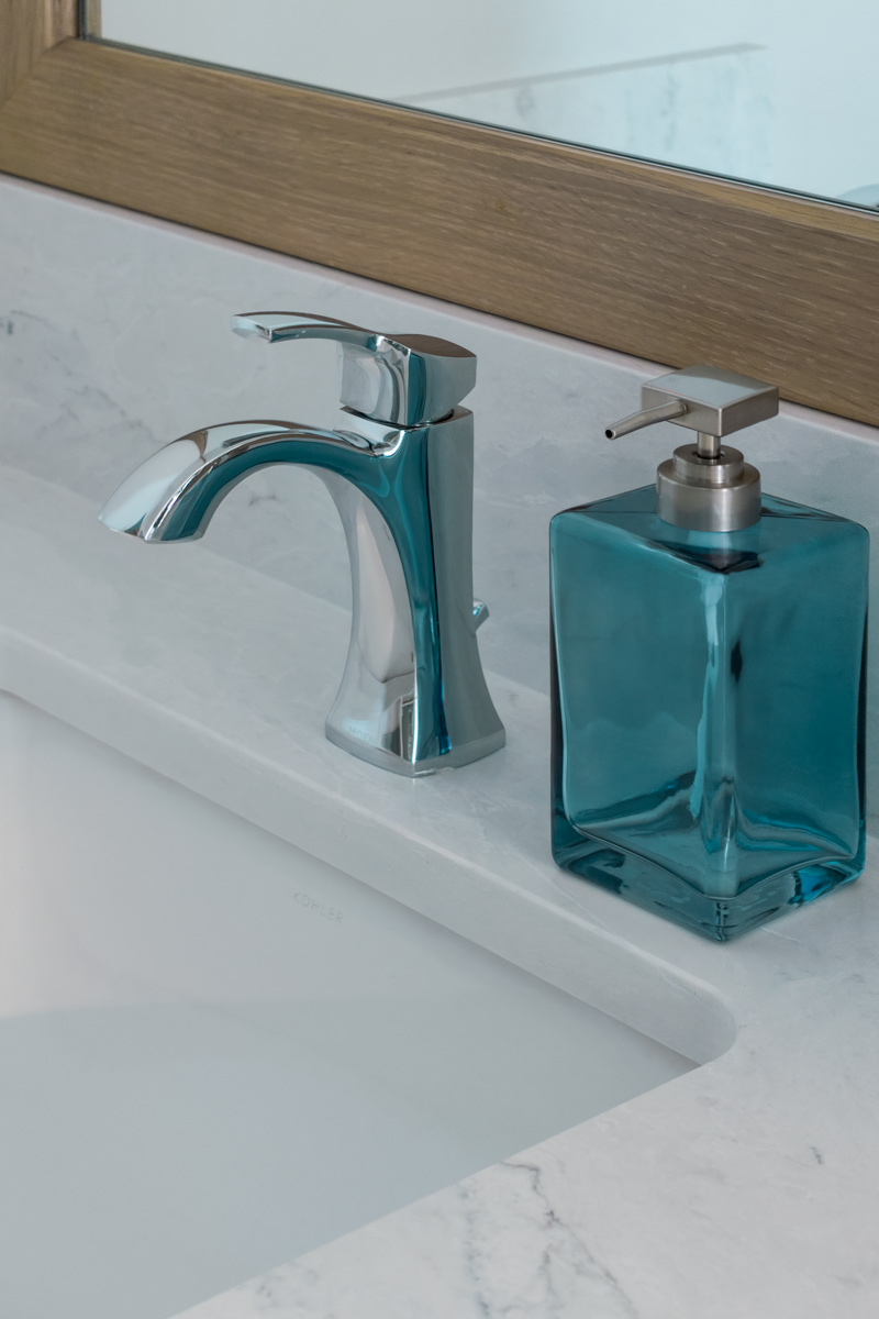
Moen
Special Features:
- Stand-up blow-dry station with powered drawers
- Sit-down makeup station
- Hidden shower niche for body care products
- Shower tailor-made for leg shaving with a foot niche, tub filler faucet and bench
- Showpiece light fixture
Before / After Photos:
