The Setup
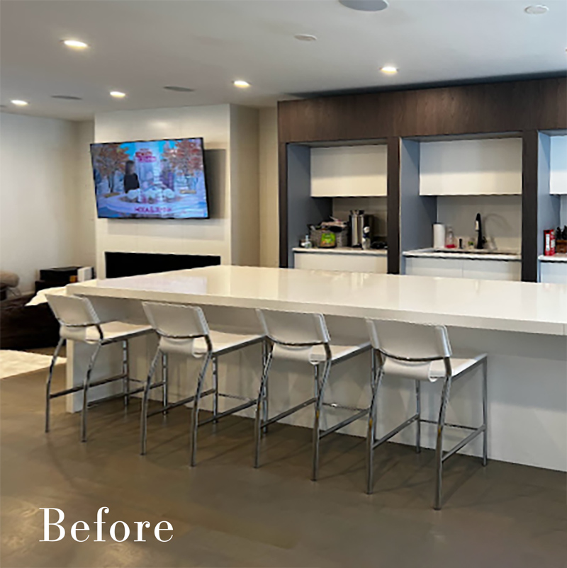
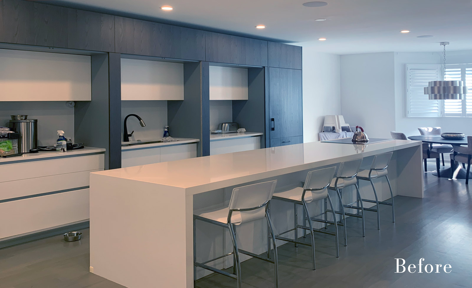
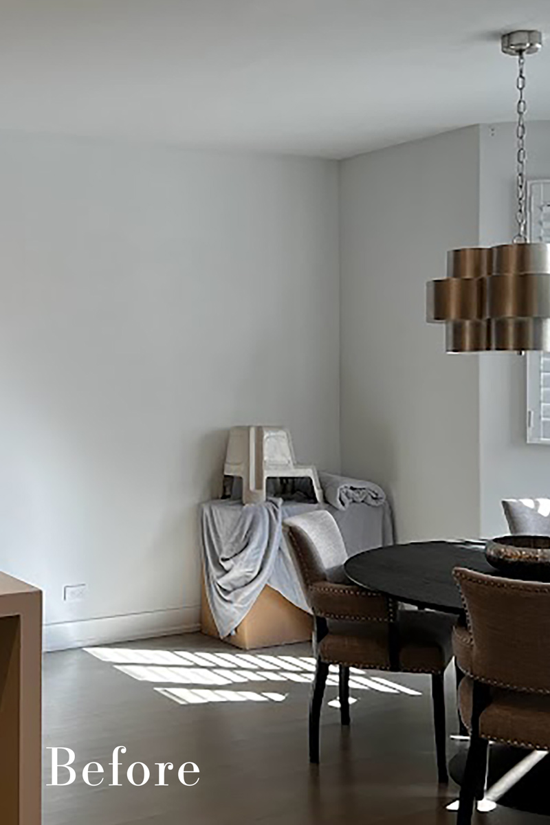
Sam’s client had lived in her downtown townhome home for less than a year when she decided to remodel the spacious second level. This open area consisted of three sections: a TV and fireplace zone, a sparsely furnished dining area, and a dominant central kitchen. The kitchen featured a long back wall with three segmented sections and a massive island housing the cooktop. She found the kitchen’s functionality lacking and its presence overwhelming – it dominated the entire floor, regardless of where you stood.
Design objectives:
- Reconfigure key kitchen elements (sink, cooktop, oven) while minimizing the kitchen’s visual impact
- Optimize the kitchen’s back wall, eliminating existing dead space
- Create a purposeful, well-defined dining area
- Establish a distinct, comfortable living area
- Reuse existing appliances and flooring
- Maintain an overall modern design aesthetic
The Remodel
Design challenges to be solved:
- Redesign the island to reduce its overwhelming presence
- Create a comfortable, dedicated living room within the available space
- Establish a distinct, inviting dining area within spatial constraints
- Enhance kitchen functionality and style without dominating the entire floor
The Renewed Space
Design solutions:
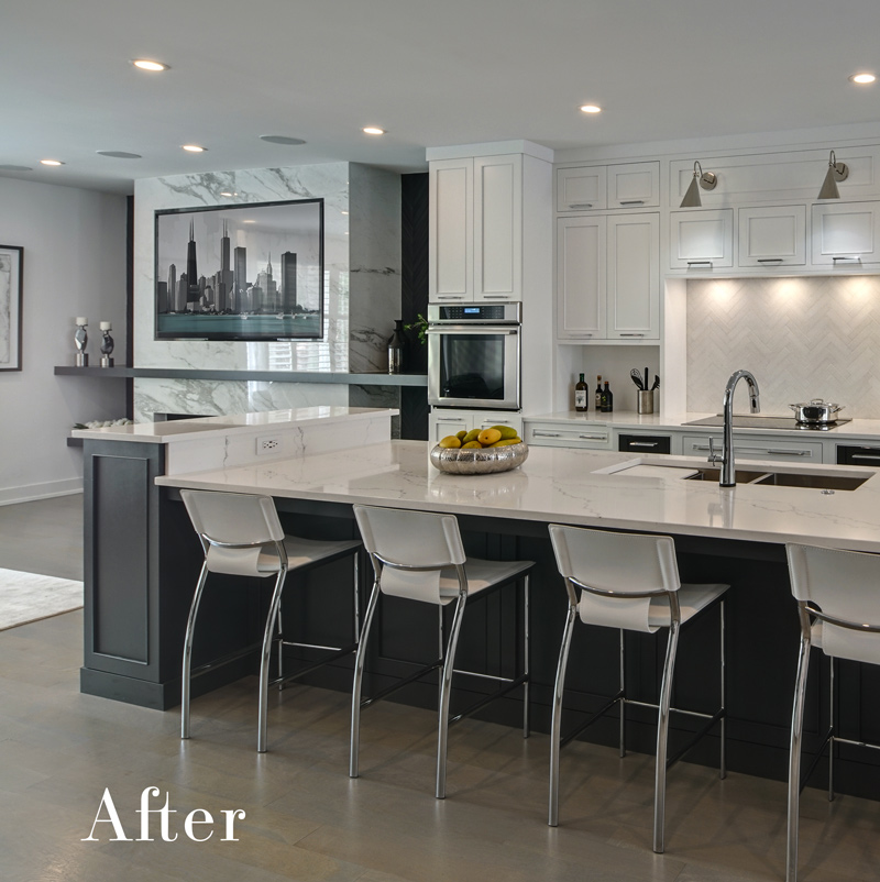
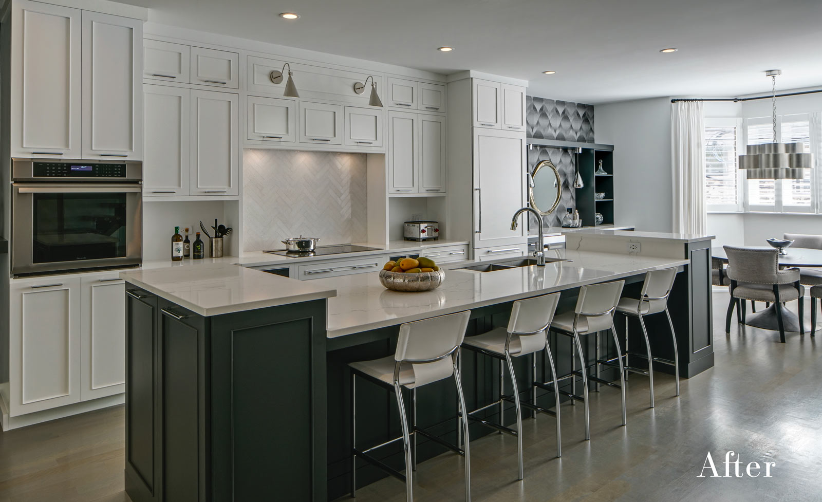
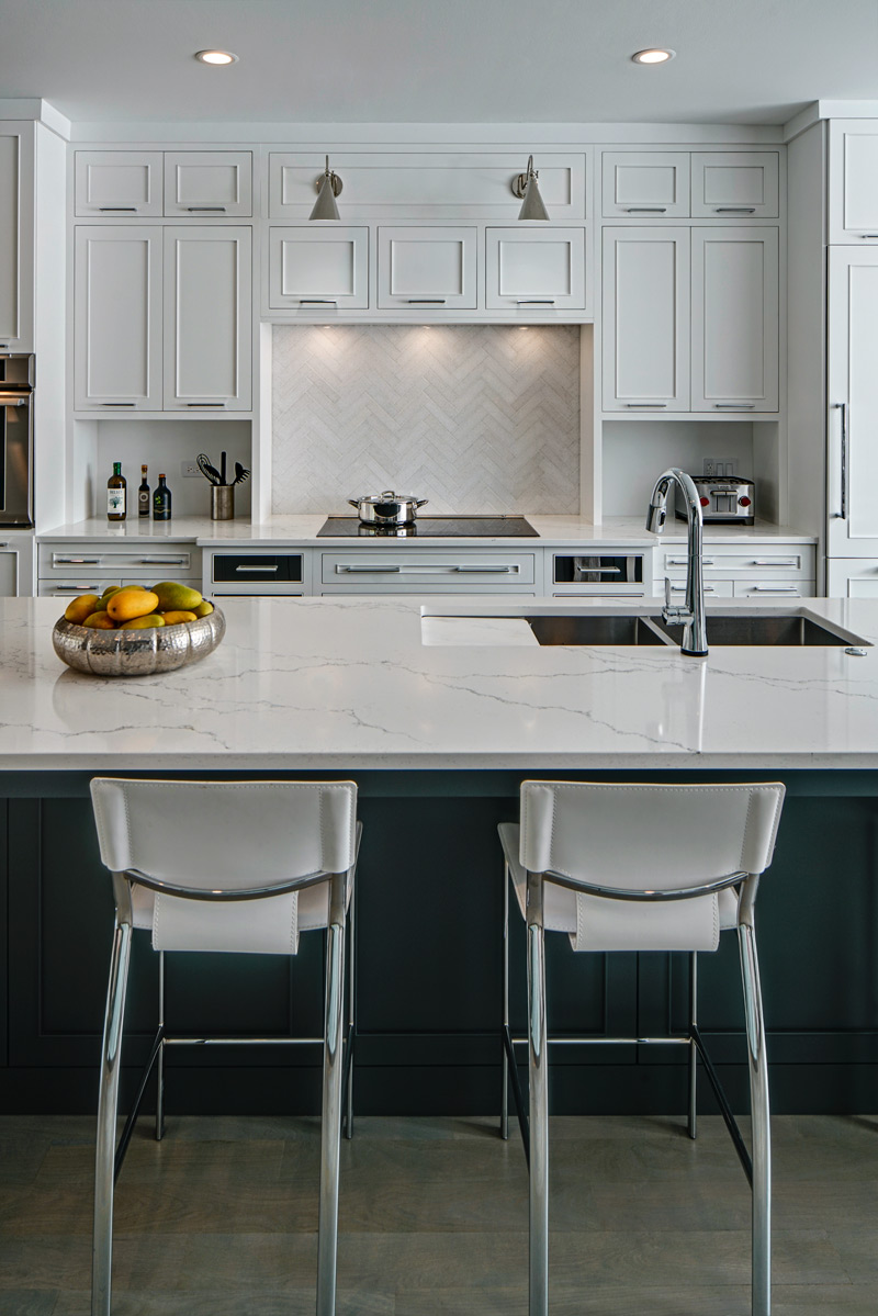
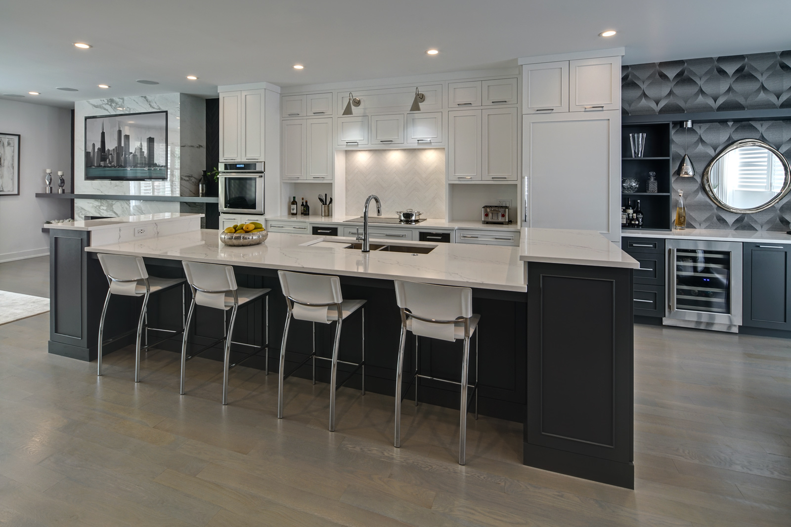
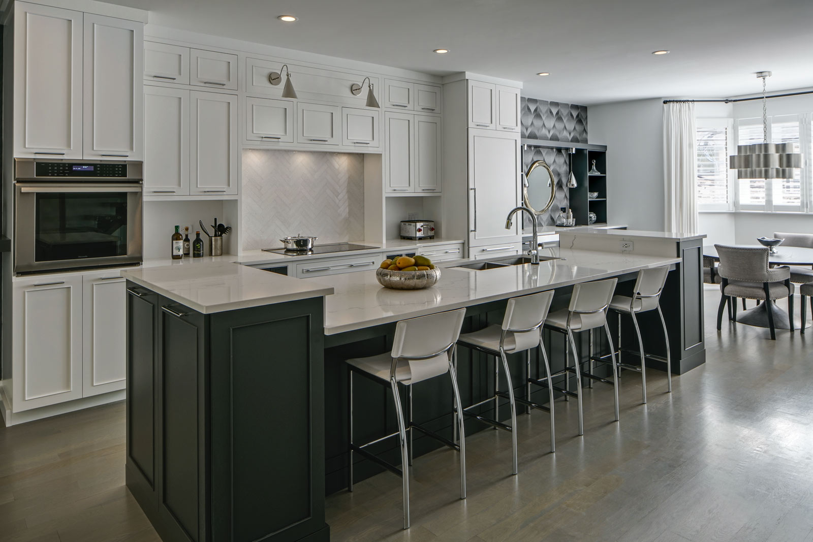
- Sam created raised end caps for the island. This separated the kitchen from adjacent living and dining areas while focusing the kitchen’s functionality. The new sink location offers ample workspace, allowing the cook to interact with guests seated at the island. The redesigned island also provides additional storage.
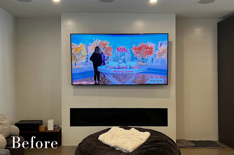
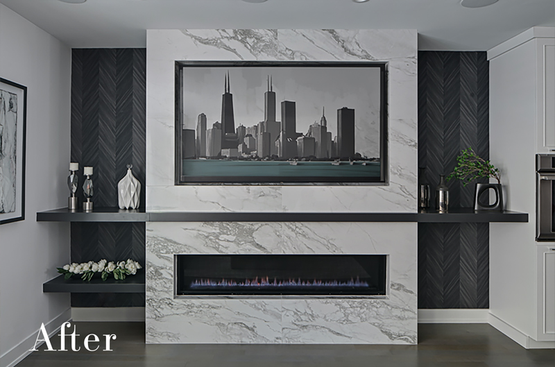
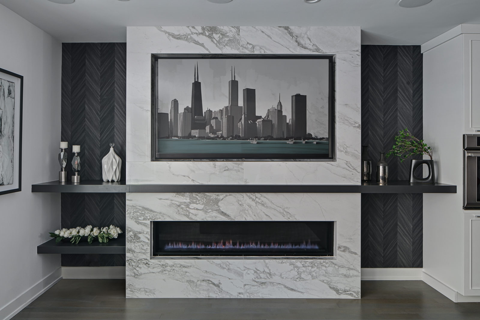
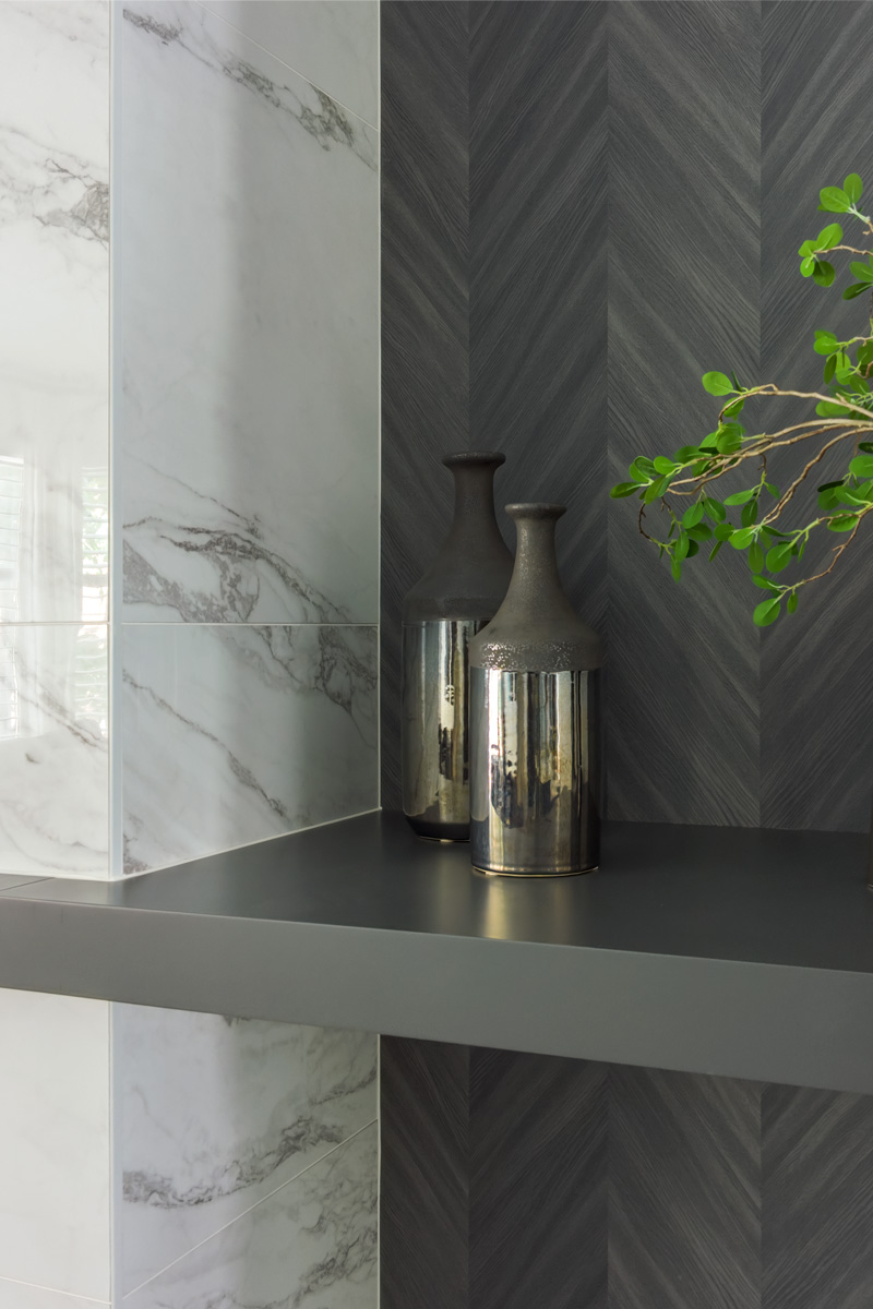
- For the living area, Sam opted for a functional-yet-minimalist approach. Large-format tile creates a natural stone look for the fireplace and TV wall. The recessed TV and extended fireplace shelf maintain a sleek profile. Artistic wallpaper adds depth and texture, while the intentional lack of extensive shelving keeps the space open and distinct.
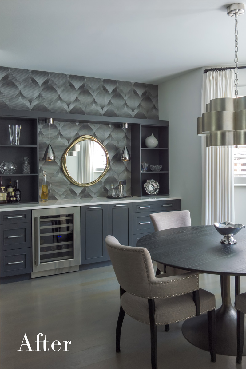
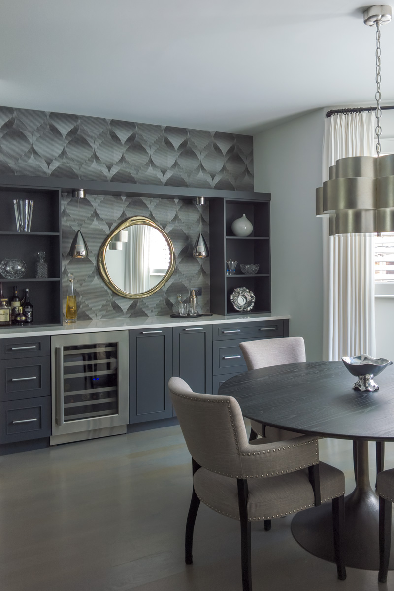
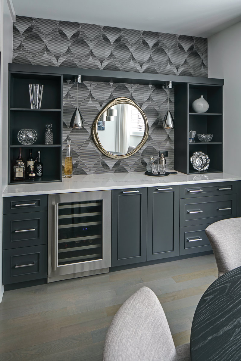
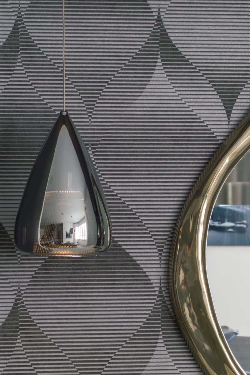
- Sam transformed the dining area’s blank wall into a feature, adding a unique dry bar with counter space, open shelves, cabinet storage and a beverage fridge. Wallpaper behind and above the bar contributes to the area’s personality. A mirror adds depth while pendant lights add style and visual interest.
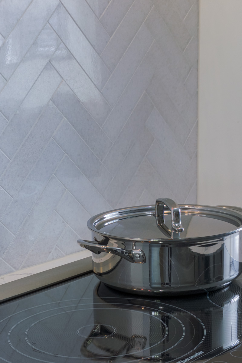
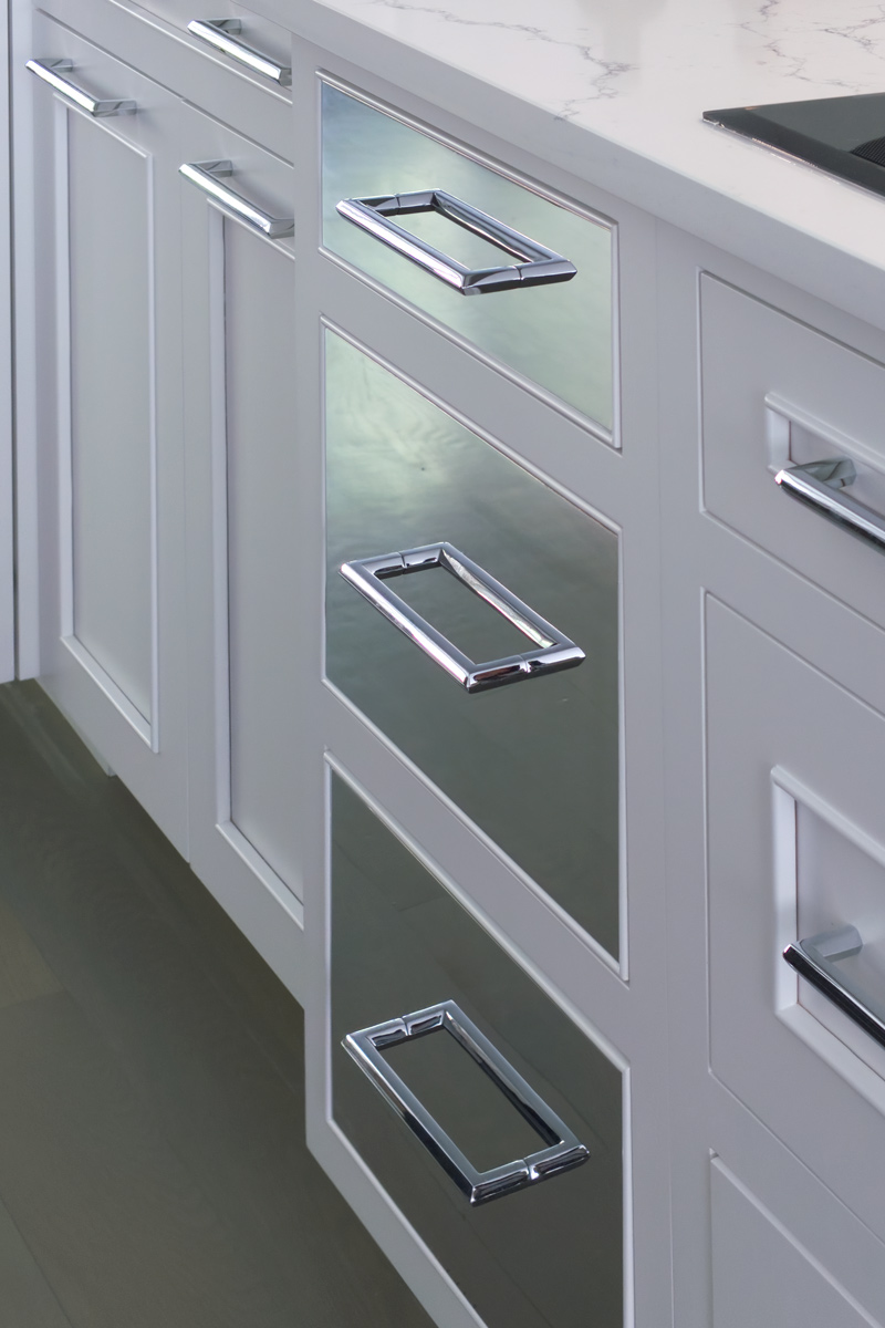
- Relocating the cooktop to the back wall facilitates hidden ventilation, reducing visual clutter. Sam balanced transitional and modern elements for a contemporary yet comfortable feel. The digital control panel on the convection cooktop maintains a sleek look, while the wall oven is now at an easy-to-use height. Mirrored base cabinet fronts and a paneled fridge prevent cabinetry monotony.
The redesign has delighted Sam’s client, achieving her main goal of creating a more inviting and visually appealing space. Each section now has its own visual personality and functionality while harmonizing within a monochromatic palette. The entire floor offers wow-factor pop upon first glance, with each area maintaining its distinct character while contributing to a cohesive, modern aesthetic.
Size of Space:
- 27 ‘ x 14’
Cabinetry:
- Brand: Grabill
- Perimeter: Glacier
- Island/Bar/Fireplace: Antracita
Countertops:
- Brand: U-Quartz
- Type: Quartz
- Color: Stratosphere
Thermador Appliances:
- 36″ Built in Fridge/Freezer
- 30″ Built-in Single Oven
- 24″ Micro Dwr
- 36″ Induction Cooktop
- 24″ Integrated Dishwasher
- 24″ Beverage Center
- 36″ Downdraft
Plumbing:
- Delta Touch Faucet
- Bai Two Double Sink
- Mountain Air switch
- Garbage Disposal
Special Features:
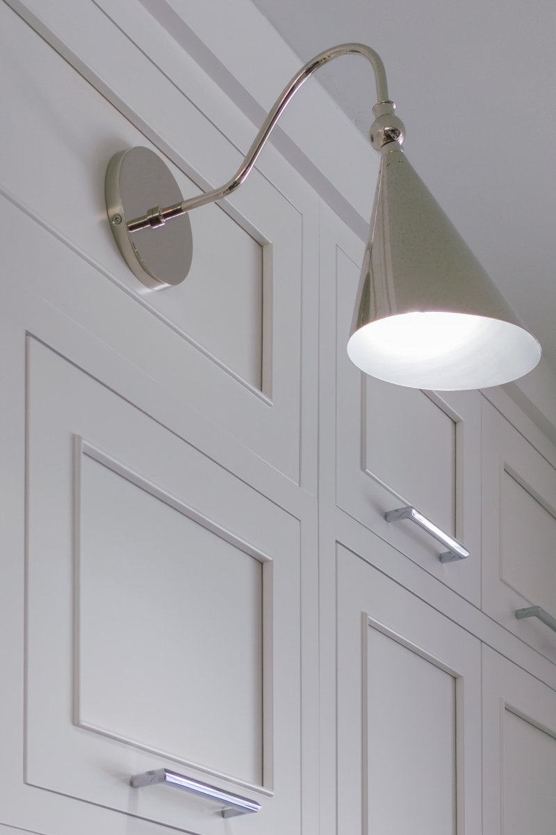
- Creative accent lighting
- Sleek-yet-functional fireplace mantle extending into deeper side shelving
- Doorless kitchen appliance garages contributing to the open feel
- Mirrored drawer and cabinet doors as accent moments in the cabinetry wall

Before/After:
