The setup
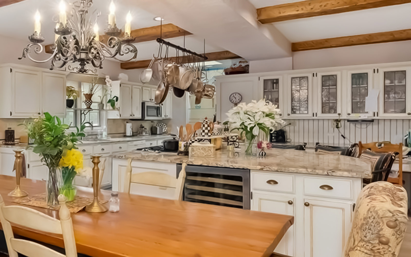
The original kitchen in this historic River Forest home was a hodgepodge of design elements created by additions to the space over the years. From a functional standpoint, the layout was overly complicated. The kitchen was an L shape with the work triangle in the small leg of the L. It was a fairly large space, but the layout made it feel like a very small kitchen. (See ‘before’ photo below.)
The traffic flow from other areas of the home entered at awkward locations, rendering some walls useless for storage or workspace.
In addition to solving functionality and flow issues, the homeowner wanted their new kitchen area to have an updated look that still tied into the home’s English Tudor style.
The remodel
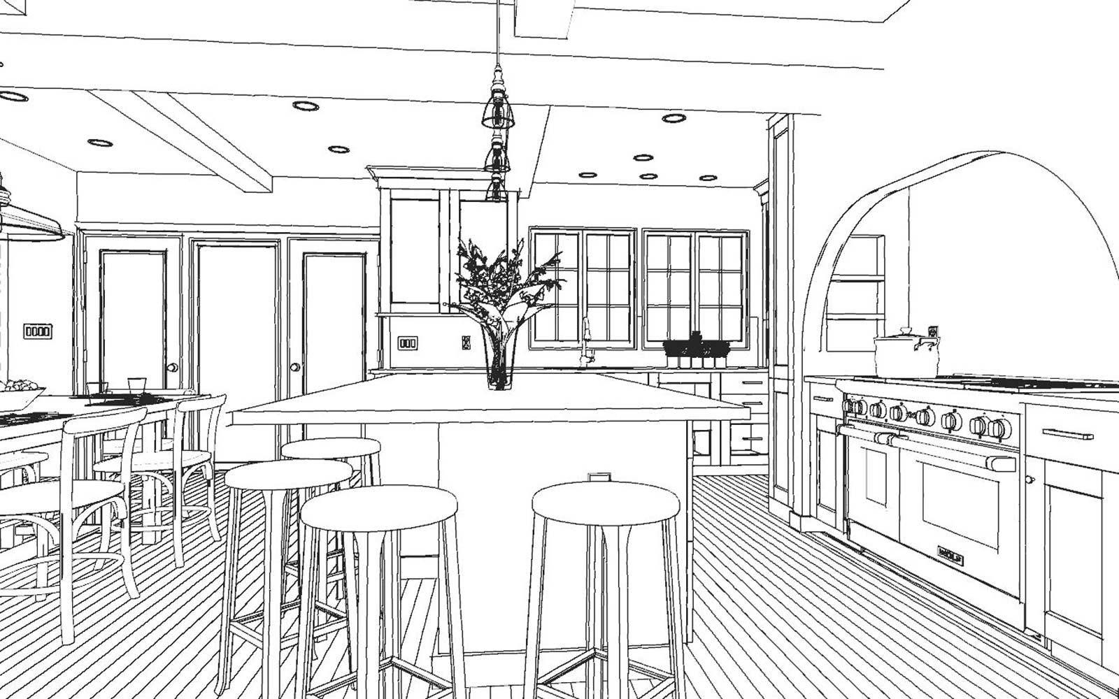
We took everything down to the studs and reestablished design elements like existing beams and a very particular texture on the walls and ceiling. The short leg of the L was closed off and a nice-sized walk-in pantry was put in its place. This functions as the major storage area now – just a few wall cabinets are visible for the everyday dishes.
Entries into the space were closed off and relocated to help the overall traffic flow of the home. The windows and exterior doors in the room were removed and relocated. The new ones were finished in a style to match those in some of the existing parts of the home.
The Renewed Space
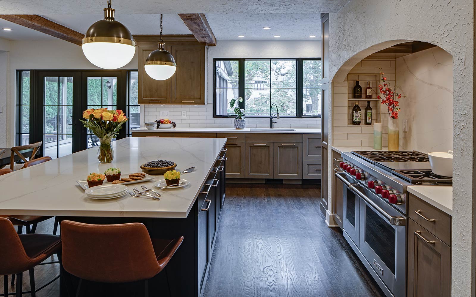
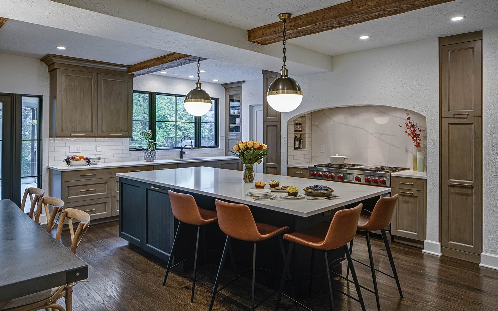
This kitchen now has a nice, spacious feel for this growing family of five. A large arch was built to enclose the range and disguise some architectural details that could not be changed. This was carefully finished in the same textured surface as the original walls.
Pantries are now strategically located on both sides of the range area: a pull-out pantry on one side and a shallower pantry on the other side. The large island functions as a spacious work area and a central hub for the busy family’s many daily activities.
The transitional design elements and subdued, neutral color palette contribute to what is now a very calming and functional space for the entire family.
Cabinetry:
Perimeter
- Brand: Grabill
- Finish: Alder Smokestone Glaze
- Door style: Devonshire
Island
- Brand: Grabill
- Finish: Hickory Black Stain
- Door style: Devonshire
Countertops:
Kitchen Perimeter
- Material: Vicostone Quartz
- Color: Grey Savoi
Kitchen Island
- Material: Q Quartz
- Color: Verona
Appliances:
- Sharp Microwave
- Wolf Duel Fual 6 Burner/Griddle
- Best Ventilating System
- Sub-Zero Refrigerator/Freezer
- Fisher & Paykel Dishwasher
Size:
20’ x 25′
Special Features:
- Custom hearth design
- Full height Q quartz Verona backsplash
- Large island with seating for 4


